Sunday 31 October 2010

Tech Analysis: NFS: Hot Pursuit Demo (PS3 vs 360)

Some studios simply understand the foundations that make for good multi-platform development, and Criterion is at the forefront of those. With an engine custom built to take advantage of both consoles specific strengths, and leveraging near flawless workarounds against their weaknesses, it is no surprise to see that once again they have delivered another exceptional example of high-level PS3 and 360 development.

The tech powering Burnout Paradise showed that one of the key factors in achieving parity across both formats was parallelisation; whereby off loading multiple tasks across multiple CPU threads and processors allowed for nearly every small bit of CPU/GPU time to be used effectively. Scalability was at the core, with the level of overall processing time constantly shifting accordingly between tasks that needed it as and when required.

Criterion understands that spreading the workload and keeping all parts of the rendering engine busy is the main factor in obtaining constantly high performance across the board, and on both platforms. But it’s more than that; optimising the engine so that the core components that make up the graphical look of the game are suited to both platforms, and not just one, plays an equally massive role too.

For Need For Speed: Hot Pursuit Criterion have done exactly that. Like with Burnout Paradise the team have been able to balance out the underlying tech behind the game, with an impressive feature set; including real-time image-based lighting on the cars, beautiful specular highlights, and large, open environments, with cross platform performance that is shockingly soild.


And performance is indeed the first thing that you’ll notice: NFS:HP is clocked at a constant 30fps with absolutely no screen tearing. It goes without saying that both formats are like for like in this regard, and if anything proves that Criterion’s engine delivers on what it set out to do.

The game almost never deviates from its initial 30fps update, only taking a quick drop during some of the more intensive takedown scenes, but never during normal racing/driving. The same thing is true for both PS3 and 360; even when driving around like a lunatic, crashing into scenery and smashing into the sides of your rivals, the game preserves its smoothness with ease.

Along with barely any slowdown, I have to say that it is definitely something of a surprise to see a distinct lack of screen tearing being present during gameplay. NFS:HP seems to continuously maintain v-sync on both PS3 and 360 without needing to drop it in order to preserve framerate. This in contrast to the likes of Split Second in which v-sync is temporarily disengaged in order to ensure more steady performance as a result. But here, there doesn’t seem to be a problem.

However, I must also state that it is incredibly hard to detect extremely minor events of screen tearing in such dark and low contrast areas, so maybe it is possible that the odd frame could be being torn on very brief occasions, though that is not obvious during regular gameplay. Without equipment to measure such things, I can only go by what I’m seeing.


Running at half the framerate of Burnout Paradise (that was 60fps) NFS feels distinctly different to Criterion’s last title, and not just because of the framerate. The handling model has been completely reworked and built up into what feels and looks like a new game, and not a simple re-hash of what has gone before. Though the use of a lower framerate, and this new, slower drifting mechanic has a dramatic effect on the action.

Obviously running at 30fps introduces higher controller latency into the mix, whereby button presses and turns of the analogue stick are ever so slightly less instant than if the game was running at a higher framerate. This latency is definitely apparent over and above the 60fps Burnout Paradise, although it is actually the new handling mechanics, and the use of demo specific cars that make the control seem to have a little more lag than it does.

In fact, when gently moving the left stick to turn you can see that small, almost instant movements are possible, and that it is the way the game plays that brings about this feeling – it is intentional, and reminiscent of the handling found in Black Rock’s Split Second.


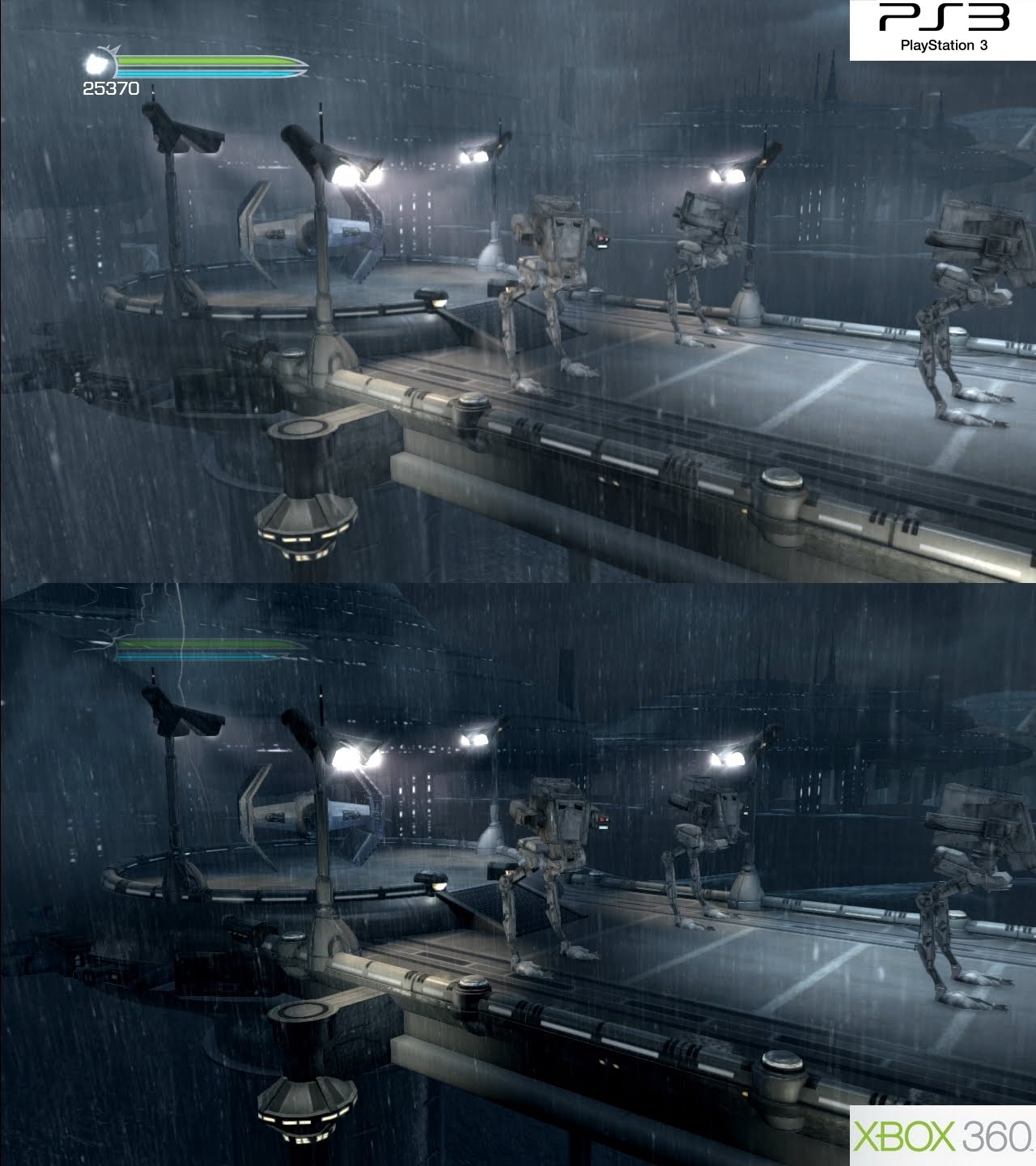
So in terms of performance both versions appear pretty much like for like, and we can also see the same thing being applied to the rest of the demo. Looking at screens, and by playing both versions almost side-by-side (flicking back and forth between HDMI inputs) we can see that texture detail, filtering, lighting, and the vast majority of effects are exactly the same on both platforms. It’s basically a solid match, with next to no discernable differences.

However, there was one really small difference that I was able to spot, though you will really have to go looking for it. Some of the specular maps on the game’s road surfaces are rendered in a slightly higher resolution on the 360. You can see this in the screenshot below. Notice how the bump-mapping appears slightly clearer on the 360 build, and slightly more blurred on the PS3.

It’s a very minor observation, one which rears its head on only some surfaces. But to be fair this isn’t something you are ever likely to notice when playing the game. And even if you do, it certainly isn't something that intrudes on the overall experience.


Moving on to the general make up of the game and image quality analysis, and we can see that NFS:HP is rendered in 720p (1280x720) on both platforms, with the standard 2xMSAA (multi-sampling anti-aliasing) delivering ample edge smoothing.

Interestingly, there seems to be more than just MSAA going on in regards to this; many areas of the game (small pieces of geometry, objects in the distance, and most noticeably, power lines and thin wires) feature a surprising amount of jaggies reduction, more than what is possible with just regular MSAA. Both versions are exactly the same in this regard.

In the night-time police chase section – the only part of the demo we had access to – we can see that despite the low contrast nature of the scene aiding things slightly, that there is far less in the way of overall aliasing than expected on thin surfaces and polygon edges. Looking at still screen shots it is clear than parts of the environment are being smoothed out using another method of image smoothing. Which one, and how, we don’t really know, though the effect is solidly welcome.

However, the sub-pixel issue still appears in areas across the scene, with some objects in the distance still having noticeably shimmering edges, and some undesired shader aliasing. It’s definitely an improvement over what traditional anti-aliasing techniques would have provided, but not quite the clean, artifact free look that it can initially appear to be.

Either way, the use of MSAA plus additional edge smoothing is definitely beneficial, and delivers a tangible improvement over what we expected. It’s not anywhere near as impressive as God Of War 3’s use of MLAA (morphological anti-aliasing), but a nice inclusion nevertheless - many surfaces get great use of smoothing not otherwise obtainable by regular means.


Lastly, the way the lighting has been implemented is another nice plus point in this latest Criterion exploit. The whole game uses something called image-based lighting, whereby the cars are accurately lit by their surrounding environments at all times, meaning that the clouds and other numerous light sources all have an impact on how the cars look throughout the game.

This is done by rendering the environment first, using the more traditional forward rendering method, whilst the cars are done afterwards in a differed rendering pass. The environments have to be done first in order to accurately light and shade the cars; the result being a mightily impressive use of lighting with a level of realism not often seen outside high-end tech demos.


In the end the demo for Need For Speed: Hot Pursuit clearly showcases some of Criterion’s new tech rather nicely, and also manages to prove that their way of thinking when it comes to multi-platform development is in fact the right one. There’s barely any difference between the PS3 and 360 versions of the game, and aside from one small factor they look exactly the same.

The game may not always impressive on an artistic level – I personally don’t really like the night-time demo track all that much, but technically it definitely raises the bar in some respects. Some remaining sub-pixel aliasing isses aside (you need to use supersmapling, which isn’t feasible on consoles), it would be nice to see more developers taking this approach to game development.

Sadly, I wasn’t able to analyse the supposedly more impressive daytime track - it’s locked until one of your friends on both PSN and XBLA has downloaded and played the demo. And rather annoyingly, none of mine have, so a further look will be required when the final game comes out to really see just how well Criterion’s engine, and the overall game it self turns out. While the demo is a nice, intriguing starting point, it is only a tiny chunk of what the final release will have to offer.

As always thanks go out to AlStrong for the pixel counting, and Cynamite.de for most of our comparison screens. Mr Deap for the others. A full gallery can be found here.

Friday 29 October 2010

More PSP2 Information Surfaces

It’s been an interesting week for news surrounding Sony and the future of their PSP series of handhelds. The PSP phone (currently untitled) was revealed online in an article over at engadget, in which we covered on Wednesday, and now Kotaku are also reporting that the PSP2 – the true successor to the original PSP, will be loosing its UMD drive.

Sources informing the site say that the PSP2 will be going down the same digital distribution route as the existing PSPgo, with software being stored on memory sticks of some kind. However, retail releases will not be discarded – Sony currently are undecided on what storage solution they will take. My best guess is some kind of small memory card, perhaps something like what the NDS already uses but with much greater storage capacity. Either way a costly disc reading mechanism is out for sure.

Interestingly, the machine is also said to feature a whopping 1GB of RAM, which is pretty huge for a handheld device. And sources state that we could be looking at something approaching similar Xbox 360 levels of graphical quality with games on the system, though I expect with obvious downgrades in certain areas. Processing power certainly won't be a match.

In addition it’s not as if multimedia use requires such extravagant amounts of memory. Graphics rendering on the other hand, is a vastly different beast, especially at high resolutions. Ultimately though, the overall level of performance is going to be more dictated by battery life, cooling, and overall power consumption than anything else, and that does rule out equaling current home console hardware in a mobile device. The power draw on anything actually delivering 360-esque levels of performance would be far too high for a handheld, although that doesn't mean something similar in terms of overall looks can't be achieved with less.

There was no mention of what kind of CPU/GPU combo is expected to show up in the machine, although a high-end Imagination Technologies Power VR SGX variant is hotly rumoured to be the prime candidate.

Over recent months there have been a variety of rumours surrounding the system, from the increasingly likely inclusion of touch-sensitive controls and a HD resolution display, to signs pointing at a slim-lined version of the traditional dual analogue control set up also being part of the system’s feedback inspired design. However, it was the removal of UMD that was the most certain – it was almost guaranteed given the format’s poor performance and lacklustre uptake in general.

With certainly more to follow next year, it probably won’t be all that long until Sony finally decide to unveil the somewhat murky curtain that the PSP2 has been hiding behind over the last year or so. Before then however, we expect more ‘off-record’ stuff to surface.

Wednesday 27 October 2010

The PSP Phone Revealed

Way back in August we reported that a mobile phone version of Sony’s PSP was being worked on. The un-named device was said to be an amalgomation of both the PSPgo and the Samsung Captivate in terms of design, and was supposed to be powered by the brand new Android 3.0 operating system.

Today Engadget seems to have exclusively unveiled what looks like a prototype version of the device, finally confirming those early rumblings from a few months ago.


The currently un-named device forgoes any actual PlayStation branding, instead being positioned under the Sony Ericsson banner, perhaps to differenciate it from the separate PSP2 project in the works, but also due to it being handled by a completely different branch of the company.

In the above shot we can see that the device features the traditional d-pad and buttons found on the PSP, with the styling appearing to be similar to the PSPgo. Two shoulder buttons can also be seen in additional screenshots in the original Engadget article. However, one thing does seem to be missing – the system has no visible analogue nub on show. Instead, it has been replaced with a multi-touch, touch sensitive pad more in-keeping with the design trend of having less control options on most smartphones.

Moving on, and sources have also revealed that the system will be powered by a 1GHz Qualcomm MSM8655 mobile processor, which is backed up with 512MBs of RAM and 1GB of ROM. This will drive images onto what is speculated to be a 3.7 to 4.1 inch touchscreen display, thus adding even more functionality to the mix. Much like the iPhone it could be used to control games, making way for simple casual type experiences on top of the dedicated ‘core’ titles that will no doubt separate the system from other similar phones.

On top of that, a built-in camera with LED flash was mentioned, along with support for MicroSD cards in place of the standard Pro Duo sticks used by the normal PSP models, putting it firmly in-line with the PSPgo on that front.

In terms of software support and online, apparently, Sony are planning to launch a brand new marketplace specifically for the system, in which users will be able to download specific top-tier PlayStation titles such as God Of War, and as previously hinted, Call Of Duty. I imagine that this will be a key part in their plans to extend the PlayStation Network branding across multiple mobile devices, and as such will help them to gain a greater foothold in an increasingly competitive market.

Other than that, Engadget seem to believe that the PSP Phone could still launch sometime in between fall this year and 2011. Originally it was speculated to hit during the end of 2010, although that is now looking increasingly unlikley. Instead we expect more details to be forthcoming in the next few months, possibly weeks.

Either way the PSP Phone looks like becoming a rather intriguing prospect, and it will be interesting to see just how well it holds up against the iPhone 4 and other comparable smartphones.

Tuesday 26 October 2010

Tech Analysis: Vanquish Update (PS3 vs 360)

Created by both the legendary Shinji Mikami, and the visionary Atsushi Inaba, Vanquish is one of the most exciting and intense shooters to come out of any software house in recent years. Although, it is only from the minds, and indeed talent, nurtured in the land of the rising sun in which such an exemplary form of high-octane, and beautifully staged gunplay could have originated. Coming out of nowhere Vanquish is an amazing game, and one of the most impressively modern, though staunchly old-school examples of run and gun mayhem you’ll find on any console, let alone the PS3 or 360, and is well worth the price of entry.

The demo release way back in August showed that Vanquish was more or less a match on both PS3 and 360, but the finished game now solidly confirms that. Like with the demo Vanquish looks to be almost completely identical across both platforms, having just one or two extremely subtle, but barely noticeable differences, with performance being the most defining factor between both versions.

What we have here is a stark contrast to Platinum Games last release, Bayonetta, which was seriously gimped on the PS3. Running with its framerate bitterly halved, along with lower resolution textures and alpha effects it was perhaps one of the worst cross-platform releases I’d come across thus far. But unlike that particular title, Vanquish was completely developed in-house on both platforms, with the PS3 game being the lead platform.

We took an in-depth look at the demo in an earlier tech analysis, so there’s little reason to spend a huge amount of time re-treading old ground, seeing as pretty much most of our findings back then still ring true now when it comes to the final retail copy. Instead what follows is a recap of sorts with updated comparison shots and an extended look at performance across both formats – arguably the deciding factor when it comes to Platinum Games’ latest.


Vanquish comes to both PS3 and 360 with a high contrast, heavily stylised look rendering at 1024x720, and with 2xMSAA (multi-sampling anti-aliasing). Sharpness is like for like, and polygon edges are reasonably clean given the circumstances, with jaggies mostly being kept successfully under control despite the high contrast nature of the game – due no doubt to the title’s extensive use of post-process, per-object motion blur in addition the standard MSAA implementation.

However, the game does appear a little soft in places due to the slight sub-HD framebuffer being upscaled to 720p on both consoles. Although this never manifests itself in any meaningful way, and the overall look is still that of being mostly sharp and clinical despite the amount of screen-distorting effects on offer.

Given the huge amount of stuff being rendered on screen at once; plenty of particles, transparencies, and geometry, it is surprising to see that absolutely nothing has been paired back on either build of the game. Alpha buffers are rendered in full resolution, and both texture detail and filtering are an exact match across both platforms, with tons of beautiful shader effects adorning the display. The fact that the developers have been able to almost reach 720p in its entirety (1280x720) is impressive to say the least.

The use of a 1024x720 resolution framebuffer with 2xMSAA means that the game’s graphical make-up on a frame-by-frame basis manages to work comfortably with both systems differing memory bandwidth limitations – on the 360 in particular the FB fits into the system’s EDRAM without tiling, while PS3 owners get something that isn’t too bandwidth heavy overall. The result of which is basically image parity on both platforms, with only some shadowing quirks and mild gamma differences.


Of course such oddities are hardly justifiable as plus or minus points against each version. Shadowing has slightly different implementations on each platform, with occasional differences here and there, though in motion they look basically the same. This was also apparent in the Enslaved demo we sampled a few weeks back for an another tech analysis, and like with that particular title, in Vanquish it barely impacts on the overall look of the game.

There also seems to some small gamma differences between the two versions. Contrast seems to be slightly boosted, and brightness reduced on the PS3 giving some textures a mildly more washed out look, along with darker shadowing. Detail levels remain the same however, and a quick, and very slight re-calibration of my TV's video settings then yielded near identical results.


One thing that stands out as much in the final game as it did in the demo, is the title’s use of a range of screen-distortion effects and per-object motion blur. Individual parts of the scenery, along with enemies and projectiles become warped and blurred with fast movement and large explosions, in what can only be described as a bonanza of post-processing goodness.

Like with pretty much the rest of the game, both the PS3 and 360 versions are the same in this regard, with levels of post processing effects usually only found in either high-end PS3 specific titles, or in the PC space where technology is always rapidly moving ahead of the consoles. It’s an impressive feat to behold, especially given the demanding circumstances the game engine regularly finds itself in.

Interestingly, the use of motion blur actually helps in making the game seem smoother than it actually is. In Vanquish blur is used not only to distort images on screen, but also to simulate (if not accidentally) a smoothening effect, though without any artificial framerate enhancement.

The Force Unlreashed II demo demonstrates this perfectly, often feeling smoother and more fluid than a 30fps game, and the same thing can be found here in Vanquish as well. The result is that even when performance takes a brief nosedive, it never quite looks quite as bad as it sometimes feels, which I guess is actually a good thing because Vanquish running at 60fps would be an impossible feat.


So far things have been pretty much identical across both platforms, sans for some shadowing/lighting quirks, both of which are barely even noticeable. Instead, what actually separates the two builds apart from each other is performance, in which we see the PS3 command an overall lead, with no screen tearing, and mix of fewer and heavier framerate drops than its 360 counterpart.

Effectively, overall performance between both versions of the game is exactly the same as in the demo. The first section of the final game IS basically the demo, but briefly expanded upon both at the beginning and at the end. In which case we can see that the same scenario displays the same results as our earlier findings; that the PS3 version tends to drop framerate a little more during the large-scale boss encounter, whilst doing so less often during regularly combat situations.

Moving on past the first mission and into further stages of the game, and we can find largely the same results yet again. Sadly, I don’t have any hard way of confirming actual framerates outside of using my own eyes, but it does appear that the 360 build has a small advantage during most of the game’s boss battles, though admittedly I’ve not played both versions all the way through to completion.

Vanquish targets a 30fps update, and manages to successfully maintain that with only a few dips in between, and some heavy drops when the engine is stressed. Most notably the PS3 version seems to be ever so slightly smoother in normal circumstances, whereas the 360 drops the odd few frames more. Though it has to be said that the differences aren’t earth shattering, barely registering at all when immersed in the action. However the PS3 build does feel ever so slightly more fluid as a whole.


So framerates are basically very similar, with one platform ever so slightly favouring heavy load scenarios, and the other more regular encounters. However, in terms of dealing with screen tearing the results are remarkably different, and this appears to be down to each version’s implementations of v-sync – the 360 version happily loses it in order to keep fluidity, whilst the PS3 benefits from having additional support from being triple-buffered.

Triple buffering means that for every frame being displayed, the game renders a total of three. If the first frame is torn, then the next is selected, and so on, until a clean frame is found. Screen tearing is only really noticeable when multiple frames are torn, so by having more frames rendered for each one displayed, means that you are less likely to be using a final frame that isn’t clean.

For the PS3 it means that Vanquish never tears a single frame. Like in the demo its performance is rock solid in this regard, never faltering even when a cataclysmic event is kicking off right in front of your eyes. By contrast the game 360 game doesn’t feature any kind of continuous v-sync, and unlike hinted at in our demo analysis, doesn’t feature any kind of frame buffer technique (as tearing was barely visible I thought that it could have used the lesser doubled buffered approach), leading to regular, though mostly unseen bouts of tearing.

However, the tearing is so mild on the 360 that it is barely noticeable at all. In fact, during play I only noticed it for a split second or so when there was lots of stuff on screen at once; a clear sign that despite the PS3 being the lead build of the game, that the 360 version is still thoroughly optimised. Instead, screen tearing mostly rears its head during the large boss battles, and rarely in normal combat.

Of course there are both advantages and downsides to either approach. The controls for instance feel a touch more responsive on the 360; a common trait found when comparing games featuring frame buffering, and those without. In order for the PS3 to maintain its stellar v-sync performance (in reality it could be dropping it) triple buffering adds an additional rendering cost into the mix. The amount of time it takes to display a frame goes up, and with it comes additional controller latency.

However, this additional latency only subtly manifests itself, and Vanquish never feels laggy or unresponsive outside of when large framerate drops occur. Interestingly, when both versions are put under strain during a boss encounter, they feel pretty much the same, with the 360 just about coming out on top overall.

Even when taking this into account, there’s no doubt that the PS3 build takes the performance lead by the smallest of margins. All things considered; framerate drops, screen tearing, controller latency, it is clear that the Sony game demonstrates a subtle advantage in most of these areas. Although, with the exception of screen tearing, both are a pretty even match, making Vanquish an enjoyable, and downright awesome experience whichever platform you happen to own.


Compared to Sega’s PS3 port of Bayonetta, Vanquish is sensational. Platinum Games have clearly balanced out the intricacies of their graphics engine with the limitations of both platforms in mind, whilst also taking advantage of similar core strengths, thus benefiting the PS3. And the result is nothing but an impressive showing of parity across both formats.

Sure, the 360 game may well tear a few frames every so often, and the PS3 build’s use of triple buffering adds additional controller latency into the mix, although neither really takes away anything from either version, or the game as a whole. For the most part, all in all Vanquish is virtually identical across the board on both platforms, with any subtle differences being mere curiosities than ranking marks on a scorecard.

In short, Platinum Games’ latest is an essential purchase regardless of which console you happen to own, and is in no way a repeat of the travesty that was Bayonetta. Although, the blame for that one lies solely in Sega’s court.

For a more complete look at the tech powering the game, and a nice companion piece to this somewhat lengthy follow up article, why not check out our earlier demo analysis. That is, if you haven’t already.

Thanks as always to AlStrong for the pixel counting, and to Cynamite.de for the screens. Check out the original gallery here.

Sunday 24 October 2010

Review: Castlevania: Lords Of Shadow (PS3)

Lords Of Shadow isn’t really a Castlevania game. Of course this should have been apparent to anyone who watched any of the pre-release trailers of this franachie reboot months ago, although it isn’t until you actually pick it up and play do you realise just how far off it really is. Konami’s latest actually takes more inspiration from the likes of God Of War and Devil May Cry than say past Castlevania titles. Though it does have a heightened awareness of adding additional complexity to the combat, whilst creating more expansive, thought-provoking puzzles, which both make it feel like a reboot of the franchise than a whole new separate entity.

But even feeling a little bit like a separate entity is no bad thing, given the previously mixed track record of Castlevania games in 3D, and Lords Of Shadow clearly marks the first time the franchise has ever felt so accomplished in its move to the third dimension. The stellar voice acting work and cinematic presentation is tightly bound together with an intriguing script, blending seamlessly with a tough, and sometimes unforgiving, but always fair stab at intense visceral action, always requiring you to be utterly focused to really reap its rewards.

At times it feels like LOS really knows what it needs to be doing to bring the series up to date, out of its shadowy niche confines and into the mainstream limelight. The combat for example, and relatively linear level design are two such areas, which not only make LOS more accessible, but also a more succinct, controlled experience.

Unlike past Castlevania games, LOS doesn’t allow for any real freedom of exploration. You are simply shuffled along a linear path, with the occasional branching segment here and there often leading you to a dead end, or back to an interconnecting point earlier in the stage. Each chapter consists of a series of levels which you are expected to plow your way through, hacking past anything that stands in your way without much to deviate you off that plan. Puzzles break up the lengthy action sequences, and a small touch of Uncharted style platforming provides the game with some more relaxed moments in which to take a short rest break.


Most of your time spent in Castlevania will be battling the many hordes of enemies that are vying for your blood; the standard series fare of werewolves and skeletons are joined by ogres, trolls, and giant titans who bare more than a passing resemblance to some of the lavish creatures found in Shadow Of The Colossus.

Combat then, is the single most thing you’ll be preoccupied with in Lords Of Shadow. There are plenty of enemies that are in need of dispatching, and a whole host of techniques at your disposal to do this. It’s an initially simple, but altogether satisfying part of the overall experience, despite wearing a little thin after countless skirmishes across a multitude of landscapes.

Like in God Of War, Castlevania uses the basic two-button attack strategy common in games of this ilk. You have two melee attacks, both conforming to the fast/slow, weak/strong blueprint laid down decades ago - and it’s from mixing these where your combos and subsequent move sets come from - along with a single ranged strike; often quick, but decidedly best used as a last resort.


New moves are obtained whilst simply playing through the game, and killing every foe that stands in your way. While advanced moves - ones that deliver far more damage, but take longer to execute - need to be bought via the use of orbs dropped by downed enemies. The system in LOS is remarkable similar to that of DMC in terms of how new moves and combos are actually obtained, and very much like Dante’s Inferno and GOW with how they are executed.

This means that combat, for the most part, is not only familiar and really easy to get into, but also contains quite a bit of depth to keep you satisfied. And this is especially true when you consider the wealth of upgrades and additional skills that can be unlocked and bought throughout the game.

Not long after starting out you’ll gain the ability to grab hold of enemies, extracting extra weapons from them, and even using some of the larger ones as mounts; being able to ride and control them, thus allowing you to reach parts of the environment that are not otherwise traversable, along with delivering some serious damage to anyone left in your wake. For the most part, these creatures are usually only needed in specific situations, and the game directs you into riding them as and when they are required.


The same can also be said of the various extra abilities you gain through your quest. Most are given to you to complete a specific task, and after this is complete you rarely need to make use of them again until another specific situation arises. Perhaps annoyingly, you might find that you need to use a skill you haven’t performed in a few hours of gameplay, thus forgetting that you had even had it in the first place. Although later on, the game starts to make use of the various abilities on a more regular basis, even if this in it self feels like battles are being somewhat padded out.

Ultimately this can make the combat feel quite repetitive. As you only really need to make use of a few key moves and abilities, much of the additional stuff becomes lost, or discarded by the player until the need arises. Even against the game’s lavishly designed bosses; huge in nature and epic in scale, most simply have you repeating the same strategy in order to take them down, bar one or two additional moves changes mid-way through.

There are times when things are a little different. Some of the bosses, like the giant titan you fight against near the beginning of the game, take inspiration of the likes of Shadow of The Colossus. Seeing you scaling up and around it, having you hold on for dear life whilst attempting to stab out its weak point, is an epic exercise in thoroughly thrilling gameplay. But if only more encounters throughout the game were quite as exciting.


Delving a little deeper into the combat, and you find your already potentially large skillset being expanded via the use of magic.

Early on you gain the ability to use both light and dark magic, and this brings some strategy to the table. Light magic is regularly used to regenerate your health, whilst dark magic delivers extra damage to enemies from your attacks. You have separate gauges for both, and each one gets filled up by collecting orbs released from fallen enemies. The crux is that in order to gain orbs from them in the first place, the killing blow of your attack must be made without magic enabled, thus making you think about how, and for how long you use magical abilities at any one time.

Coupled with that, is yet another gauge situated at the bottom of the screen. This shows your focus. The more you dodge and block enemy attacks, the more this builds up. And when full, each additional hit releases an orb, which can then be absorbed and used to fill up your magic gauges during combat. The use of both magic, normal attacks, and maintaining focus makes the usual button bashing seem a little more interesting.


Skill is required to really take advantage of LOS’s multi-faceted, but quite simple combat system. Although at the same time it does constantly keep you immersed, and pretty focused on what you are supposed to be doing – there’s no time for a brief gander at some of the games exquisitely designed architecture, and beautifully imagine vistas while trying to bring down a hulking giant of beast intent on extinguishing the last essence of your life.

However, with so much going on, with so much in the way of upgrades, new moves and abilities, LOS almost overwhelms you with options. Granted, the basics are the core part of the experience, but there’s far too much in the way of occasional rarely used moves, useless upgrades, and added abilities. It can be a real pain sometimes trying to remember which does what, and when. That said, they do keep the game from feeling fresh; hours in you are still learning new stuff, quickly adapting to new challenges every step of the way.


Outside of the huge array of combat options at your disposal, Castlevania: LOS is a pretty linear, and tightly directed adventure. Most of the game takes places on very narrow paths with very little in the way of additional exploration. However it also encourages you to come back to certain areas when you have powered up your skills, whilst also providing one or two diverging paths in which to take. A lot of the time these lead to short dead-ends, or are roundly connected with the main path, although still give the impression that your playing field isn’t quite as narrow as it may first seem.

In many ways LOS copies its blueprint strongly from GOW. The linear nature of the experience is only toppled by the game’s expansive use of puzzles, which are far larger in nature to that of other similar games. It’s these segments which feel most like Castlevania in this regard. Some of the puzzles you encounter are rather tough, whilst others are only initially so, requiring you to use past ideas in a new way , or a move which you obtained earlier in the game to unlock its secrets.

A heavy dose of Uncharted style platforming also expands upon the puzzles, and linear nature of the gameplay as a whole. It is a mostly automated affair, with only certain walls and surfaces being climbable, and jumping off a ledge the game doesn’t want you to is rarely possible.


While I did enjoy the relaxed nature of traversing the environment, engaging with the lavish surroundings, the game’s camera tends to hinder your progress. As it is static, and placed in such a way as to direct the flow of action, it certainly doesn’t help when certain angles are difficult to judge, or when vital parts of the environment are obscured off-screen making a few leaps of faith unavoidable. This starts off to be a minor quip, but becomes irritating fairly early on, especially when you try and backtrack through areas you’ve already been to find the last key to unlock the entrance to the next stage - you often end up running off an unseen edge to your doom.

Of course having a fixed camera allows the game to show off its thoroughly accomplished graphical make up. Home to some of the most detailed, and downright impressive visuals seen this generation, environments and characters are beautifully rendered, taking inspiration from past Castlevania games, God Of War and Shadow Of The Colossus. Hardly original it would seem, but highly impressive given the overall scale and polish of what is on offer.

Sadly, the game’s framerate is rather poor as a result, with constant slowdown well below the targeted 30fps, often going down as far as 15 – 20fps in some situations. Whilst not being a deal-breaker, the increase in imput lag is wholey undesired, and the combat never feels quite as fluid as it should as a result. On the plus side there’s no ugly screen-tearing present, and despite the regularly severe drops in smoothness Lords Of Shadow is still an extremely playable affair. Just maybe not quite as polished as it could have been.


Castlevania: LOS perhaps marks the most successful entry into 3D for this series, although it is also clear that this wasn’t originally meant to be a Castlevania title at all. Fans expecting long and detailed areas filled with multiple paths and plenty to explore will be disappointed, whilst those expecting a linear action game with plenty of button bashing, and some sizeably grand puzzles will be mostly satisfied. Occasionally, the game does feel rather repetitive, and the beautiful visuals are let down by a mostly far away camera, and a poor framerate, although these elements don’t completely tarnish the overall experience.

As a whole, the linear levels, the near constant barrage of new stuff to learn, and the deep, thought provoking puzzles gel together the separate elements of Castlevania, separating it from other titles that it so unashamedly copies from. There’s also no doubt that the whole thing feels like its ripping off countless other games. And it does, pretty obviously in places. But the way in which the developers have done this puts LOS on a higher pedastal than lesser contenders.

VERDICT: 8/10

Thursday 21 October 2010

Crazy Taxi Gets Widescreen, 720p Treatment

I was quite excited to hear that Sega were planning to bring over some of their most popular Dreamcast titles to both XBLA and PSN, in HD and at 60 frames per-second no less. However, the realty was somewhat more disappointing, as the first game to be given such treatment, Sonic Adventure, was an almost half-baked, upscaled attempt at delivering on such promises.

While the framerate was indeed massively improved (doubled over the DC game), and the game benefiting from an extra lick of paint in combination with the additional level of smoothness, no work was done in bringing the presentation up to date. Sonic Adventure was displayed in 4:3 borders on either side of the action, with no option as to change their colour, or the overall aspect ratio.

Sega’s port of Crazy Taxi however, is different. As you can see the game is now presented in a true widescreen, 16:9 ratio, with the extra field of view being rendered and displayed, rather than the screen being stretched out to fit.


In addition, it appears that the game is also rendering in high definition this time around. Crazy Taxi is basically native 720p (1280x720) with no bordering, pillarboxing, or any kind of upscaling. What you get here is the real deal, running in HD business that Sonic should have been privy to.

Saying that, the bump in rendering resolution hasn’t really done all that much to improve image quality. CT has no anti-aliasing enabled, meaning that edges appear to be sharp and particularly prone to displaying jaggies. By the look of the above screenshot it's pretty obvious the overall look wont be quite as clean as first hoped.

I imagine though, that the game will be running at a flawless 60fps and with no screen tearing – it should be v-synced like Sonic Adventure, and that will be nice to see in HD for the first time.

How it will compare with the PC port is anyone’s guess, although at present it looks like playing the DC original on a progressive scan CRT TV or VGA monitor is still the best way to sample the game, seeing as the proper HD treatment has been a little unkind to the title’s aging art assets.

You can expect a full tech analysis as soon as we get our hands on the demo, assuming of course that there will be one.

Tuesday 19 October 2010

Tech Analysis: Star Wars Force Unleashed II Demo (PS3 vs 360)

Star Wars: The Force Unleashed II has already impressed us with its custom anti-aliasing solution. On Friday we took a look at the title’s use of DLAA and how it impacts on the overall image quality present in the game, focusing on the 360 demo and analysing some direct-feed pre-release screenshots for our report. Since then I’ve had a chance to get a hold of both demos (PS3 and 360), and I have to say the results are pretty impressive.

Interesting to say the least, is that SWFU II is the first game that we know of that actively uses a custom method of anti-aliasing across all platforms, whilst also taking the time to implement PS3 specific adaptations of certain visual effects (notion blur and shader effects), which result in tangible improvements to the Sony version of the game. Some of these differences are indeed subtle, and the 360 version gets its own plus points too. However SWFU II also manages to look and perform almost identically across both formats, being far closer than anyone first expected.


Just to recap, we can see that SWFU II is using the custom DLAA technique for edge smoothing on both platforms. The results are clearly apparent in the screenshots on this page. Pretty much most of the game’s jagged lines are taken care of, being smoothed over in a way that is far superior than that of traditional MSAA solutions. The look is undoubtedly similar to Santa Monica Studio’s implementation of MLAA in God Of War 3, although not quite as clean and artifact free.

Initially the use of DLAA gives the game a somewhat soft, almost sub-HD appearance. However, when zoomed in we can see that the edge steps on each pixel are the same, and it is apparent that despite the blur, SWFU II is indeed rendering in 720p on both formats.

The dark, low contrast nature of the demo means that the edge smoothing is never properly stress tested, and that nearly all offending edges are handled with relative ease. In terms of artifacting caused by how the AA works, we can still see it clearly when there is fast motion occurring on screen, and in particular when the use of motion blur is in effect. (see below)

It will be interesting to see how well the AA copes with edges in high-contrast scenes, and how much greater the extent of the artifacting will be in the final game. Although, the quality on offer here in the demo, and in the pre-release screens is still pretty impressive to say the least. The soft, but smooth look reveals a level of image quality absent in many multiplatform titles today.


Above we can see both the effect of the game’s DLAA solution in fast moving sequences, and when combined with an advanced implementation of motion blur. The use of blur clearly makes some low res artifacting stand out – a consequence of the way DLAA is implemented, but at the same time doesn’t affect IQ too much, and is mostly only subtly negative to the image.

Whilst both versions of the game feature heavy use of motion blur, it is the PS3 build which benefits from having a more refined, higher precision version of the effect. Initially it looks like the blur has been paired back slightly on the PS3. However, when looking a little closer, you can actually see that the blur preserves more detail when compared to its implementation on the 360.

The reason for this difference is that for the PS3 build the developers at Lucas Arts are actually running the effect over several of the CELL processor’s SPU’s, benefiting from the advantages of heavy parallelism and the results that it provides. By contrast the effect is being done on the GPU in the 360 game, with less overall processing being available to maintain such high levels of precision.

This isn’t the first time we’ve seen such an effect benefit from using the PS3’s SPU’s. Uncharted 2 did a similar thing with its motion blur effect, spreading the processing load over five SPU’s to better maximise overall performance, and to obtain greater precision.


Other than running the motion blur algorithm on the PS3’s CELL processor, there’s little else in the game that benefits from such specialised offloading of graphics tasks, although, without speaking to the developers directly we can’t know for sure.

There are however, other rendering differences between the two versions of the game. During cut-scenes it is apparent that the 360 build gains a slight edge, having slightly more detailed textures on parts of the characters - possibly slightly higher-res in nature, and slightly better surface shaders.

Looking at the cut-scenes for instance, Starkiller obviously features more detailed wrinkles on his face on the 360 – a result of some higher-res texturing, and better normal map blending. In particular his face has moving creases absent from the PS3 build, due to the 360 version having additional normal maps being blended together to create this effect.

This seems to be more down to a memory bandwidth issue on PS3 than anything else, as more intricate details are only visible in the cut-scenes and not during actual gameplay. The use of additional normal maps can eat into available texture memory, which appears to be the cause here.

There is an unexplained oddity however. Lightsabres appear to have a slightly fatter appearance on the PS3, compared to a skinnier look on 360. It looks like the glow effect on the PS3 is benefiting from additional shaders, and possibly texture changes. Quite why though, I’m not too sure. But the effect is noticeable during both gameplay and cut-scenes, and can be seen in the screenshot above.


For the most part, during gameplay things generally look like-for-like across both platforms, with almost equal amounts of texturing, shaders, and lighting. Occasional things are still subtly noticeable, like what looks like better specular effects on certain parts of the PS3 game, although this is more down to rendering differences than any specific advantages cross platform. Sometimes these things may look ever so slightly different, but one version certainly isn’t better than the other.

Still, texture detail in both versions itself isn’t all that great, sometimes being lower-res in nature, though this is nicely offset by plentiful use of normal mapping. Most surfaces in the game feature this effect, and it really helps to convey a sense of more detail in the overall image. It’s clear that the developers are simply balancing out memory cost issues of rendering an array of shaders and post process effects by using lower-res textures and plenty of normal maps, in creating a detailed look to the whole scene.


One thing that does stand out though, whilst looking pretty cool, is the lighting: it’s reasonably accomplished and sees plenty of scope throughout this opening level. Your force powers in particular cast light on surrounding surfaces, along with being reflected. Plus the entire environment is full of real-time light sources, which work well in this dark and stormy scene. Some of these are dynamic in nature, whilst others appear pre-baked using traditional shadow maps.

Strangely it looks like your light sabre is only reflected in the environment, although the light given off is not. In one particular area your lightsabre is reflected on both the floor and surrounding wall, but no real-time lighting is present with its use. This appears to be mainly confined to indoor areas of the game.

Complementing the blend of real-time lighting and baked shadowing, SWFU2 throws in SSAO (screen-space ambient occlusion) into the mix, bringing a greater sense of depth to the scene. Its implementation is both clean and virtually artifact free.

The look of the rain itself is also pretty impressive, engulfing the scene and creating a dark and forboding atmosphere remanicient of that from near the end of Episode III – where Anakin Skywalker makes the transformation from Dark Jedi to Darth Vader. However from a tech point of view it is relatively simple. The rain is essentially created by using a series of moving texture maps, which are arranged into basic, randomly occuring strips, with alpha coverage for transparency. It is convincing without demanding much in the way of rendering time.


So while much of the game is basically like for like, arguably reaching parity, and with the PS3 version seeing some small rendering benefits through custom use of the CELL processor’s SPU’s, it is the 360 game which commands a small lead in terms of performance.

SWFU2 basically runs at a maximum of 30fps for most of the time, dropping framerate when the engine comes under stress, and losing v-sync in order to preserve overall smoothness. Both versions only suffer from small, sometimes barely noticeable drops in framerate, although it is the 360 build which fares a little better.

The PS3 demo drops from its targeted 30fps slightly more often than the 360 one, tearing more frames as the engine attempts to keep up with rendering the next frame. Most of the time the worst bouts of tearing will often occur in quiet, enclosed indoor spaces in which there is little going on (on both formats) – moving and turning the camera is the main culprit here. Whereas on the 360 things are a little more stable, with less small drops occurring, and noticeably less tearing, regardless of situation.

In any case both versions exhibit mild screen tearing and drops in framerate, although it is the 360 build which remains the most consistent, with little to no noticeable drops in framerate throughout. That said putting things into perspective, when concentrating on playing the game these differences don’t exactly come to the forefront of the experience. Screen tearing in particular is often barely visible during the dark, low contrast outside scenes, and appears briefly for only a split second or so, and the drops in framerate can often be so small as to go unnoticed.

In the end neither version really deviates that far from maintaining a solid 30fps, with the 360 having a small, but still visible advantage in this area, and with having subtler, less noticeable levels of screen tearing – usually next to none during outside gameplay scenes. However, both versions are more than acceptable in this regard, and the slight issues present don’t take away anything from either game, meaning that both demos generally perform well.


After our initial look at the game on last Friday, it is apparent that Star Wars: The Force Unleashed II is way ahead of the first game – it looks far, far better for sure, and overall performance across both formats is a distinctly more closely matched affair. The use of DLAA on both versions, and the higher precision motion blur on the PS3 is most impressive, delivering a smooth, albeit soft look to the proceedings.

While it is indeed too early to tell how well the AA will fare in the final game, in which high contrast areas could have a detrimental affect on image quality, with larger amounts of visible artifacting, and lesser levels of successful edge smoothing, the demo nonetheless is a promising starting point.

Visually the rest of the game’s graphical make up is well balanced, mildly playing to the strengths of each format without breaking overall parity, and showcasing to developers that the PS3 needn’t be on the receiving end of another sub-par port. Although, this is just the demo. And in the confines of small spaces, and given the lack of any real scene-busting action, the finished product may different significantly, especially with regards to performance.

That said however, things are indeed looking good, and the game’s blend of DLAA, motion blur, and a range of nicely integrated shader effects sure makes for an interesting concoction. But I guess we’ll have to wait until the finished game to find out the final results. If we get suitable screenshots (I'm definitely going to have access to both games, guaranteed), then look out for a follow-up report.

Thanks go out to Dominic Eskofier and the team at Cynamite.de for the screens. The full gallery of uncompressed shots can be found here.

Sunday 17 October 2010

Review: Sonic 4: Episode 1 (PS3/PSN)

Sonic’s had a tough time as of late. It’s been nearly fifteen years since his name was last synonymous with quality gaming, a quality that appeared to diminish as soon as he and his various cohorts made the jump to 3D. It’s not just that however, subsequent 2D instalments have also missed the mark, and the point by favouring speed and automation over skilled platforming action. With Sonic 4 Sega is looking to rectify this by delivering a title that not only promises to play like the Sonics of old, but also to look like them as well. But does it succeed?


Right from the outset Sonic 4 wears its heritage on its sleeves. From the chequered scenery of the Splash Hill Zone, to the low-fi, synth-inspired soundtrack throughout (by Sonic Team’s Jun Senoue), every part of the game wants to be one of those 16bit Megadrive originals. And for all Sega’s efforts it largely achieves that, minus a few unnecessary slips along the way, and perhaps a tendency to stick a little too closely in trying to remake past titles instead of delivering something new.

What you’ll find in Sonic 4 is what can only be described as classically styled Sonic action. You’ll be running and jumping across various platforms, speeding through loop-de-loops and corkscrew paths, whilst being propelled into the air via star-printed springs, and bouncing on enemies to release your fluffy comrades locked inside. There’s no embarrassing voice acting, no wannabe superstar, quasi-metal music, and no additional playable characters. Although the latter was never a bad thing in the MD Sonics.


Power-ups make their trademark return. And for Sonic 4 Sega have simply gone back to the basics here as well; the bubble shield, speed shoes, and invisibility are the only ones to be included. And each one looks, and acts very much like it did all those years ago, bar a few modern changes of course. These are activated by jumping onto the various monitors located throughout each of the game’s four main stages, and other than giving you the aforementioned abilities, you can also find ones which give you ten rings instead. Again, exactly like the old Sonic games.

In terms of moves the spin dash introduced in Sonic 4 remains, though slower in execution than before, and perhaps a little less useful this time around. And this is joined by a homing attack, which works pretty much exactly as it did in Sonic Unleashed. What’s nice is that Sega haven’t tampered too much with the basics here; the homing attack works really well with the standard Sonic mechanics and level designs, and although these have been heavily altered, the inclusion of a new move actually keeps things fresh rather than feeling broken.


There are some cool parts throughout the game which sees Sonic, after speeding through a series of tunnels and loops, being catapulted into the air before allowing you to use the homing attack to bounce off a line of enemies, thus going down a different path in the stage than you normally would. In fact, there are quite a few different routes to take through each zone in Sonic 4. Some simply take you down Sonic Advance-inspired speed runs through a wealth of gorgeous scenery, whilst others find you carefully navigating a maze of platforms, bouncing off more enemies before both paths converge back onto the main route.

It’s things like these which show how accomplished some parts of the level design is in Sonic 4, and are clearly touching lightly upon aspects which later played a large part in Sonic 3, and Sonic & Knuckles. Admittedly, not all of these ideas work as expected, or anywhere near as well as they should. A few areas in the later parts of the game are filled with bottomless chasms, and cheap traps leading to a quick death. These often feel like remnants from the Sonic Advance games, and at times cast a real shadow over the splendid work Sonic Team have done with much of the game.


Another area in which Sonic Team (and Dimps) seems to have missed the mark is with regards to the game’s physics, and handling of Sonic himself. And they seem to have missed this by some margin.

One of the main complaints about Sonic Rush, and the recent 3D games, was that Sonic was just too fast, so much so that you often collided with enemies, and flew off platform edges before you knew that they were coming. Now, while this has indeed been addressed in Sonic 4, the developers have instead gone the opposite way, balancing out a lower top speed with really slow, and somewhat sluggish acceleration. Sonic 4 is slower (though only slightly) and less responsive that any of the 16bit titles in this regard

Annoyingly, the game was supposed to bring back the feeling of building up momentum and reaching top speed through cleverly finding that ‘perfect path’ through each level. However, the physics in Sonic 4 don’t seem to conform to gravity, instead they feel rather floaty and pretty heavy at the same time. It is possible for Sonic to walk up walls, lose speed whilst moving downhill. Plus, on top of that, it takes a good few seconds for him to get going fast enough for the game to begin to feel responsive.


On the upside, once you get used to this you’ll scarcely find that such issues break the game, let alone appear frequently. Although later parts require you to be able to move and respond faster, and without delay, it is still possible to manage with the current mechanics without causing too much in the way of frustration. Saying that Sonic Team definitely needs to address these concerns if they are to really make an exceptional, or even great Sonic game.

Still, I found my self regularly enjoying large parts of the game as a whole, sometimes loving them regardless of the issues present. It was also rather nice to see some solid, and often well thought out platforming sections throughout the game, balancing out the fast/slow dynamic the originals were known for. The odd, out of place puzzle in the Labyrinth Zone notwithstanding, much of the level design is firmly crafted mix of action and exploration, with a few more frequent bouts of high-speed excitement to differentiate things.


Laid out for all to see, Sonic 4 is played across four distinct zones, each with three main acts, and a final boss act, in which the player is faced with another battle against Dr Robotnik, and one of his Egg Mobile contraptions. The entire game is one retro-styled remix of the first two games, with elements from 3 and Sonic & Knuckles, combined with some original ideas and a lovely HD graphical overhaul.

The boss battles in particular are classic ones lifted from past games, whilst each being given an unexpected twist at the end. Sometimes these are awesome to fight against (the first boss), while at other times they are long and drawn out for far too long (the final encounter against all of the game’s bosses, and then a remake of Sonic 2’s end boss), which serve to annoy rather than to invoke fond memories of the old games Sega are trying to recreate.


Visually, Sonic 4 looks astounding at times. The unique mix of pre-rendered 2D sprites and polygon-based enemies and characters looks fantastic, and totally in keeping with the series trademark look. If you’ve ever wanted to see just what a HD-remix of Sonic 1 or 2 would look like, then Sonic 4 delivers just that. On a slight downer, every one of the game’s four stages are pretty much direct remakes of levels found in the first two 16bit Sonic’s. And whilst it is nice to them lavishly recreated in HD here, this is supposed to be Sonic 4, and not New Sonic The Hedgehog. But even then, I quite like the obvious homage.

One thing that does stick out for the worse is that Sonic’s running animation is also a little off and out of time with how fast he appears to be going. Making the change between walking, running, and full, flat-out, leg-rolling sprint never looks particularly comfortable. It’s fluid for sure, but also a little disjointed. However, the rest of the game is positively beautiful, and is exactly how I’d expected a current-gen 2D Sonic game to look like.


I have no qualms about Sonic’s brand new look. Overhauled using textured, anti-aliasd geometry was definitely the right choice - although I would’ve loved to see a totally sprite-based presentation (it’s about 95% at the moment) - his design echo’s what I would describe as a natural continuation of his look based on unused Knuckles Chaotix sprites, along with being jazzed up to fit in with how the brand is currently portrayed.

The music, made using low-fi synthesiser samples, sounds tonally very similar to that of the classic 16bit games. Whilst lacking the same range, the compositions themselves are perfectly in fitting with the game’s stages, and the retro-styled nature of the whole production. The title screen, Splash Hill Zone, and the first act of Mad Gear Zone are by far the best Sonic 4 has to offer.

You'll also be pleased to know that most of the sound effects have been taken from past games - the 16bit titles in particular, although some Sonic Adventure samples have been used for the menu screens throughout the game. Like with the music and the style of the graphics, the combination of seemlessly integrating old effects with ones taken from modern Sonic games is a great way of keeping that 'old-school' feeling intact without making it seem dated.


Sonic 4 is definitely a homage release in the vain of New Super Mario Bros, and a partial remake of Sonic’s 1&2, rather than an all out sequel to Sonic & Knuckles. Although that is hardly a bad thing considering it could have turned out so much worse.

I’m sure plenty of fans will moan about the change of art style surrounding Sonic himself, the obvious re-tread of various stages from the first two games, and the fact that the handling and physics aren’t quite as they should be. But that said, we all have our own ideas about just what Sonic 4 should be like, and what we have here is a rushed middle-ground of sorts; an often flawed, occasionally messy, but also sometimes great first attempt at crafting a modern day Sonic classic.

Sega’s latest is a solid mix of combining the old and the new, lacking in originality, or any real inspiration. But at the same time finding its feet after being absent for the past fifteen years, and in places doing a reasonably good job at that too. All things considered, and a few problems aside, with some small improvements and a more unique identity, then Sonic 4 may just turn into the true sequel we’ve all been waiting for. And that is all anyone, fans and new folk alike could really ask for. Though sadly, we’re not quite there yet.

VERDICT: 7/10