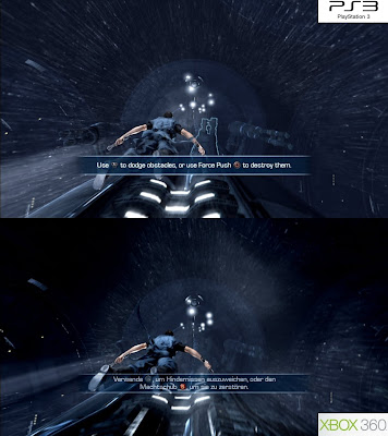
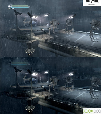
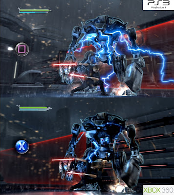
Interesting to say the least, is that SWFU II is the first game that we know of that actively uses a custom method of anti-aliasing across all platforms, whilst also taking the time to implement PS3 specific adaptations of certain visual effects (notion blur and shader effects), which result in tangible improvements to the Sony version of the game. Some of these differences are indeed subtle, and the 360 version gets its own plus points too. However SWFU II also manages to look and perform almost identically across both formats, being far closer than anyone first expected.

Just to recap, we can see that SWFU II is using the custom DLAA technique for edge smoothing on both platforms. The results are clearly apparent in the screenshots on this page. Pretty much most of the game’s jagged lines are taken care of, being smoothed over in a way that is far superior than that of traditional MSAA solutions. The look is undoubtedly similar to Santa Monica Studio’s implementation of MLAA in God Of War 3, although not quite as clean and artifact free.
Initially the use of DLAA gives the game a somewhat soft, almost sub-HD appearance. However, when zoomed in we can see that the edge steps on each pixel are the same, and it is apparent that despite the blur, SWFU II is indeed rendering in 720p on both formats.
The dark, low contrast nature of the demo means that the edge smoothing is never properly stress tested, and that nearly all offending edges are handled with relative ease. In terms of artifacting caused by how the AA works, we can still see it clearly when there is fast motion occurring on screen, and in particular when the use of motion blur is in effect. (see below)
It will be interesting to see how well the AA copes with edges in high-contrast scenes, and how much greater the extent of the artifacting will be in the final game. Although, the quality on offer here in the demo, and in the pre-release screens is still pretty impressive to say the least. The soft, but smooth look reveals a level of image quality absent in many multiplatform titles today.

Above we can see both the effect of the game’s DLAA solution in fast moving sequences, and when combined with an advanced implementation of motion blur. The use of blur clearly makes some low res artifacting stand out – a consequence of the way DLAA is implemented, but at the same time doesn’t affect IQ too much, and is mostly only subtly negative to the image.
Whilst both versions of the game feature heavy use of motion blur, it is the PS3 build which benefits from having a more refined, higher precision version of the effect. Initially it looks like the blur has been paired back slightly on the PS3. However, when looking a little closer, you can actually see that the blur preserves more detail when compared to its implementation on the 360.
The reason for this difference is that for the PS3 build the developers at Lucas Arts are actually running the effect over several of the CELL processor’s SPU’s, benefiting from the advantages of heavy parallelism and the results that it provides. By contrast the effect is being done on the GPU in the 360 game, with less overall processing being available to maintain such high levels of precision.
This isn’t the first time we’ve seen such an effect benefit from using the PS3’s SPU’s. Uncharted 2 did a similar thing with its motion blur effect, spreading the processing load over five SPU’s to better maximise overall performance, and to obtain greater precision.

Other than running the motion blur algorithm on the PS3’s CELL processor, there’s little else in the game that benefits from such specialised offloading of graphics tasks, although, without speaking to the developers directly we can’t know for sure.
There are however, other rendering differences between the two versions of the game. During cut-scenes it is apparent that the 360 build gains a slight edge, having slightly more detailed textures on parts of the characters - possibly slightly higher-res in nature, and slightly better surface shaders.
Looking at the cut-scenes for instance, Starkiller obviously features more detailed wrinkles on his face on the 360 – a result of some higher-res texturing, and better normal map blending. In particular his face has moving creases absent from the PS3 build, due to the 360 version having additional normal maps being blended together to create this effect.
This seems to be more down to a memory bandwidth issue on PS3 than anything else, as more intricate details are only visible in the cut-scenes and not during actual gameplay. The use of additional normal maps can eat into available texture memory, which appears to be the cause here.
There is an unexplained oddity however. Lightsabres appear to have a slightly fatter appearance on the PS3, compared to a skinnier look on 360. It looks like the glow effect on the PS3 is benefiting from additional shaders, and possibly texture changes. Quite why though, I’m not too sure. But the effect is noticeable during both gameplay and cut-scenes, and can be seen in the screenshot above.


For the most part, during gameplay things generally look like-for-like across both platforms, with almost equal amounts of texturing, shaders, and lighting. Occasional things are still subtly noticeable, like what looks like better specular effects on certain parts of the PS3 game, although this is more down to rendering differences than any specific advantages cross platform. Sometimes these things may look ever so slightly different, but one version certainly isn’t better than the other.
Still, texture detail in both versions itself isn’t all that great, sometimes being lower-res in nature, though this is nicely offset by plentiful use of normal mapping. Most surfaces in the game feature this effect, and it really helps to convey a sense of more detail in the overall image. It’s clear that the developers are simply balancing out memory cost issues of rendering an array of shaders and post process effects by using lower-res textures and plenty of normal maps, in creating a detailed look to the whole scene.

One thing that does stand out though, whilst looking pretty cool, is the lighting: it’s reasonably accomplished and sees plenty of scope throughout this opening level. Your force powers in particular cast light on surrounding surfaces, along with being reflected. Plus the entire environment is full of real-time light sources, which work well in this dark and stormy scene. Some of these are dynamic in nature, whilst others appear pre-baked using traditional shadow maps.
Strangely it looks like your light sabre is only reflected in the environment, although the light given off is not. In one particular area your lightsabre is reflected on both the floor and surrounding wall, but no real-time lighting is present with its use. This appears to be mainly confined to indoor areas of the game.
Complementing the blend of real-time lighting and baked shadowing, SWFU2 throws in SSAO (screen-space ambient occlusion) into the mix, bringing a greater sense of depth to the scene. Its implementation is both clean and virtually artifact free.
The look of the rain itself is also pretty impressive, engulfing the scene and creating a dark and forboding atmosphere remanicient of that from near the end of Episode III – where Anakin Skywalker makes the transformation from Dark Jedi to Darth Vader. However from a tech point of view it is relatively simple. The rain is essentially created by using a series of moving texture maps, which are arranged into basic, randomly occuring strips, with alpha coverage for transparency. It is convincing without demanding much in the way of rendering time.

So while much of the game is basically like for like, arguably reaching parity, and with the PS3 version seeing some small rendering benefits through custom use of the CELL processor’s SPU’s, it is the 360 game which commands a small lead in terms of performance.
SWFU2 basically runs at a maximum of 30fps for most of the time, dropping framerate when the engine comes under stress, and losing v-sync in order to preserve overall smoothness. Both versions only suffer from small, sometimes barely noticeable drops in framerate, although it is the 360 build which fares a little better.
The PS3 demo drops from its targeted 30fps slightly more often than the 360 one, tearing more frames as the engine attempts to keep up with rendering the next frame. Most of the time the worst bouts of tearing will often occur in quiet, enclosed indoor spaces in which there is little going on (on both formats) – moving and turning the camera is the main culprit here. Whereas on the 360 things are a little more stable, with less small drops occurring, and noticeably less tearing, regardless of situation.
In any case both versions exhibit mild screen tearing and drops in framerate, although it is the 360 build which remains the most consistent, with little to no noticeable drops in framerate throughout. That said putting things into perspective, when concentrating on playing the game these differences don’t exactly come to the forefront of the experience. Screen tearing in particular is often barely visible during the dark, low contrast outside scenes, and appears briefly for only a split second or so, and the drops in framerate can often be so small as to go unnoticed.
In the end neither version really deviates that far from maintaining a solid 30fps, with the 360 having a small, but still visible advantage in this area, and with having subtler, less noticeable levels of screen tearing – usually next to none during outside gameplay scenes. However, both versions are more than acceptable in this regard, and the slight issues present don’t take away anything from either game, meaning that both demos generally perform well.

After our initial look at the game on last Friday, it is apparent that Star Wars: The Force Unleashed II is way ahead of the first game – it looks far, far better for sure, and overall performance across both formats is a distinctly more closely matched affair. The use of DLAA on both versions, and the higher precision motion blur on the PS3 is most impressive, delivering a smooth, albeit soft look to the proceedings.
While it is indeed too early to tell how well the AA will fare in the final game, in which high contrast areas could have a detrimental affect on image quality, with larger amounts of visible artifacting, and lesser levels of successful edge smoothing, the demo nonetheless is a promising starting point.
Visually the rest of the game’s graphical make up is well balanced, mildly playing to the strengths of each format without breaking overall parity, and showcasing to developers that the PS3 needn’t be on the receiving end of another sub-par port. Although, this is just the demo. And in the confines of small spaces, and given the lack of any real scene-busting action, the finished product may different significantly, especially with regards to performance.
That said however, things are indeed looking good, and the game’s blend of DLAA, motion blur, and a range of nicely integrated shader effects sure makes for an interesting concoction. But I guess we’ll have to wait until the finished game to find out the final results. If we get suitable screenshots (I'm definitely going to have access to both games, guaranteed), then look out for a follow-up report.
Thanks go out to Dominic Eskofier and the team at Cynamite.de for the screens. The full gallery of uncompressed shots can be found here.

No comments:
Post a Comment