Monday, 12 December 2011

PC Tech Analysis: Batman: Arkham City (Digital Foundry)


PC versions of cross-platform titles are often characterised as simple ports with only the power of the hardware itself giving any advantage over their console equivalents in terms of higher frame-rates or superior resolutions. Batman: Arkham City on PC is not one of these games. It's enormously improved over the console game, even if the initially broken DirectX 11 rendering mode grabbed headlines for all the wrong reasons.

While it doesn't reach the same lofty standards set by the likes of Battlefield 3, it's clear that UK developer Rocksteady has put some effort into making the PC version a substantially better experience. While much of the artwork is shared with the Xbox 360 and PlayStation 3 builds, pretty much every corner of the game is blessed with a graphical upgrade in one way of another. Some of the differences are quite subtle, adding an extra layer of mild polish to the look of the game, while others are far more drastic, showcasing just how much more detail and clarity is possible when pairing up Rocksteady's masterpiece with a decent spec PC. It's a game that cries out to be run at resolutions well in excess of the console standard 720p.

Click through to read the full article...

And here's the Batman: Arkham City console Face-Off...

Wednesday, 30 November 2011

PSP E-1000 Review


Almost seven years after its debut in Japan, Sony has released the latest - and final - iteration of its venerable PlayStation Portable handheld. The new E-1000 is a cut-down budget model available in stores now for just £85. Is it an example of cost-cutting too far, or is it a sparkling return to form after the ill-advised PSPgo and the disappointing PSP-3000?

Click through to find out...

Monday, 28 November 2011

Saints Row: The Third (Digital Foundry - Face-Off)


Grand Theft Auto may be taking a more serious tone as the series matures but the Saints Row games are moving in the opposite direction. In-depth characterisation and an intriguing story are left behind in favour of what made the earlier GTA games so much fun to play in the first place - that is, being able to mess around in an open-world playground where realism is given the elbow in favour of all-out insanity.

Saints Row: The Third also represents a large graphical improvement over the second game in the series. The change in art direction in this latest instalment in combination with more restrained use of normal mapping and specular highlighting on some surfaces creates a more realistic look to the environments. A closer look at the texturing also reveals quite a bit of subtle detailing in many places: the small cracks that appear on the road and pavements, and the degradations manifesting on the walls of old buildings found throughout Steelport.

Click through for the full article...

Saturday, 26 November 2011

Hardware Review: Sony HMZ-T1 Personal 3D Viewer


At Digital Foundry, we enjoy 3D gaming but we remain unconvinced about the delivery mechanism - never mind the glasses, it's the nature of the screens themselves that we have issues with. The experience of going to the cinema and having your entire field of view consumed by the 3D image is a level of immersion far beyond what we see at home where the typical 3DTV can't hope to compete, presenting itself almost like a "window with depth" in the corner of the living room.

Sony's solution to this problem is one of the reasons we love the company - it'll quite happily turn ultra-niche, proof-of-concept devices into full consumer products, seemingly no matter how low the sales volumes are likely to be. The grandly titled HMZ-T1 Head Mounted Display places twin 0.7-inch 720p OLED monitors an inch in front of your eyes, the aim being - according to Sony PR - to emulate viewing a whopping 750ft IMAX screen from 20 feet away, delivering a 45-degree field-of-view without the need for a gargantuan projector...

Click through for the full article.

Sunday, 9 October 2011

Hardware Review: Acer HN274H 3D Monitor

Another one of my Digital Foundry pieces. Here we have a comprehensive look one of the few 3D monitors out there that supports the HDMI 1.4 spec, while possibly having the potential to double up as a reasonable HDTV replacement.


Acer's unforgetably titled HN274H takes the form of a substantial 27-inch desktop display with a range of HDMI 1.4 compatible inputs and it also offers full support for both NVIDIA and AMD's 3D systems, meaning stereoscopic gaming up to 1080p60 - a format PS3 and its HDMI 1.4 compliance can't match. On top of that, if your PC graphics card is powerful enough, there's nothing to stop you running games at 1080p at 120FPS in 2D either - a very cool, eerily smooth experience we recommend you try out if you can.

With this all-formats support, the HN274H is a unique all-in-one product and the price isn't bad either: the display can be picked up for around £480 - not bad for a piece of hardware that supports all major stereoscopic 3D gaming systems, and happily works with other HDMI-based devices like 3D set-top boxes and Blu-ray players.

Click through for the full article here...

Formula 1 2011 (Digital Foundry - Face-Off)


With F1 2011 Codemasters continues to refine the solid foundations laid down by last year's game. The handling mechanics have been improved, crafting an experience which is even more authentic than before, while the AI has been refreshed to ensure that seasoned veterans receive a strong challenge. The changes aren't particularly drastic but they do have a positive impact on the game: F1 2011 is easier to play for the casual fan whilst containing plenty of depth under the hood for those who go looking.

F1 2011's graphical upgrades are also delivered with the same kind of subtlety: enhanced weather effects and a small increase in track-side detail bring about a more polished look to proceedings. The raw aesthetics seen in the previous title - giving the game a clean, almost clinical appearance - are left practically unchanged from an artistic perspective, and this is once again backed with a constrained use of lighting compared to other EGO engine games such as DiRT and GRID. To all intents and purposes the lighting scheme works well even if it lacks some of the shiny bloom effects which made Moto GP 10/11 such a pleasure to look at.

Click through for the full article here...

Sunday, 18 September 2011

Dead Island (Digital Foundry - Face-Off)


First announced in 2006, it's taken some five years for Dead Island to arrive, and the end result is an ambitious, open-world first-person action title that borrows many elements from other games - most notably, Dead Rising, Borderlands and Left 4 Dead - while still trying to carve out an identity of its own.

The game is nothing like the memorable trailer; non-playable characters serve to give you quests rather than provide any emotional attachment, while most of the suspense is provided by chance encounters with respawning zombies rather than carefully directed scares. The focus throughout is one of co-operative play, with the missions and progression system tailored for this purpose. Up to four players can tackle the campaign, fending off the infected population while performing a range of standard-issue fetch quests, among other diversions. The overall feeling you get from the game is that Dead Island is an uneasy mix of game styles that's being marketed as an emotionally gripping horror romp on a lavish, sun-drenched island.

Click through for the full article here...

Wednesday, 7 September 2011

Bodycount (Digital Foundry - Face-Off)


Conceived as the spiritual successor to Criterion's much-loved Black, Bodycount fails to make an impact on the battlefield, delivering an experience that feels rushed, unpolished and to a certain extent unfinished. It's a bitter blow for those hoping to get a current-generation taste of what made the Burnout makers' FPS so much fun to play. In that respect, the baton has been passed to EA stablemates DICE, and we can only hope that Battlefield 3 is the game that delivers.

But what about the multi-platform conversion aspect? Has Codemasters' new Guildford studio successfully provided a graphically solid experience on both formats? How well does the core technology hold up to handling a fast-paced shooter, where the rendering load can be particularly unpredictable?

Click through for the full article here.

Friday, 8 July 2011

F.E.A.R 3 (Digital Foundry - Face-Off)


Since the original F.E.A.R. debuted in late 2005, the series has lost some of its impact in terms of delivering a dark and frightening experience and has evolved in new directions. Shifting into the hands of Day 1 Studios for this latest instalment, the team has made multiplayer a focus for the new sequel with the introduction of a robust co-op component, thus adding an intriguing twist to the standard F.E.A.R. gameplay.

The core technology underpinning the game has also seen a substantial change. Powered by a heavily modified Despair Engine (as utilised in Day One's last game, Fracture) this has resulted in several key enhancements and optimisations which help deliver a more polished experience across a range of platforms...

Click through for the full article here.

Moving Forward: The Future of IQGamer

Okay, so you might be wondering why updates on this site have been rather infrequent over the last few months, compared to last year's near-continuous stream of content. In that time several noteworthy releases have come and gone, and there have been more than a few interesting technical developments - and even the unveiling of a new console (The Wii U). E3 especially, showcased some impressive wares which demanded coverage. But alas, I was way to busy to do anything about it.

So what's going on then?

Well, over the last few months I've been freelancing for Digital Foundry, working on technical comparisons of the latest games (Face-Off's) which are then published over at Eurogamer. Effectively, this takes up most of my time outside of working another job in addition to doing this, so understandably there's not much time for IQGamer in between. However, rather than letting this site descend into an update-less graveyard of legacy content, I shall be posting up links to my latest stuff over at Digital Foundry, keeping you guys informed along the way.

Here's a brief list of just some of the things I've been working on over at DF since coverage began to dry up here at IQG:

F.E.A.R 3
Shadows Of The Dammed
Alice: Madness Returns
Red Faction Armageddon
DiRT 3

Additionally, you can expect the odd bit of exclusive IQG content as well, from time to time. Going forward, this site will be more of my personal outlet for technical analysis, perhaps taking a look at a few things that wouldn't make publication elsewhere. But until then, be sure to head over to Digital Foundry and enjoy the latest Face-Off's.

Wednesday, 25 May 2011

Tech Analysis: LA Noire (360 vs PS3)

Like with Quantic Dream's Heavy Rain, Rockstar Games and Team Bondi's LA Noire is more of an experience than a raw videogame. But unlike the former, it actually manages to become a far more involving affair, with a decent script and excellent performances breaking through the many mundane – or simply slower, more realistic if you will – parts of being a rising detective.

The key component in making this happen, is the game's use of a costly, but incredibly advanced way of capturing facial animation. Team Bondi uses a digital scanning solution, called MotionScan, which in effect records the actor's performance and the creates a 3D animated model for use in-game. Of course, there's more to it than that; the model has to be compressed and scaled down in terms of complexity to fit into the memory and processing requirements of both consoles. But the end result is still the same: the most believable facial animation work seen in any videogame to date.

LA Noire was originally a PS3 exclusive release, only switching platforms after Rockstar decided that a multi-platform only future was the way forward. As such, the core game engine has been optimised for the Sony platform, with some effects looking better on the system, though in some cases we actually find the 360 code to be mildly superior in this regard. On the whole Team Boni have delivered an excellent example of solid multi-platform parity, delivering an open-world experience which is accomplished on both formats, but that does favour the PS3.
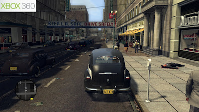
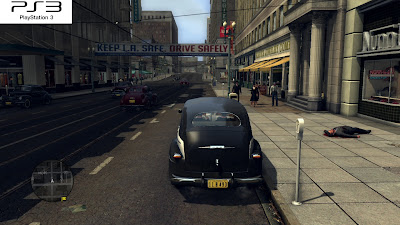

In past Rockstar titles – namely GTA4 and Red Dead Redemption – we found that memory bandwidth, along with vertex shading performance was a key concern in getting the engine up and running on both systems without compromising on the graphical look of the game. While 360 owners received native 720p with 2x multi-sampling anti-aliasing with it's framebuffer, PS3 gamers were treated with a sub-HD resolution and quincunx AA instead. The result was a blurrier overall look with more in the way of aliasing issues and lesser amounts of visible fine detail.

For LA Noire things are very different. Sure enough, on the 360 we find the very same 720p plus 2xMSAA framebuffer we've come to expect, but the difference here is that both versions now operate at 720p with the same amount of edge-smoothing. The level of sharpness and clean edges is now equivalent across the board, with crisp and clear image quality overly apparent, sans for some deliberate blurring due to some purposely placed depth of field effects.
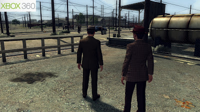
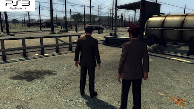

That's not to say there aren't still issues with LA Noire's presentation. Firstly, while some smaller details – such as the larger telegraph wires for example – are thankfully devoid of any shimmering or jaggies, the same cannot be said for thinner wires or small elements of scenery dotted throughout the environment.

Secondly, the game is filled with various shimmering shadows which flicker and clip out of view on many an occasion, meaning that although image quality is fairly decent, it's far from perfect overall. Given the open world nature of the game and the high levels of detail on offer, this of course was only to be expected. And there are times when this level of detail does benefit the presentation – it helps create a believable world in which to immerse the player.

LA Noire's world it littered with little touches just waiting to be noticed; detailed geometry on the fronts of buildings, the intricate nature of the power lines roving across the city of LA, various smoke and particle effects, the heat haze present on a muggy morning sun rise, and not forgetting the interactive plants and foliage. Not everything always looks polished or impressive, but these small touches are very welcome nonetheless.
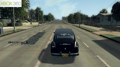
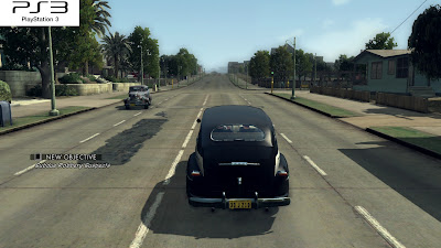
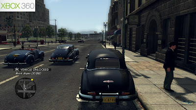
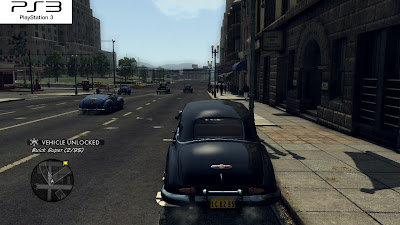


So with that said, it's a pretty accomplished game engine overall, with plenty of detail apparent in both versions. By the looks of things Team Bondi have optimised their engine around the PS3's architecture but without neglecting the 360, thus enabling both versions to look identical from an art standpoint, with only a few technical differences between them.

Occasionally we see what appears to be lower resolution, or less detailed textures on either format at different points. Although, it seems that this is a simple LOD/streaming issues with regards to mip-maps and nothing more. Sometimes we see higher quality assets loading in on the PS3, but not the 360 and vice-versa.
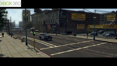
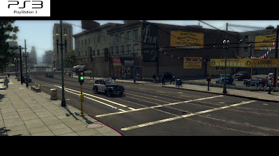
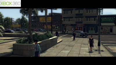
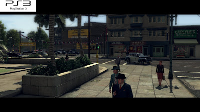


In terms of overall LOD set-up however, the PS3 version commands a small lead over the 360 game. Here we see environmental objects – such as buildings, trees etc – popping in later on the 360, along with texture detail and shadows. By contrast, on the PS3 they usually load in a little quicker, with far away details often being visible from longer distances.

Additionally, the use of a depth of field effect also helps in masking LOD issues on both. In some scenes we see DOF is stronger on the 360, hiding object pop. While in others the two versions appear identical. We also see that some foliage and trees being slightly more detailed on the PS3 too, regardless of LOD.

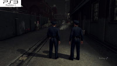

Contrary to some early reports, SSAO (screen-space ambient occlusion) is indeed present in both versions of LA Noire, however the overall impact of the effect throughout is quite different. SSAO adds noticeable depth to scenes in both versions of the game, although the effect is stronger on the PS3. On the 360 the intensity seems to have been reduced, along with the radius of the shadowing produced, thus making it stand out far less than it does on the PS3.
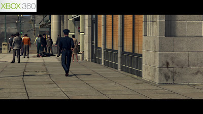
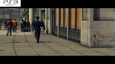

In scenes which appear quite flat and lacking depth, the SSAO in LA Noire generally favours the PS3's implementation – especially on the characters. Elsewhere, and on the environments, it can be far too obvious, appearing less realistic as a result. It's also quite buggy in both versions, prone to a few artefacts in motion. For example the shadowing that SSAO produces often appears as a floating halo around objects, creating an unnatural glow where ambient light occlusion is simulated, in addition to occasionally flickering or popping in and out of view. Both versions suffer from this, but this is more noticeable on the PS3 due to the stronger use of the effect..

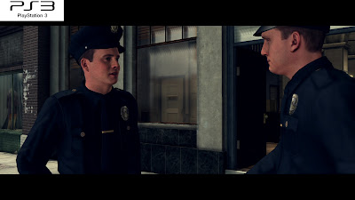

Shadowing on the other hand, looks nicer on the PS3 (although wholly subjective – some may prefer the 360's dithered look). While actual shadow resolution is the same across both formats, constantly changing depending on the distance from the player, they way in which they are filtered is not.

Essentially, we're looking at PCF filtering on both versions respectively. However, edges are plainly filtered on the PS3, thus preserving sharpness at the expense of some jittering. While on the 360 the penumbras are dithered in order to create a smoother appearance. Although, this means edges suffer from an apparent graininess, albeit without less jittering side effects. Ambient shadowing on the characters can also appear a touch grainy at times too.

From a distance the shadows in general do look a tad nicer on the 360, but up close and the opposite is true. Here, you'll find that the graininess of the 360's shadows look more than a touch more unsightly at times.
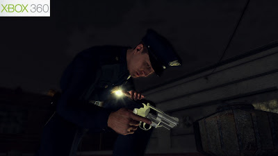
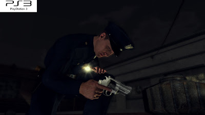
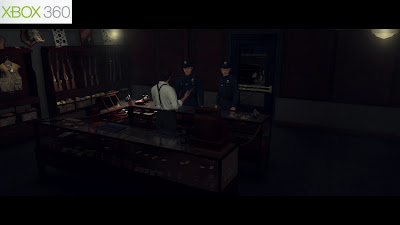
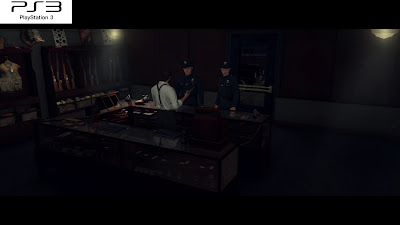


There are a few other differences between both versions of LA Noire, but nothing that you'd be able to notice whilst playing. Lighting for example isn't a complete match in all like-for-like situations.

In some night time scenes it looks like there are some light sources have been positioned a little differently on both versions, though not all the time. Whereas when indoors, the PS3 seems to occasionally benefit from stronger use of lighting. The stronger use of SSAO also creates a darkening affect on lighting in any given scene, which accounts for some - but not all - of the oddities we've been finding.
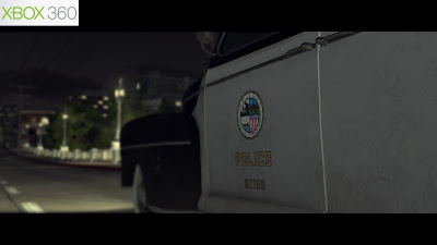
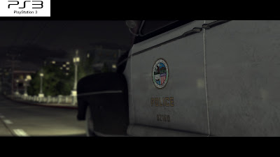

We also find that reflections on some shiny surfaces are sometimes stronger on the PS3 – the intensity of the effect appears to be lower on the 360. As a result it looked like reflections were absent in a few places, when really this wasn't the case at all. Although saying that, none of the above lighting differences are present in every scene, and as such are more technical curiosities than anything else.

On the whole, there's a real sense that LA Noire is very, very close on both platforms and that the differences aren't exactly going to be deal breaker for owners of only one system. Sure enough, some parts of the game's graphical make up can be pretty inconsistent at times. But Team Bondi have created a nice looking title, that while far from perfectly polished, has a lot of soul and character whilst also holding up rather well technically.
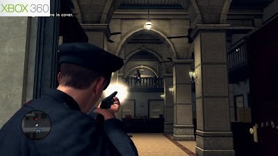
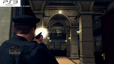

Moving on, and LA Noire targets a 30fps update, with the frame-rate being capped at that level. Compared to previous Rockstar titles, performance is much improved on both consoles, but especially so on the PS3.

There are still some similarities with GTAIV and Red Dead Redemption. Like with those titles the PS3 version is v-synced at all times, while the 360 game isn't. As such we see some subtle screen tearing appearing at the very top of the display, although this goes by virtually unnoticed. Tearing only really occurs during gunfire and hectic scenes, or in scenes whereby gunfire results in some environmental destruction, so isn't an issue at all.

Moving on to frame-rate concerns, and we find that performance is better overall on the PS3 game. Both start out running at the targeted 30fps, and both drop frame-rate heavily in stressful scenes with lots going on. However, for the most part it is the PS3 version which copes better in these situations, dropping less frames and for shorter periods. In some shoot outs – and in the on-foot chase sequence near the beginning of the game – we see smoothness take a dip, with frame-rates in the 20's on the both formats. But the PS3 version in the same scenes operates between four to six frames higher, looking and feeling more fluid as a result.

Of course in similar scenes elsewhere the opposite can also be true on occasion – the 360 game can see higher frame-rates than the PS3, though the differences aren't always as pronounced. Here it seems that environmental factors (crowds, cars, scenery etc) are the main cause behind this. Like with most open-world titles, load strongly dictates the level of performance at any given time. Cut-scenes for example, set in more detailed areas of the game can struggle to reach the desired 30fps, whilst indoors things are far more stable. The same could be said with regards to driving and on-foot sections, where the more pedestrians, cars, and scenery on screen causing frame-rates to fluctuates.

In any case, performance in LA Noire is far more solid on the whole compared to both GTAIV and Red Dead Redemption on both formats – especially on the PS3, whereby Team Bondi's optimisations for the platform result in a smoother overall experience, but without pairing back on any details. The PS3 version features slightly longer draw distances and LODs, but also manages to perform more consistently across the board. Although, as good as that sounds, both versions are equally as playable, and we do often find a pretty consistent 30fps update during play, which is the main thing really.
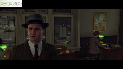
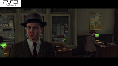

Beyond the close multi-platform conversion between PS3 and 360, the developer's biggest achievement comes with the inclusion of a stunning facial animation system, which provides perhaps the most uncannily realistic, and downright believable looking characters we've ever seen in a videogame.

Actors performances are digitally scanned in 3D, and detailed, animated models are created automatically from this. These then have to be paired back significantly to work within the technical budgetary constraints of the home consoles; geometry complexity is hugely reduced, and in it's place large amounts of multi-layered normal maps are used, in combination with various textures, which are then blended to deliver the final in-game model.
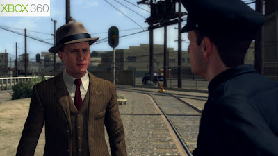
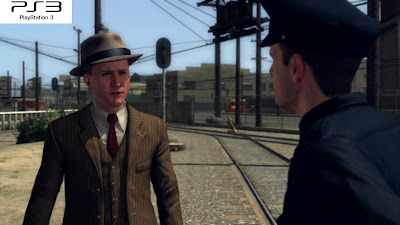

As you can see above, the end results are stunning to behold - intricate muscular movements are carefully handled with ease, subtle changes in wrinkle and skin distortion are present as facial expressions change, eyes and lips move and are perfectly in sync with dialogue. Essentially, the actors original performance is recreated extremely accurately in 3D, and it works very well in bringing about a real sense of immersion to the proceedings.

However, the downside of this technique is that facial movements cannot be tweaked by hand (there's no animation rig to modify), and additional skin texture details and shaders are troublesome to add without breaking the seamless look created by the original scan. As a result there are no advanced shaders present at all – facial models simply consist of various normal maps, textures, a colour map, and a phong specular map – which leaves them looking a touch flat compared to hand crafted creations.

When compared to the limitations of traditional motion capture, the use of digitally, 3D scanned performances outweighs any negatives that go along with the technique. The lack of any additional shaders, or even environmental reflections on the faces hardly takes away from the overall look of the game. Instead, the slightly plain, washed out appearance of the characters fit in perfectly with the hazy 1940's art style the developers are going for. In effect by far the most important element here is the believable performance being captured and displayed correctly, it is central to the core experience.

On the other hand, the rest of the character animation has been motion captured the traditional way, before being touched up by artists for use in the game. As such, we see some odd mismatches and errors with the way in which the facial performance and bodily animations actually blend together. For the most part the two are pretty seamless, but sometimes it can be a little noticeable that there are two different systems at work, especially when the end result isn't quite as perfect across the entire range of animations on the characters.

This is of course very minor in the grand scheme of things, and has no impact on your enjoyment of the game itself, nor does it spoil any of the superb acting and capturing work done throughout. Like with the rest of LA, Noire Team Bondi have done a great job.
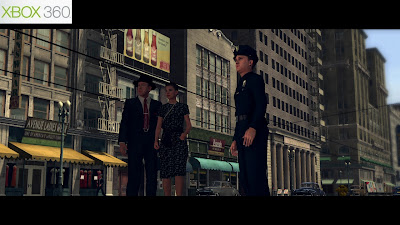
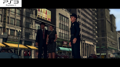

Looking back at past Rockstar releases, and it's pretty obvious that the 360 has been the main focus throughout development, with both Red Dead and GTAIV heavily build around specifics which favour the 360 as a platform - long draw distances, plenty of intricately detailed scenery, and loads of alpha-based effects, all of which are dependant on having huge amounts of memory bandwidth available, along with a hefty amount of vertex shading capability.

Using a custom engine set-up, Team Bondi have delivered a title which does the opposite. It has been carefully optimised around the PS3's strengths and weaknesses, thus not only resulting in far better overall performance, but also a superb multi-platform conversion that is incredibly close on both formats while favouring Sony's system.

There really isn't much in it all. There's a real sense that SSAO is perhaps more balanced and realistic on the 360, but other areas of the game – LOD, shadowing, performance under load - slide tangibly towards the PS3, albeit subtly in most cases. As such, both versions of LA Noire come highly recommended, but for owners of both consoles the PS3 version provides a touch more polished experience overall, and thus is the one to get given the choice.

In the end, LA Noire's long term success will largely depend on how players react to its unique blend of streamlined sandbox-style gameplay, and more tightly controlled/scripted story progression that is paramount to the experience as a whole, just as much as the lavish trimmings of 1940's LA and the key graphical talking points – the actual performances themselves, and their superb recreation in computer rendered form.

Either way you can't deny that Rockstar and Team Bondi have offered up a compelling ride that blends the core elements of film with the interactive parts of a traditional videogame, and does so without any overly self-aware, arty undertones.

Saturday, 7 May 2011

Tech Analysis: Gears Of War 3: Multiplayer Beta

Gears Of War 2's multiplayer component, while highly entertaining and incredibly well put together featured some obvious latency issues compared to other high profile online titles. Some matches would go by without issue, while in others you would struggle to maintain aiming accuracy as controller lag impacted on the experience. Since then Epic has listened to these concerns, and for Gears 3 have provided the community with dedicated servers helping to reduce latency to negligible levels.

The gameplay has also been completely overhauled too, now catering for different play-styles via the use of what appears to be a balanced weapon selection (at this stage at least). Close or long ranged weapons part a huge part - often in providing a counterbalance - with players being able to switch between either option at any time. Here, you'll find that someone with a Retro Lancer to be just as deadly as someone with a Sawed Off. It just depends entirely on their own ability and approach in any given situation. The game modes too, have also been reworked and made to be a little more accessible to those unfamiliar with GOW's own brand of multiplayer action.

Of course gameplay and graphics often go hand in hand. The Unreal Engine 3 and Epic's Gears Of War series have been at the very heat of pushing high-end visuals on Microsoft's Xbox 360 console. Not only has the engine been behind some of the most graphically superb releases on the platform, it is also constantly undergoing a range of subtle tweaks and major enhancements.

Gears Of War 2 saw the engine being upgraded to handled bigger environments with longer draw distances - texture and object steaming was refined to prevent noticeable object pop in the campaign mode. Epic also expanded on the lighting component present in the first game and SSAO brought an increased depth to the title's already decent use of shadowing.

Even in it's current stages as a mutiplayer beta, Gears 3 demonstrates similar leaps in visual quality, with upgrades in a variety of different areas. Perhaps the framebuffer is the only thing exempt from this, but in any case image quality was never really an issue to begin with.


For the record, you're looking at a native 720p rendering resolution forgoing the use of anti-aliasing. In past titles, AA was performed pretty early on in the rendering cycle, meaning that it had pratically no impact on the final scene being rendered. Sampling was only done on static objects and lighting, thus additional post processing elements - such as depth of field, bloom etc - and dynamic lighting weren''t covered by the limited use of MSAA at all. So as a result Epic has disabled the use of edge-smoothing completely, perhaps in order to maintain more consistant performance while the game benefits from a range of graphical improvements.

The lack of AA means that we find a variable level of jaggies and shimmering edges. Stages featuring copious amounts of sub-pixel elements suffer the most, whilst areas with mainly large geometric structures fare much better. This is of course in line with most UE3 titles, and in the case of Gears 3 can be considered a worthy trade-off considering number of HQ components in the game's rendering tech. It's also worth pointing out that aliasing is less noticeable overall than it was in Gears 2.


Looking back at past titles, it was the single player campaign that trumped any of the multiplayer modes graphically. And it's very likely that we'll see a similar kind of visual leap again with the campaign in Gears 3. The current beta exceeds past instalments in most areas, which leads us to believe that Epic have even more visual mastery packed away under the hood.

Compared to Gears 2, the various upgrades come in thick and fast. At the base level we see more detailed character and environment modelling, both in texture work and in geometric complexity. Little cracks and other small details that feature on the surrounding environmental stonework are more distinct than before. In particular, the depth of the parallax mapped floors have even more of an impact, even if they do look just a little too OTT as a result.

There a few obvious low resolution, and repeated textures dotted about, along with some rather flat looking surfaces. But these do very little to spoil the over look of the game considering how detailed the environments actually are. The leap in quality is huge compared to Gears 2's multiplayer mode, and even exceeds the single player campaign portion of it with ease.

Additionally, there is little in the way of harsh LOD transitions at the beginning of each match. In Gears 2 there was a tendancy for the engine to still be streaming in final quality assests for at least a minute or two after matches had begun. But thankfully, we see that this issue is pretty much non-existent in Gears 3.


The biggest change however, comes in the form of the game's lighting system. Like with the likes of Crysis 2 and Battlefield 3, Gears 3 features its own implementation of global illumination via Epic's Lightmass solution, which provides a cheap alternative to the few real-time GI systems doing the rounds right now (Geomeric's Enlighten for example). Ambient lighting, along with the main light bounces are rendered off-line before being pre-baked onto the environments, thus providing a similarly realistic look but without the raw processing costs usually associated with doing this.

Dynamic lightmaps ensure that the lighting data actually affects moving objects in real-time, rather than having no impact whatsoever. Given the fact that the sun's position never changes, by far the most important factor is believably lighting up the various dynamic objects present in any given scene - lighting that never moves can be convincingly baked, so long as it still affects environmental objects in real-time. And the implementation found in Gears 3 manages to do a excellent job in this regard.


We also see that sunlight now casts dynamic shadows off select objects, further enhanced when combined with the game's pre-baked shadowing components. Other elements that give off light - such as gunfire and explosions, burning parts of the scenery etc - react with both the environment and the objects contained within. Although they did this in Gears 2 as well, the effect is more refined in this sequel.

Even if the baseline environmental lighting is static, the combination of dynamic lightmaps and additional light sources help breathe life into the way in which scenes are lit and shaded. The difference is dramatic to say the least; there's a whole lot more depth added to the scene over the previous games.


Outside of Lightmass, and there are a few other nice touches that Epic have made with the lighting engine in Gears 3. A probable FP10 buffer, and a controlled use of bloom substitutes true HDR lighting without over-emphasising the top end of the spectrum, while the game now features stronger use of simulated godrays (they are simply a post process-based effect). As you can see above, in some stages sunshafts dynamically react with the environment, while in other areas they are more static in nature.

Additionally, the way that SSAO is handled has also been tweaked slightly. SSAO is done as a post process in both GOW 2&3, with it being reprojected and accumulated over multiple frames. The end result is that it could appear more noticeable in still scenes in GOW 2 than when moving. In Gears 3 however, the temporal side effects have been reduced, and there is now greater consistency in deploying the effect throughout the scene.


In terms of alpha-based effects, smoke in particular features convincing depth being heavily multi-layered, while also appearing volumetric. Particles, fire and smoke look much fuller than they did in Gears 2. The way in which they interact with the surrounding geometry is almost bug free - you can see clearly in the shots below how the smoke collides with the nearby walls, rather than simply clipping through them. Alpha buffers are also rendered in full resolution, taking full advantage of the high bandwidth eDRAM present in the 360's Xenos GPU.


Moving on, and when looking at the online element in any game the importance of having a consistent frame-rate is paramount. It's not so much about ensuring you have a visually smooth experience (though that certainly helps), but instead one with as little controller latency as possible. Essentilaly the two do go hand in hand, but with previous Gears games this was limited by the lack of dedicated servers, thus introducing additional latency outside of the game slowing down.

Although it's likely that we'll see greater variation in performance during the single player campaign, due to the engine pushing much larger environments and more stenous action, in the beta Epic has done well to keep things under control in order to deliver as little input lag as possible. And this is something that has further been addressed by the use of dedicated servers. In the beta not everyone will be on dedicated servers at all times, although performance on these alternate hosts is improved compared to the ones powering GOW2's online component.


Performance-wise, Gears Of War 3 operates at 30fps and employs v-sync in order to maintain image consistency. However, we also see that v-sync is disengaged when the frame-rate drops below 30fps in order to maintain a steady level of performance in scenes which stress the engine. To that effect there is some barely visible tearing that manifests by crawling up and down the screen, which can frequently occur during gunfire, but its impact goes reletively un-noticed for the most part.

While the game manages a stable frame-rate for extended periods of time, there are a few drops in smoothness to speak of when the engine is put under stress; mainly in scenes whereby multiple players are present and lots of gunfire and explosions create additional load. But outside of these scenarios there is little in the way of slowdown to impact on the experience, which also ensures a crisp controller responce is maintained as often as possible.

Also, like with many games this generation (Alan Wake and Vanquish both spring to mind) GOW3's smooth refresh rate is further enhanced by the inclusion of motion blur. Going back to the first game and the Gears series has always used a vector-based motion blur implementation, but this is now handled on a per-object basis. As you can see below, the effect varies in strength - ranging from rather subtle to in your face as it were, producing a nice screen distortion effect in the process - but also serves to seamlessly blend individual frames together to create a more fluid screen refresh.


Overall, even in its unfinished state as a multiplayer beta, Gears Of War 3 is clearly shaping up to be another noteworthy graphical showcase for the 360. Sure enough, the real test of course, will come in the form of the single-player campaign, in which larger environments and distinct set-pieces are likely to push the engine a lot harder than anything we've witnessed thus far. But for now things are looking rather promising, with Epic successfully using its underlying tech to craft a suitably lavish visual experience. Going back to Gears 2 and then to the beta, and there's a real tangible difference to be felt in the overall quality of what we are seeing.

Coming away from the look of the game and there is also a sense that Epic are trying to further hone in Gears Of War 3 as a distinct online experience, separating it from past titles and from other online shooters in order to keep things fresh. Not only is the gameplay faster, but the close/ranged set-up for example, seems balanced enough for players to compete on an even keel regardless of their play-style, while the skillfully deployed weapon placements ensure that mastery of the maps themselves, and the calculated strategy that goes along with them isn't lost to those more inclined to simply run and gun their way to the top.