The IQGamer Crysis 2 demo analysis is on its way. But in the meantime I suggest you take a look at the video below. It’s a rather impressive demonstration of global illumination using the CryEngine 3 – using multiple light bounces rather than just one!
All the shadows and lighting, along with the actual rendering is being performed in real time. Although there is no in-direct shadowing taking place, there are other neat touches, such as diffuse shadows and HDR. You can also get a brief glance of CryEngine 3’s day/night lighting cycle.
Similar things can be done using pre-backed alternatives, which are obviously static – not great for scenes with noticeable changes in the lighting cycle - but cost far less, especially if baked directly onto textures themselves. Unreal Engine 3’s Lightmass solution springs to mind. It’s good alternative for games which feature a fixed sun position, relying on many local, dynamic lights to create a similar effect.
Crysis 2 uses a single bounce form of real-time global illumination: it's clearly visible in the Xbox 360 demo. But more on that shortly.
Monday, 31 January 2011
Sunday, 30 January 2011
Tech Analysis: Little Big Planet 2 (PS3)
Little Big Planet was a game that really got those creative juices flowing. On the surface it was a simple, physics-based platformer. But under the hood it became apparent that it was so much more. The tools given to create and design your own levels could be used in such a way that went well beyond the platform confines Media Molecule had envisioned for the title. And for LBP2, things have been taken a step further, with a complete set of tools designed to allow for just that: building your own creation that bypasses platforming altogether.
Of course, outside of the successes such unique custom content has found - and indeed there are millions of user-created downloads to be hand - the engine powering the game was always there to facilitate a natural realism, bound by real-world properties, and developed to augment the title’s physics-based approach. To that end, the original LBP featured both a realistic lighting and shadowing system, even emulating light passing through dense objects, along with a range of impressive, though perhaps restrained, visual effects.
For LBP2, Media Molecule have gone back and re-written most of their original engine, expanding on various graphical concepts simply toyed with in the first game, to delivering a fully-realised implementation here. This sequel incorporates comprehensive changes to nearly every part of the engine: lighting and shadowing for one, anti-aliasing and core rendering make-up to name but two more. All these tweaks and upgrades have not only made for an impressively organic visual look, but are also far more accurate in nature.

Take the baseline framebuffer for a second. LBP2 renders in 720p, like the original, but ditches the standard 2xMSAA (multi-sampling anti-aliasing) for Sony’s custom MLAA (morphological anti-aliasing) solution instead. The end result is a clean and sharp look, with incredibly smooth edges, free from most obvious edge shimmering and other such artefacts. Here, we see up to 16x MSAA on some surfaces in-line with the level of edge-smoothing this technique regularly provides, along with 4x and 8x on other smaller pieces of geometry.
The only aliasing that we can frequently notice on some areas, appears to be from various sub-pixel edges. There are also examples of what we like to call ‘soft’ edge shimmering on a few AA’d edges at certain angles. Although, most have competently been dealt with. Indeed, a lot of the aliasing present on screen is very similar to the kind seen in supersampled, in-game trailers; that is to say, its impact is very small in diminishing the high level of image quality we can see in Media Molecule’s sequel.

A change in the method of AA used is but one upgrade LBP2 has seen. The developers have also completely re-written their engine to work as a standard forward renderer, thus making certain visual effects much easier to do. Previously, parts of LBP1’s core rendering make-up was differed, meaning that some elements of the engine were sufficiently bottlenecked – use of alpha effects for example, had to be done via the less desirable A2C method, thus inducing a screen-door effect on many transparencies, like smoke and fire.
In LBP2, this isn’t at all the case. Here we see that all transparent effects are rendered using the more standard alpha coverage, with alpha blend method, free from the dithered, pixelated look they had before. Not only are these effects now easier to do, they are also better blended too. Particle effects, other elements, such as smoke and fire, are still rendered in a lower resolution. However, they are nicely smoothed over to avoid any pixelation, or other similar side-effects, much like the use of alpha in both Killzone 1&2.
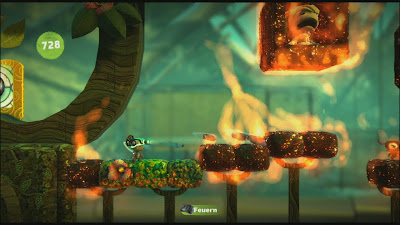
Far more interesting, is the way that these effects now interact with the game’s light sources, in changing the intensity of the lighting and in turn, the way shadows are cast as a result. This is down to the game’s brand new lighting engine, which accurately simulates global illumination in how the entire game is lit and shaded. LBP2 uses something called volumetric lighting, whereby individual lights affects how other objects all around them are lit, with elements such as reflections and specular highlights changing dynamically.
A single light source in LBP2 now has the ability to change the lighting composition of the entire scene. Shadows are cast via every light source – and indeed every object - and move accordingly with changes to the lighting present. This is best observed as Sackboy traverses his environment, moving in and out of contrasting areas of brightness, and through more subtle changes in environmental shadowing, along with when there is lots of objects being randomly thrown around the screen, each with their own shadow.
We can also see evidence of ambient occlusion. Previously, we thought that LBP2 was simply using SSAO to deliver AO on various surfaces, characters etc. However, that isn’t the case. LBP2 actually features real-time ambient occlusion as a consequence of its volumetric lighting engine. For most games, this would perhaps be too resource intensive to do. Although, the simpler nature of LBP’s world, and being far more tightly controlled in terms of the rendering workload on screen, allows this to be possible.

In addition, we can also see that LBP2 also makes use of volumetric alpha effects, whereby flat, 2D spites can contain three-dimensional volume, having an incredibly obvious, depth look to then, whilst controlling the light output through the effect. A series of values contain that volume inside say, a cloud of smoke, giving the object depth, but more importantly accurately limiting/changing the amount of light that passes though it.
It’s a nice effect, one that appears to be only subtly used in what I’ve played of the game so far. On some downloadable, user-created stages however, ones with plenty of explosions, smoke and particles, the result is more obvious. Seeing the amount of light reduce underneath, or very mildly to the side of a cloud of smoke or mist, but not simply a pre-calculated dimming, but what looks looks like physically less light output is a key demonstrator of the effect in action.
In combination with the game’s use of light and shadow, this helps to emphasise the realistic look that MM have sort to create for the fantastical world of LBP2. Added depth is one consequence, but mostly, having all objects accurately look like they exist tangibly in the world is another.

Going back to LBP2’s use of shadowing, we’ve already mentioned that the game engine casts shadows for every object on screen, wherein a clear example of shadowing would realistically take place. Although, what we’ve failed to mention is that the game also uses soft shadows for all objects too.
These shadows, like with the game’s alpha affects, are rendered in a lower resolution to the framebuffer. However, this is negated somewhat – though not totally – by the use of high quality shadow filtering, which helps blend in the lower res soft shadows onto their environment and other objects.
There are still some examples of flickering shadows, and jittering edges where the use of filtering isn’t enough to hide their low-res nature. But, then again, outside of a in-engine, pre-rendred cut-scene, or in the obscenely high-end PC space, shadowing errors are simply part and parcel of current real-time rendering with performance-sapping, hardware limitations.

Another impressive part of LBP2’s technical make-up to look at, is the game’s use of real-world physics in how objects in this artificial world react. Swing on a rope, and you can almost feel the pull of gravity; push over a stack of lightweight boxes, and watch the ease of how they tumble, knocking others over, pushing and falling in accordance to their physical properties. Heavy objects also have weight behind them: Sackboy himself, bounces and flows through the air like stuffed and stitched toy – all of which adds a sense of real tangibility to the world these items and characters inhabit.
Also, these elements allow you to have an understanding of how many of the objects, challenges and puzzles work, before even attempting them. Once you know which objects have which properties – and some are obvious as soon as you see them, then all you have to do is master their usage, but using your own worldly understanding to do so. And of course, the technique required with the Dual Shock controller.
Occasionally, objects, characters etc, react with a ragdoll-like effect, which partially breaks the illusion that Media Molecule have created. Although, with so much going on technically, you can’t expect perfect representation of physics. Even in high-end CGI productions, replicating certain properties flawlessly, even just accurately, is a lot of the time, beyond what is feasible, let alone possible in a real-time rendered environment. In which case, the developers have done an absolutely stellar job with LBP2 as a whole, carefully balancing out what works and what doesn’t.
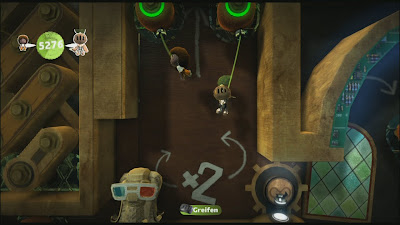
Moving on, and in addition the numerous advancements in lighting and shadowing, we can also see the inclusion of both a depth of field effect present in the background on some stages, and motion blur on fast moving objects.
Interestingly, the implementation of motion blur seems to be relatively simple – it affects the whole screen, rather than being done per-object, like in Killzone 3, and the original LBP. The reason for the downgrade – even though the effect still looks very good – seems to stem from having such an accurate, and performance-heavy lighting system as part of the core rendering engine. As such, there is less rendering time per-frame left for object-based motion blur. Instead, blur appears to be done as a simpler post-process effect.
On the off-set, all these advanced visual effects; the accurate, real-time nature of the game’s shadowing and lighting, motion blur, and depth of field, you would assume to have quite an impact on performance – that a heavy performance hit wouldn’t be unusual. Although, whilst sampling a few levels from the game’s campaign and some additional user-created stages, that doesn’t seem to be the case
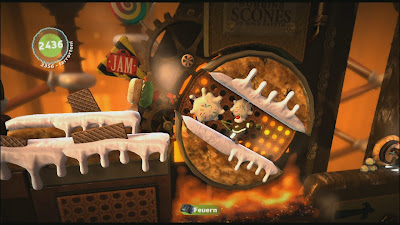
Little Big Planet largely runs smoothly, simple dropping a few frames when the load increases beyond the engine’s capacity to resolve it, with v-sync being completely absent and some noticeable screen tearing sometimes being apparent. Media Molecule targets a solid 30fps update, and rather than allow for the framerate to drop heavily whilst encountering a heavier load, prefers to go over budget with rendering the next frame instead. Thus, we can see that a 30fps update is maintained in situations whereby if the game was v-synced, would drop down to 20fps for a brief moment or so, maybe longer, with some screen tearing being apparent as a result.
While the engine does successfully attempt to hold a steady 30fps for the most part, we can see that it does occasionally slow down, sometimes quite obviously down to around what looks like 20fps or so for a brief second or so, sometimes far less so. However, for much of the time what we are seeing as framerate drops, are actually manifestations of very mild tearing, in which the screen wobbles briefly for a split second or so, instead of tearing noticeably.
The engine frequently misses its window for rendering the next frame however, and as a result, we see a large amount of tearing on fairly frequent occasions, where the effect is clearly visible across the middle of the screen when it happens, sometimes mostly to the left, or all the way across, depending on how much the engine stalls.
At it’s worst, there can be many torn frames manifesting one after the other: the end product is what looks like a juddering in combination with a tearing of the screen. When this occurs it looks like the game is both dropping frames and tearing, but in reality is still holding a mostly solid 30fps.
But despite this, the overall engine’s performance is largely solid - sans perhaps the screen tearing, but otherwise, given the strain due to the complexity of the game’s core graphical, and indeed physics-based make-up, you can’t really complain too much. All that additional oomph goes a long way to further immersing you in Sackboy’s world, so I think that the performance trade-offs are worth it.

At first it might seem surprising to see such a technically accomplished rendering engine, for such a quaint, although very impressive platformer. But, when looking at how the core graphical make-up really adds a sense of immersion, a sense of increased believability to the world contained within, then it becomes completely beneficial.
Many of the elements that make LBP as magical as it is to play – not to mention to watch up close or from a distance – is down to how most elements in this virtual world act according to what we know about reality, the physical world around us. Things such as objects casting shadows which change as a result of the direction of a light source, or the smooth edges found throughout (MLAA) that hides the per-pixel, blocky nature of digital rendering. All definitively add something to the table, however small they initially appear to be.
In which case, Media Molecule has done a stellar job at creating a game that is as technically advanced as it is visually accurate. I doubt anyone will actually play LBP for its superb graphical make-up, but instead be fully engrossed in its fresh and addictively unique gameplay. The visuals, as it were, are simply there to facilitate the atmosphere and add an extra sense of realism to a cute, but cool, fantasy world. In that respect, LBP2 can be really nice to look at, but even better to play. And that’s exactly the point, really.
Thanks to Cynamite.de (gamesaktuell) for the screens and AlStrong for the pixel counting. Various galleries can be found here. Plus, a special no thanks to my phone cam, which failed to pick-up a very clear example of volumetric fog in a really dark area of the game.
Up Next: Crysis 2 analysis due for late tomorrow evening.
Of course, outside of the successes such unique custom content has found - and indeed there are millions of user-created downloads to be hand - the engine powering the game was always there to facilitate a natural realism, bound by real-world properties, and developed to augment the title’s physics-based approach. To that end, the original LBP featured both a realistic lighting and shadowing system, even emulating light passing through dense objects, along with a range of impressive, though perhaps restrained, visual effects.
For LBP2, Media Molecule have gone back and re-written most of their original engine, expanding on various graphical concepts simply toyed with in the first game, to delivering a fully-realised implementation here. This sequel incorporates comprehensive changes to nearly every part of the engine: lighting and shadowing for one, anti-aliasing and core rendering make-up to name but two more. All these tweaks and upgrades have not only made for an impressively organic visual look, but are also far more accurate in nature.

Take the baseline framebuffer for a second. LBP2 renders in 720p, like the original, but ditches the standard 2xMSAA (multi-sampling anti-aliasing) for Sony’s custom MLAA (morphological anti-aliasing) solution instead. The end result is a clean and sharp look, with incredibly smooth edges, free from most obvious edge shimmering and other such artefacts. Here, we see up to 16x MSAA on some surfaces in-line with the level of edge-smoothing this technique regularly provides, along with 4x and 8x on other smaller pieces of geometry.
The only aliasing that we can frequently notice on some areas, appears to be from various sub-pixel edges. There are also examples of what we like to call ‘soft’ edge shimmering on a few AA’d edges at certain angles. Although, most have competently been dealt with. Indeed, a lot of the aliasing present on screen is very similar to the kind seen in supersampled, in-game trailers; that is to say, its impact is very small in diminishing the high level of image quality we can see in Media Molecule’s sequel.

A change in the method of AA used is but one upgrade LBP2 has seen. The developers have also completely re-written their engine to work as a standard forward renderer, thus making certain visual effects much easier to do. Previously, parts of LBP1’s core rendering make-up was differed, meaning that some elements of the engine were sufficiently bottlenecked – use of alpha effects for example, had to be done via the less desirable A2C method, thus inducing a screen-door effect on many transparencies, like smoke and fire.
In LBP2, this isn’t at all the case. Here we see that all transparent effects are rendered using the more standard alpha coverage, with alpha blend method, free from the dithered, pixelated look they had before. Not only are these effects now easier to do, they are also better blended too. Particle effects, other elements, such as smoke and fire, are still rendered in a lower resolution. However, they are nicely smoothed over to avoid any pixelation, or other similar side-effects, much like the use of alpha in both Killzone 1&2.

Far more interesting, is the way that these effects now interact with the game’s light sources, in changing the intensity of the lighting and in turn, the way shadows are cast as a result. This is down to the game’s brand new lighting engine, which accurately simulates global illumination in how the entire game is lit and shaded. LBP2 uses something called volumetric lighting, whereby individual lights affects how other objects all around them are lit, with elements such as reflections and specular highlights changing dynamically.
A single light source in LBP2 now has the ability to change the lighting composition of the entire scene. Shadows are cast via every light source – and indeed every object - and move accordingly with changes to the lighting present. This is best observed as Sackboy traverses his environment, moving in and out of contrasting areas of brightness, and through more subtle changes in environmental shadowing, along with when there is lots of objects being randomly thrown around the screen, each with their own shadow.
We can also see evidence of ambient occlusion. Previously, we thought that LBP2 was simply using SSAO to deliver AO on various surfaces, characters etc. However, that isn’t the case. LBP2 actually features real-time ambient occlusion as a consequence of its volumetric lighting engine. For most games, this would perhaps be too resource intensive to do. Although, the simpler nature of LBP’s world, and being far more tightly controlled in terms of the rendering workload on screen, allows this to be possible.

In addition, we can also see that LBP2 also makes use of volumetric alpha effects, whereby flat, 2D spites can contain three-dimensional volume, having an incredibly obvious, depth look to then, whilst controlling the light output through the effect. A series of values contain that volume inside say, a cloud of smoke, giving the object depth, but more importantly accurately limiting/changing the amount of light that passes though it.
It’s a nice effect, one that appears to be only subtly used in what I’ve played of the game so far. On some downloadable, user-created stages however, ones with plenty of explosions, smoke and particles, the result is more obvious. Seeing the amount of light reduce underneath, or very mildly to the side of a cloud of smoke or mist, but not simply a pre-calculated dimming, but what looks looks like physically less light output is a key demonstrator of the effect in action.
In combination with the game’s use of light and shadow, this helps to emphasise the realistic look that MM have sort to create for the fantastical world of LBP2. Added depth is one consequence, but mostly, having all objects accurately look like they exist tangibly in the world is another.

Going back to LBP2’s use of shadowing, we’ve already mentioned that the game engine casts shadows for every object on screen, wherein a clear example of shadowing would realistically take place. Although, what we’ve failed to mention is that the game also uses soft shadows for all objects too.
These shadows, like with the game’s alpha affects, are rendered in a lower resolution to the framebuffer. However, this is negated somewhat – though not totally – by the use of high quality shadow filtering, which helps blend in the lower res soft shadows onto their environment and other objects.
There are still some examples of flickering shadows, and jittering edges where the use of filtering isn’t enough to hide their low-res nature. But, then again, outside of a in-engine, pre-rendred cut-scene, or in the obscenely high-end PC space, shadowing errors are simply part and parcel of current real-time rendering with performance-sapping, hardware limitations.

Another impressive part of LBP2’s technical make-up to look at, is the game’s use of real-world physics in how objects in this artificial world react. Swing on a rope, and you can almost feel the pull of gravity; push over a stack of lightweight boxes, and watch the ease of how they tumble, knocking others over, pushing and falling in accordance to their physical properties. Heavy objects also have weight behind them: Sackboy himself, bounces and flows through the air like stuffed and stitched toy – all of which adds a sense of real tangibility to the world these items and characters inhabit.
Also, these elements allow you to have an understanding of how many of the objects, challenges and puzzles work, before even attempting them. Once you know which objects have which properties – and some are obvious as soon as you see them, then all you have to do is master their usage, but using your own worldly understanding to do so. And of course, the technique required with the Dual Shock controller.
Occasionally, objects, characters etc, react with a ragdoll-like effect, which partially breaks the illusion that Media Molecule have created. Although, with so much going on technically, you can’t expect perfect representation of physics. Even in high-end CGI productions, replicating certain properties flawlessly, even just accurately, is a lot of the time, beyond what is feasible, let alone possible in a real-time rendered environment. In which case, the developers have done an absolutely stellar job with LBP2 as a whole, carefully balancing out what works and what doesn’t.

Moving on, and in addition the numerous advancements in lighting and shadowing, we can also see the inclusion of both a depth of field effect present in the background on some stages, and motion blur on fast moving objects.
Interestingly, the implementation of motion blur seems to be relatively simple – it affects the whole screen, rather than being done per-object, like in Killzone 3, and the original LBP. The reason for the downgrade – even though the effect still looks very good – seems to stem from having such an accurate, and performance-heavy lighting system as part of the core rendering engine. As such, there is less rendering time per-frame left for object-based motion blur. Instead, blur appears to be done as a simpler post-process effect.
On the off-set, all these advanced visual effects; the accurate, real-time nature of the game’s shadowing and lighting, motion blur, and depth of field, you would assume to have quite an impact on performance – that a heavy performance hit wouldn’t be unusual. Although, whilst sampling a few levels from the game’s campaign and some additional user-created stages, that doesn’t seem to be the case

Little Big Planet largely runs smoothly, simple dropping a few frames when the load increases beyond the engine’s capacity to resolve it, with v-sync being completely absent and some noticeable screen tearing sometimes being apparent. Media Molecule targets a solid 30fps update, and rather than allow for the framerate to drop heavily whilst encountering a heavier load, prefers to go over budget with rendering the next frame instead. Thus, we can see that a 30fps update is maintained in situations whereby if the game was v-synced, would drop down to 20fps for a brief moment or so, maybe longer, with some screen tearing being apparent as a result.
While the engine does successfully attempt to hold a steady 30fps for the most part, we can see that it does occasionally slow down, sometimes quite obviously down to around what looks like 20fps or so for a brief second or so, sometimes far less so. However, for much of the time what we are seeing as framerate drops, are actually manifestations of very mild tearing, in which the screen wobbles briefly for a split second or so, instead of tearing noticeably.
The engine frequently misses its window for rendering the next frame however, and as a result, we see a large amount of tearing on fairly frequent occasions, where the effect is clearly visible across the middle of the screen when it happens, sometimes mostly to the left, or all the way across, depending on how much the engine stalls.
At it’s worst, there can be many torn frames manifesting one after the other: the end product is what looks like a juddering in combination with a tearing of the screen. When this occurs it looks like the game is both dropping frames and tearing, but in reality is still holding a mostly solid 30fps.
But despite this, the overall engine’s performance is largely solid - sans perhaps the screen tearing, but otherwise, given the strain due to the complexity of the game’s core graphical, and indeed physics-based make-up, you can’t really complain too much. All that additional oomph goes a long way to further immersing you in Sackboy’s world, so I think that the performance trade-offs are worth it.

At first it might seem surprising to see such a technically accomplished rendering engine, for such a quaint, although very impressive platformer. But, when looking at how the core graphical make-up really adds a sense of immersion, a sense of increased believability to the world contained within, then it becomes completely beneficial.
Many of the elements that make LBP as magical as it is to play – not to mention to watch up close or from a distance – is down to how most elements in this virtual world act according to what we know about reality, the physical world around us. Things such as objects casting shadows which change as a result of the direction of a light source, or the smooth edges found throughout (MLAA) that hides the per-pixel, blocky nature of digital rendering. All definitively add something to the table, however small they initially appear to be.
In which case, Media Molecule has done a stellar job at creating a game that is as technically advanced as it is visually accurate. I doubt anyone will actually play LBP for its superb graphical make-up, but instead be fully engrossed in its fresh and addictively unique gameplay. The visuals, as it were, are simply there to facilitate the atmosphere and add an extra sense of realism to a cute, but cool, fantasy world. In that respect, LBP2 can be really nice to look at, but even better to play. And that’s exactly the point, really.
Thanks to Cynamite.de (gamesaktuell) for the screens and AlStrong for the pixel counting. Various galleries can be found here. Plus, a special no thanks to my phone cam, which failed to pick-up a very clear example of volumetric fog in a really dark area of the game.
Up Next: Crysis 2 analysis due for late tomorrow evening.
Friday, 28 January 2011
PSP Titles To Be Emulated On NGP
In an interview with Japanese site Impress Watch, Sony’s Kaz Hirai stated that the NGP would indeed be backwards compatible with original PSP games. However, there is a catch; as the company’s new handheld doesn’t have a UMD drive, only downloadable PSP titles will be compatible. There won’t be anyway to play non PSN-based PSP games on the new handheld.

How PSP games are handled on the system though, is somewhat more interesting; we all knew that UMD was effectively out a good few years ago, but software emulation of the original PSP… that’s something of a heavy undertaking to get 100% right, although not really unexpected given the device’s incredibly high-end specifications. According to the Sony executive, downloadable PSP games will be fully emulated on the NGP, much like in the way current PSP Mini’s are playable on the PS3.
As with other PSN releases, users will be able to transfer over their downloaded purchases to the system so long as their ‘download limit’ hasn’t been reached – it’s currently five downloads in total per-game across multiple systems. Thankfully, since the release of the PSPGo, Sony have been steadily upping the amount of PSP games available for digital sale across PSN, with the company suggesting that developers actively support this method of distribution ahead of the NGP’s eventual debut.
Other details, such as whether or not original PSP games would be rendered in a higher resolution to match the NGP’s display, weren’t forthcoming. But, seeing as PSP Mini’s aren’t when running on the PS3, then a similarly upscaled image is expected when these titles are played on the NGP.
Thursday, 27 January 2011
NGP (PSP2) Specs Confirmed: A Brief Analysis
Yesterday a French site posted up likely specifications of Sony’s upcoming PSP2, which saw the inclusion of a quad-core ARM Cortex A9 CPU and a IMG Tech SGX 543 MP4+ GPU inside the system. Today, Sony officially broke their silence on the device, revealing both the console itself, along with the final internal specifications of the unit.
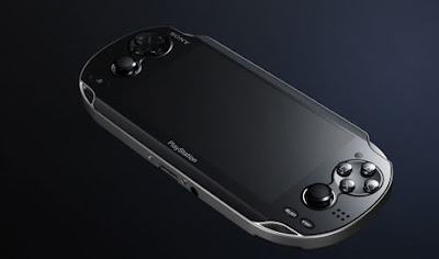
We can safely put an end to multi-core CELL processor rumours, and word of a GPU to rival that of PS3’s RSX – the quad-core SGX 543 MP4+ is certainly powerful when used in tandem with four A9 CPU’s, but still pretty far away from delivering the same level of performance as the PS3 itself. Although, in a string of highly-impressive gameplay demonstrations, via video trailers, we can see that games on the system emulate PS3-level complexity with relative ease, and are way beyond the level of games shown running on the iPhone 4.
There’s no question that the NGP, as Sony are officially codenaming the system, is incredibly powerful for a handheld device. The SGX 543 features full Open GL 2.0 support, along with what looks like Pixel Shader Model 4.1 capabilities, allowing for potential cross compatibility with devices that share similar hardware, but also the capacity for current-gen, PS3 and 360 level of visual effects.
Less overall geometry and texture detail is a given, as is what looks like lower shadow quality on some of the titles shown, although, many of the demos use some PS3 level assets which helps in bridging the gap. And, on the small screen – one that packs a 960x544 16:9 OLED display – the differences are even less likely to be noticed.
In addition, while the use of a quad-core CPU may seem like overkill, various developers have stated, that a lack of overall processing power on the CPU-side is what’s holding back high-end iPhone titles. So, the NGP set-up of a quad-core GPU, and four CPU cores looks like a solid solution to that problem. The GPU definitely packs enough punch, from what we’ve seen so far. Plus, the use of tile-based, differed rendering of the PowerVR tech will provide an additional performance boost over traditional forward renderers; regardless of whether being coded for directly to metal, or by higher-level software API’s.
All in all, the NGP definitely looks like being at the very high-end of handheld tech… at least until 2011, by which time many smartphones are likely to have caught up. But despite this, ether way, Sony have clearly demonstrated that their next-generation portable is fully capable of delivering PS3-style graphics on the small screen. Like-for-like or not, that's certainly a pretty impressive talking point.
Here's the final specs sheet in its entirety:
CPU:
ARM Corte-A9 core (4 core)
GPU:
SGX543MP4+
External Dimensions:
Approx. 182.0 x 18.6 x 83.5mm (width x height x depth) (tentative, excludes largest projection)
Screen:
(Touch screen) 5 inches (16:9), 960 x 544, Approx. 16 million colors, OLED Multi touch screen (capacitive type)
Rear touch pad:
Multi touch pad (capacitive type)
Cameras:
Front camera, Rear camera
Sound:
Built-in stereo speakers, built-in microphone
Sensors:
Six-axis motion sensing system (three-axis gyroscope, three-axis accelerometer)
Three-axis electronic compass
Location
Built-in GPS
Wi-Fi location service support
Keys/Switches:
PS button
Power button
Directional buttons (Up/Down/Right/Left)
Action buttons (Triangle, Circle, Cross, Square)
Shoulder buttons (Right/Left)
Right stick, Left stick
START button, SELECT button
Volume buttons (+/-)
Wireless Communications:
Mobile network connectivity (3G)
IEEE 802.11b/g/n (n = 1x1)
(Wi-Fi) (Infrastructure mode/Ad-hoc mode)
Bluetooth 2.1+EDR (A2DP/AVRCP/HSP)
A fuller, more intricate analysis of the hardware will be performed at a later date. There’s still many aspects of the internals that we don’t know: the clock speed of the GPU, and the amount of VRAM/memory bandwidth, to name but three. But we’ll cover this, and other concerns, more thoroughly when we get a chance.
Wednesday, 26 January 2011
PSP2 Hardware Revealed?
Recent rumours have put the PSP2 has being as powerful as the PS3, to having a quad-core GPU and cut down CELL processor, neither of which seemed to make any sense given both the power draw and overall cost requirements usually adhered to by the vast majority of handheld devices. However, the latest rumour does indeed shed some light on past statements – particularly the one about the system using a quad-core GPU, whilst firmly de-railing others.
According to French site 01.net, more concrete evidence of the PSP2’s hardware specs have surfaced via supposed information taken directly from the system’s development kit. Interestingly, the specifications reveal a system that features the very same CPU/GPU combo that will power the upcoming iPad 2 and iPhone 5, thus firmly shooting down reports of the machine being ‘as powerful’ as the PS3. Instead, the system looks to be at the forefront of mobile technology, but still behind both the RSX and Xenos found in the PS3 and 360 respectively.
Other details include a 5″ OLED multi-touch screen (that’s the front screen and not the rear touchpad), up to 512 MB LPDDR2 RAM and 16 GB’s worth of flash memory. The system also is said to feature an SD card slot for games, although it isn’t known whether this supports either SDHC, SDXC, or both.
Seeing as many PSP titles are currently approaching the 1.8GB capacity of the system’s UMD discs, and PSP2 titles are going to require far more, SDHC – which currently supports up to 32GB of storage space – isn’t going to be enough for storing lots of downloaded content from PSN. In which case, it’s almost certain that SDXC – which can hold up to 2TB (64GB in current sizes), and indeed SDHC for completions sake, will be supported.
In addition, as recent rumours suggest, the system will reportedly feature 3G support, thus having full wireless support via the use of a mobile phone network (although no phone support is planned), along with both standard Wi-Fi and Bluetooth. Two cameras will also be present; one on the front, and one on the rear, while in terms of size, the PSP2 won’t be as wide as the PSP3000 but will instead be slightly longer.
Interestingly, like the 3DS, the PSP2 is said to sport motion control via the use of both an accelerometer and a gyroscope, thus covering another base in the market. 3D however, is currently out of the question. Perhaps, given the already high-spec nature of the device, the use of a quad-core CPU/GPU, and OLED screen, that inclusion of such a feature would raise the cost significantly more than what would be acceptable. Although, the current spec and feature-set will put it way above that of the 3DS in terms of pricing anyway.
A full list of the PSP2’s specs can be found below:
Screen: 5″ OLED multi-touch screen
Control: A Multi-touch trackpad (rumored to be on the rear of the unit), four face buttons, two shoulder buttons, two analog sticks, directional pad
Resolution: 960 x 544
CPU: Quad-core ARM Cortex A9
GPU: PowerVR SGX 543 MP4+
RAM: 1GB LPDDR2 in the Debug unit, with 512 MB possible in the retail unit
Storage: 16GB flash internal (like the PSP Go) and an SD slot
Connectivity: Wi-fi, 3G, and Bluetooth
At the moment, all the details are simply rumour and well-informed speculation. However, we’d be rather surprised if there wasn’t more than a fraction of truth to these and other such reports.
In terms of the hardware spec, if true, it seems that Sony have taken a reasonable step in balancing raw hardware capability with heat dissipation and power draw – two of the largest concerns when designing a handheld; that is to say, that it is possible that titles could display PS3 and 360 quality visuals, but certainly not in a like-for-like manner. Various cuts, such as less in the way of geometry and advanced hardware effects are a given. Although, seeing as the screen will be only a fraction of the display sizes most people play their PS3/360 titles on – and still a reasonably high 960 x 544 resolution – simulating current-gen console graphics in this way shouldn’t be a problem.
So, while exact PS3 quality visuals remain firmly – whatever hardware Sony actually has under the hood in the PSP2 – something of a pipedream, and judging by developer comments, pure PR hyperbole, the system’s hardware make-up still makes it an incredibly powerful device, especially compared to other handhelds.
Certainly, despite using the same CPU/GPU combo as forthcoming Apple products, direct access to the hardware via the development kit – and without needing to conform to Open GL standard for cross compatibility with older devices – will easily lead to a noticeable leap in performance by comparison. There’s nothing really standing in the way of coders from extracting every last drop power from the machine via low-level optimisation of the hardware in ways where software API’s often restrict.
The real question though, is today’s hardware reveal actually what’s inside Sony’s next-gen handheld at all? All that, and more I expect, we will find out tomorrow, at the company’s worldwide unveiling of the device itself. Until then, the specifications listed on this page are perhaps the most tangibly convincing we’ve seen, representing both a powerful but power conscious device; one that is well above existingly comparable mobile products.
Sunday, 23 January 2011
Tech Analysis: Mass Effect 2: Final Game Update
When we took a look at the PS3 Demo of Mass Effect 2 for our initial - and rather in-depth - tech analysis, we found that Bioware seemed to have delivered an incredibly strong conversion of the game, one in which most differences were said to be ‘tit for tat’ -especially the lighting - with no one version coming out on top. Both had their own plus points, and unique quirks which set them apart.
For the most part, content found in game demos rarely feature any drastic improvements when sampling final retail code. However, with ME2 things are a little different. Bioware have tightened up the PS3 code, thus resulting in a few select optimisations that bring that build even closer to that of the Xbox 360 game.
While many of the somewhat subtle differences still remain, both performance and certain shader effects have been tangibly improved for the final PS3 release. But before we talk about those, lets quickly recap.

As expected, Mass Effect 2 renders in 720p across both formats, with the 360 game getting broken use of 2xMSAA and the PS3 having no AA at all. Due to the deffered nature of how the UE3 renders certain elements of the scene – it does so in separate render passes – much of the anti-aliasing in the 360 build is completely absent, with only a select few edges having the smoothing shade applied. In that respect, both versions look basically identical. In motion and in most screens, there’s nothing to tell them apart in this area.
In the demo, we described how the PS3 version of ME2 had some sacrifices made in order to work around the system’s well-documented memory constraints, along with improvements in other areas over the 360 game. Elements such as skin shaders and use of normal maps on the characters were both paired back, though we also saw the use of higher quality shadow filtering as well.
Looking at the retail build, and we see pretty much the same result, minus some small upgrades to the shader effects on Commander Shepard’s face along with higher res normal maps. The rest of the characters seem to be rendered exactly as before.
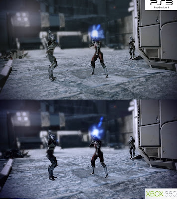
For the most part texture detail and filtering are largely identical as well. Here we see a few higher resolution texture maps on the characters in the PS3 game to compensate for the lack of normal mapping on some areas. Miranda’s hexagonal suit for one, lacks the normal mapped surface of the 360 game, but supplants this with clear use of higher res texturing. Occasionally, these changes make certain details appear a little flat, but mostly Bioware’s rebalancing of certain details works rather well.
Reduced levels of normal mapped textures on the environments are still present, as is the lack of HDR-styled bloom lighting. Although, we can also see that many environmental textures on both versions are simply hi-resolution ones, lacking normal maps and specular highlights. Instead, we have some diffuse reflection maps, along with the higher resolution artwork being used to compensate for the lack of depth normal mapping usually creates – depth is obtained in these cases via the texture maps themselves – in order to save on memory bandwidth on both systems.
There are also parts of the environment on the PS3 game that lack the same specular layer to represent sheen found on the 360 version when light passes over affected surfaces. This seems to be down to both an absence of the effect in addition to the lack of bloom. On some occasions, lighting composition in a scene often affects the amount of specularity that is present on certain surfaces. Although, it is also clear that some parts of the environment have the effect, while others obviously do not.

The lighting system found in the PS3 version of ME2 was perhaps the main talking point of the demo. In order to prepare for the upcoming, multiplatform release of Mass Effect 3, Bioware used an upgraded version of the UE3 for the PS3 build of ME2, resulting in a few noticeable differences in how lighting is handled across both versions of the game. But rather than being technically superior, or worse in any way, these differences seem to be more artistic in nature, with some scenes featuring more in the way of shadow detail, and others less so.
Outside of this change in overall composition, any oddities are likely to be a side-effect of the upgraded UE3’s lighting system not being completely compatible with the one used in the original PC and 360 versions of the game. And to that end, it's unlikely that Bioware had enough time to tweak thus any further, not with ME3 around the corner.
In any case, the reworked lighting engine in the PS3 game appears to be more ambient in nature, with less in the way of what looks like more direct light sources. Instead, characters and parts of the environment don’t always seem to be lit up according to specific object placement, but more inconspicuously throughout. Although, there are plenty of examples where this isn't the case, and in which the origin of the lighting is overly apparent.
As a result of this inconsistency, there are some shadowing errors present – characters that either look to dark, covered in shade, or too flat, lit up more strongly from various angles. We see this on both platforms, though at the expense of featuring lighting that looks a little out of place at times.
Both version display imperfections in this regard and, as to which one is the visually superior, technically better of the two. Well, that pretty much comes down to personal preference. Both implementations look great in general, with the PS3 game occasionally lacking depth in certain scenes and the 360 one over accentuating elements in others. The more subtle PS3 approach is more comfortable to look at overall - especially up close, and I do prefer it, but there’s nothing wrong with the 360’s lighting at all.
It will be interesting however, to see just how this part of the engine fares in the upcoming Mass Effect 3. Have Bioware opted for the PS3’s more ambient approach for the new game, or will we see the title displaying similar lighting properties to 360 ME2? If the lighting changes are equally artistically and tech based, then perhaps a better balance between the two will be found. We’ll just have to wait and see.

Now, in terms of performance, when first sampling the final retail copy of Mass Effect 2 compared to our demo findings, there were two things that we noticed; that the PS3 build no longer featured any screen tearing, and that the framerate appeared to never rise above 30fps. In fact, as a whole it looks like both versions are now basically almost equal in this regard, with generally more even levels of performance overall, but at the expense of the previously smoother jumps above the 30fps mark on the PS3.
What this means, is that the PS3 game is now v-synced across both gameplay and cut-scenes, and now also imposes a top end framerate cap at 30fps. As a result we see the lack of any screen tearing, but at the expense of having as much top-end smoothness on the whole. This varies between gameplay and cinematics, with the cut-scenes taking a prolonged dive down to 20fps on occasions where both systems cannot cope with the load provided by the engine.
Both initially appeared to be the same, although there are times when it looked like the PS3 game was dropping down to 20fps for ever so slightly longer periods.
Gameplay-wise, and we can see that the differences are much more pronounced. During the demo we sighted small up-shoots going beyond 30fps and into what looked like something around the 50-60fps mark. But in the final game, this isn’t the case. Like with the 360 version, ME2 on the PS3 starts off confidently running at 30fps, before dropping frames in heavier load situations – areas with multiple enemies and noticeable explotions all at once, as a good example.
Here we can see dips varying between what looks like 30 and 20fps, with both versions suffering in similar situations. However, the 360 game manages perform slightly better in an overall sense – both versions seem to suffer from slowdown, but seemingly at different points, whilst the PS3 tends to hold a reduced 20fps for slightly longer. In addition, both versions also slow down at different points: PS3 again tends to suffer slightly more, but also, we find that the engine is balancing different loads when this happens.
Compared to the demo, and we find that the PS3 build’s more stable, albeit slightly lowered framerate, is in fact preferable to the uncapped, 30fps plus refresh seen before. On the whole it simply feels smoother whilst also being a near like-for like match for the 360 game. In conclusion, performance is largely solid, with no unexpected drops beyond what we’ve already experienced before in 360 ME2. Some additional slowdown aside, Bioware have done a great job.
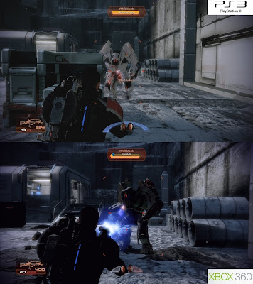
As we’ve already said before in our demo analysis, there are other factors besides graphics when considering which version of Mass Effect 2 to buy. Visually, both versions stack up rather nicely, with the subtle downgrades in normal mapping and shaders in the PS3 build having very little impact in the grand scheme of things. Also, the differing lighting implementations, which is the better of the two, is largely down to personal preference than technical superiority.
In that respect, the PS3 version of the game is perhaps equally as impressive as the 360 one, with other non-graphical features perhaps defining which game to go for. Take both content and pricing into account. The 360 game can be had for around £12 new in some places on the high street, £7 second hand, while the PS3 version retails for a full £40. Another thing to consider, is that the PS3 release comes with all of the DLC that came out last year over Xbox Live on the disc. Whereas, the 360 game is simply the bare bones original, but at a bargain price.
Ultimately, in terms of which version you should really go for, this will I expect, simply come down to whether or not you feel the extra money spent on the PS3 game is worth it over the saving of buying either a cheap copy of the 360 original. Personally, I think it might be, despite not being able to own all three games in the trilogy all on the same format. Either way, Mass Effect 2 is a superb experience and, the fact that owners of both system get to play it, is yet another bonus.
As ever, thanks go out to AlStrong (pixel counting) and to Videogamezone.de (screenshots). A full gallery of high quality shots can be found here.
For the most part, content found in game demos rarely feature any drastic improvements when sampling final retail code. However, with ME2 things are a little different. Bioware have tightened up the PS3 code, thus resulting in a few select optimisations that bring that build even closer to that of the Xbox 360 game.
While many of the somewhat subtle differences still remain, both performance and certain shader effects have been tangibly improved for the final PS3 release. But before we talk about those, lets quickly recap.

As expected, Mass Effect 2 renders in 720p across both formats, with the 360 game getting broken use of 2xMSAA and the PS3 having no AA at all. Due to the deffered nature of how the UE3 renders certain elements of the scene – it does so in separate render passes – much of the anti-aliasing in the 360 build is completely absent, with only a select few edges having the smoothing shade applied. In that respect, both versions look basically identical. In motion and in most screens, there’s nothing to tell them apart in this area.
In the demo, we described how the PS3 version of ME2 had some sacrifices made in order to work around the system’s well-documented memory constraints, along with improvements in other areas over the 360 game. Elements such as skin shaders and use of normal maps on the characters were both paired back, though we also saw the use of higher quality shadow filtering as well.
Looking at the retail build, and we see pretty much the same result, minus some small upgrades to the shader effects on Commander Shepard’s face along with higher res normal maps. The rest of the characters seem to be rendered exactly as before.

For the most part texture detail and filtering are largely identical as well. Here we see a few higher resolution texture maps on the characters in the PS3 game to compensate for the lack of normal mapping on some areas. Miranda’s hexagonal suit for one, lacks the normal mapped surface of the 360 game, but supplants this with clear use of higher res texturing. Occasionally, these changes make certain details appear a little flat, but mostly Bioware’s rebalancing of certain details works rather well.
Reduced levels of normal mapped textures on the environments are still present, as is the lack of HDR-styled bloom lighting. Although, we can also see that many environmental textures on both versions are simply hi-resolution ones, lacking normal maps and specular highlights. Instead, we have some diffuse reflection maps, along with the higher resolution artwork being used to compensate for the lack of depth normal mapping usually creates – depth is obtained in these cases via the texture maps themselves – in order to save on memory bandwidth on both systems.
There are also parts of the environment on the PS3 game that lack the same specular layer to represent sheen found on the 360 version when light passes over affected surfaces. This seems to be down to both an absence of the effect in addition to the lack of bloom. On some occasions, lighting composition in a scene often affects the amount of specularity that is present on certain surfaces. Although, it is also clear that some parts of the environment have the effect, while others obviously do not.

The lighting system found in the PS3 version of ME2 was perhaps the main talking point of the demo. In order to prepare for the upcoming, multiplatform release of Mass Effect 3, Bioware used an upgraded version of the UE3 for the PS3 build of ME2, resulting in a few noticeable differences in how lighting is handled across both versions of the game. But rather than being technically superior, or worse in any way, these differences seem to be more artistic in nature, with some scenes featuring more in the way of shadow detail, and others less so.
Outside of this change in overall composition, any oddities are likely to be a side-effect of the upgraded UE3’s lighting system not being completely compatible with the one used in the original PC and 360 versions of the game. And to that end, it's unlikely that Bioware had enough time to tweak thus any further, not with ME3 around the corner.
In any case, the reworked lighting engine in the PS3 game appears to be more ambient in nature, with less in the way of what looks like more direct light sources. Instead, characters and parts of the environment don’t always seem to be lit up according to specific object placement, but more inconspicuously throughout. Although, there are plenty of examples where this isn't the case, and in which the origin of the lighting is overly apparent.
As a result of this inconsistency, there are some shadowing errors present – characters that either look to dark, covered in shade, or too flat, lit up more strongly from various angles. We see this on both platforms, though at the expense of featuring lighting that looks a little out of place at times.
Both version display imperfections in this regard and, as to which one is the visually superior, technically better of the two. Well, that pretty much comes down to personal preference. Both implementations look great in general, with the PS3 game occasionally lacking depth in certain scenes and the 360 one over accentuating elements in others. The more subtle PS3 approach is more comfortable to look at overall - especially up close, and I do prefer it, but there’s nothing wrong with the 360’s lighting at all.
It will be interesting however, to see just how this part of the engine fares in the upcoming Mass Effect 3. Have Bioware opted for the PS3’s more ambient approach for the new game, or will we see the title displaying similar lighting properties to 360 ME2? If the lighting changes are equally artistically and tech based, then perhaps a better balance between the two will be found. We’ll just have to wait and see.

Now, in terms of performance, when first sampling the final retail copy of Mass Effect 2 compared to our demo findings, there were two things that we noticed; that the PS3 build no longer featured any screen tearing, and that the framerate appeared to never rise above 30fps. In fact, as a whole it looks like both versions are now basically almost equal in this regard, with generally more even levels of performance overall, but at the expense of the previously smoother jumps above the 30fps mark on the PS3.
What this means, is that the PS3 game is now v-synced across both gameplay and cut-scenes, and now also imposes a top end framerate cap at 30fps. As a result we see the lack of any screen tearing, but at the expense of having as much top-end smoothness on the whole. This varies between gameplay and cinematics, with the cut-scenes taking a prolonged dive down to 20fps on occasions where both systems cannot cope with the load provided by the engine.
Both initially appeared to be the same, although there are times when it looked like the PS3 game was dropping down to 20fps for ever so slightly longer periods.
Gameplay-wise, and we can see that the differences are much more pronounced. During the demo we sighted small up-shoots going beyond 30fps and into what looked like something around the 50-60fps mark. But in the final game, this isn’t the case. Like with the 360 version, ME2 on the PS3 starts off confidently running at 30fps, before dropping frames in heavier load situations – areas with multiple enemies and noticeable explotions all at once, as a good example.
Here we can see dips varying between what looks like 30 and 20fps, with both versions suffering in similar situations. However, the 360 game manages perform slightly better in an overall sense – both versions seem to suffer from slowdown, but seemingly at different points, whilst the PS3 tends to hold a reduced 20fps for slightly longer. In addition, both versions also slow down at different points: PS3 again tends to suffer slightly more, but also, we find that the engine is balancing different loads when this happens.
Compared to the demo, and we find that the PS3 build’s more stable, albeit slightly lowered framerate, is in fact preferable to the uncapped, 30fps plus refresh seen before. On the whole it simply feels smoother whilst also being a near like-for like match for the 360 game. In conclusion, performance is largely solid, with no unexpected drops beyond what we’ve already experienced before in 360 ME2. Some additional slowdown aside, Bioware have done a great job.

As we’ve already said before in our demo analysis, there are other factors besides graphics when considering which version of Mass Effect 2 to buy. Visually, both versions stack up rather nicely, with the subtle downgrades in normal mapping and shaders in the PS3 build having very little impact in the grand scheme of things. Also, the differing lighting implementations, which is the better of the two, is largely down to personal preference than technical superiority.
In that respect, the PS3 version of the game is perhaps equally as impressive as the 360 one, with other non-graphical features perhaps defining which game to go for. Take both content and pricing into account. The 360 game can be had for around £12 new in some places on the high street, £7 second hand, while the PS3 version retails for a full £40. Another thing to consider, is that the PS3 release comes with all of the DLC that came out last year over Xbox Live on the disc. Whereas, the 360 game is simply the bare bones original, but at a bargain price.
Ultimately, in terms of which version you should really go for, this will I expect, simply come down to whether or not you feel the extra money spent on the PS3 game is worth it over the saving of buying either a cheap copy of the 360 original. Personally, I think it might be, despite not being able to own all three games in the trilogy all on the same format. Either way, Mass Effect 2 is a superb experience and, the fact that owners of both system get to play it, is yet another bonus.
As ever, thanks go out to AlStrong (pixel counting) and to Videogamezone.de (screenshots). A full gallery of high quality shots can be found here.
Saturday, 22 January 2011
Update Schedule And Crysis 2 Multiplayer Trailer
Apologies for the lack of content so far this week, but I’ve been doing a full 40hrs straight at work so far, with another stretch coming up next week, so coverage might not be as regular as I’d like. That’s not to say there won’t be any in-depth updates at all though, I’m going through the first few hours of both retail copies of Mass Effect 2 for a final tech, due for this Sunday, before moving onto LBP2, and then finishing up with either the Bulletstorm demo or a short look at the Crysis 2 multiplayer trailer.
If all goes to plan, expect LBP2 on Wed and the rest sometime on the weekend. Other than that, the usual tech-related news pieces will continue, and Dead Space 2 is on the agenda for the week after. Hopefully, I get time to plow through all of the above. It’s going to be a very busy, and utterly tiring, week. But should be well worth it.
Out of interest, just before head you decide to head off, here's a very quick look at the Crysis 2 multiplayer trailer:
Despite looking like console footage, Crytek have infact created the trailer from footage of the game running on the PC, with what looks like medium detail settings applied. The IQ appears far too clean to be running on consoles, and we see some extremly high quality effects, along with what looks like a framebuffer around the 720p mark. Although, the alpha-effects appear to be rendered at a lower resolution. Just look at those smoke and particles.
By contrast, the 360 build of the single player campaign I played at the EG Expo looked decidedky worse. Sub-HD framebuffers with no anti-aliasing seemed to ruin any chance of decent image quality being present, whilst the framerate also appeared to be, at times, well below the 30fps targeted by the developers.
That build of the game however, is now very old. And it's more than likely that Crytek have made some serious headway with both console ports since then. Although, the complete lack of any PS3 footage since the original CryEngine 3 trailer is a cause for corncern.
Expect more later, after we've sampled some high quality footage that hasn't been compressed into something that approaches sub-SD quality.
Tuesday, 18 January 2011
Kinect On PC - Now To Be Official
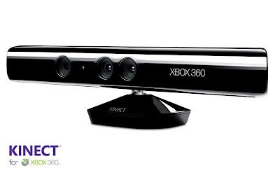
A few months ago, Microsoft’s Xbox 360 motion control entry into gaming, the Kinect, was hacked and custom coded drivers developed which enabled it to run on the PC. So far, some of the homebrew demonstrations have been even more technically accomplished than much of the official software for the device, with a 3D webcam and competent FPS controls being the highlights.
However, the Kinect was never really hacked as such. The device has always been ‘open’ as it were, only requiring creation of software drivers in order for it to work on other platforms. Plugging it into the PC for example, and you can use it as a basic webcam with relative ease.
In addition, much of the custom software solutions using Kinect on the PC have been using a depth buffer with four times the resolution than on commercial games. The Kinect’s official depth buffer spec indicates it to be 320x240 in size, whereas the actual hardware is capable of producing 640x480’s worth of depth information. This means that some homebrew applications have features significantly more advanced – if not incomplete and more rough around the edges – than the intial batch of Kinect games.
Seeing as the hardware is actually capable of working around its original PrimeSense spec – all the functionality and tech is there – signs point to Microsoft’s software API restricting the device’s full use. In particular, the resolution of the depth buffer, maybe due to the additional amount of processing workload it would have on the 360’s CPU. However, MS has also stated, that in time, via software updates from Xbox Live, that the Kinect will see more of its potential unlocked – I.E: developer support or using full-size depth buffers.
But ultimately, all this is already possible now, albeit via homebrew software applications on the PC. Although, that is all about to change if fresh rumours are to be believed.
Previously MS have commented on the Kinect hack as being expected, even welcome. That they didn’t have any plans to restrict the tech, and were instead looking to broaden its use beyond the confines of the Xbox 360 and into a wider market – into the PC space. Now, that seems to be closer to becoming a reality. A new report – via WinRumours - clams that in the next few months, MS will themselves reveal an official Kinect software development kit (SDK), along with driver support for Windows-based PCs.
Interestingly, Microsoft’s next operating system, Windows 8, will feature gesture-based control in addition to traditional mouse and keyboard support. Perhaps making Kinect an open-platform device was part of that plan from the beginning. Certainly, some of the impressive user-coded demos show that there is much potential for it to be used in the way MS are hinting at... and more. Whilst pointer support is let down with lack of precision and high latency, a simpler gesture-based solution, maybe using more complicated tracking for only specific functions, would be an ideal starting point.
Also, on the gaming side of things, Kinect’s implementation on the PC could well show us a small glimpse of the future regarding the technology. Without being held back by the 360’s aging CPU spec, and instead opened up by the possibilities of high-end PC hardware, we could see far more in the way of advanced tracking with considerably more accuracy, but with a minimum amount of lag – only slightly more than Kinect’s USB data transfer limitation.
The prospects behind this, and indeed unofficial Kinect applications, are particularly intriguing, given just what appears to be possible. And with a full MS SDK only a few months away, we shouldn’t have to wait long before some of the more originally elaborate ideas envisioned for the device to come to fruition.
Monday, 17 January 2011
3DS Internals Sighted/Analysed
A few days ago a teardown of the 3DS was posted on TVGZone, which reveals a few more interesting details about the innards of the system. The unit appears to be a final, production-grade unit. It features the slightly modified aesthetic of the final model displayed at Nintendo’s World Event in Japan; a grey analogue slider is present, along with the now flat, what looks like touch-based ‘Start’, ‘Select’, and ‘Home’ buttons. But far more relavent, the images reaveal some vital info on the internal hardware present in the system.
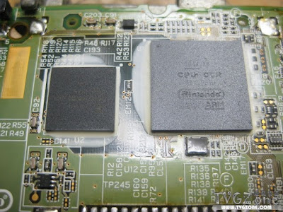
On to the inside, specifically the motherboard itself, and we can see two distinct pieces of silicon that stand out. The first appears to be a single package containing both ARM CPUs, and one DMP PICA200 GPU. Initial impressions seem to hint that it is a SoC (system-on-a-chip) with the individual components most likely all on one die.
The other, is what looks like a block of memory – possibly the entire 96MB that the system is supposed to have – unified as one single pool, from which, due to the overall hardware configuration, it looks like both the CPU and GPU can use. Markings on the chip indicate that it is FCRAM made by Fujitsu, possible a custom solution just for the 3DS as the company doesn’t make FCRAM chips higher than 64Mb.
The use of a unified memory pool is also interesting. Usually this can be limiting for the system if the GPU cannot access it directly. However, from what is known about the main memory and CPU/GPU configuration at the moment, all things point to this not being the case.
In addition to the main 96MB of memory, sources indicated that the 3DS also contains a separate pool of VRAM dedicated to the GPU (rumoured to be around 4MB), which is believed to be located on the SoC. This is most likely to be fast access eDRAM, used just to hold the framebuffer, with the GPU being able to directly access the system’s main memory pool for other things as and when it needs.
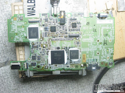
From what we can see, the use of a SoC and a separate large block of memory clearly showcases Nintendo’s cost-centric approach when designing the internals of the 3DS. It also looks like being a tidy, efficient set-up. Having all the main components on two separate packages (well the memory appears to be a single chip) keeps cost down, seeing as there is less in the way of overall silicon being used.
It will be interesting to find out just what process node both chips are on. Usually having individual parts groped together on single dies indicates a low process node in the first place, meaning that cooling and heat dissipation should be easy to achieve. In other words, Nintendo have carefully chosen components that not only provide the best ‘bang for your buck’ where the cost/power ratio is concerned, but also ones that should be easy to make future savings on for later revisions of the hardware.
Hopefully, we should find out more shortly after the 3DS’ Japanese launch, when someone else performs a slightly more in-depth teardown of the system, thus allowing us to get a better look at those two chips and the internal hardware make-up as a whole.

On to the inside, specifically the motherboard itself, and we can see two distinct pieces of silicon that stand out. The first appears to be a single package containing both ARM CPUs, and one DMP PICA200 GPU. Initial impressions seem to hint that it is a SoC (system-on-a-chip) with the individual components most likely all on one die.
The other, is what looks like a block of memory – possibly the entire 96MB that the system is supposed to have – unified as one single pool, from which, due to the overall hardware configuration, it looks like both the CPU and GPU can use. Markings on the chip indicate that it is FCRAM made by Fujitsu, possible a custom solution just for the 3DS as the company doesn’t make FCRAM chips higher than 64Mb.
The use of a unified memory pool is also interesting. Usually this can be limiting for the system if the GPU cannot access it directly. However, from what is known about the main memory and CPU/GPU configuration at the moment, all things point to this not being the case.
In addition to the main 96MB of memory, sources indicated that the 3DS also contains a separate pool of VRAM dedicated to the GPU (rumoured to be around 4MB), which is believed to be located on the SoC. This is most likely to be fast access eDRAM, used just to hold the framebuffer, with the GPU being able to directly access the system’s main memory pool for other things as and when it needs.

From what we can see, the use of a SoC and a separate large block of memory clearly showcases Nintendo’s cost-centric approach when designing the internals of the 3DS. It also looks like being a tidy, efficient set-up. Having all the main components on two separate packages (well the memory appears to be a single chip) keeps cost down, seeing as there is less in the way of overall silicon being used.
It will be interesting to find out just what process node both chips are on. Usually having individual parts groped together on single dies indicates a low process node in the first place, meaning that cooling and heat dissipation should be easy to achieve. In other words, Nintendo have carefully chosen components that not only provide the best ‘bang for your buck’ where the cost/power ratio is concerned, but also ones that should be easy to make future savings on for later revisions of the hardware.
Hopefully, we should find out more shortly after the 3DS’ Japanese launch, when someone else performs a slightly more in-depth teardown of the system, thus allowing us to get a better look at those two chips and the internal hardware make-up as a whole.
Thursday, 13 January 2011
Tech Analysis: RE: Revelations Gameplay Video
Nintendo showcased a small variety of software at its recent World Event in Japan. However, it was the first time that Capcom demonstrated Resident Evil Revelations running in real-time, with a short, but no less impressive live demonstration of the game. A trailer focusing on the title’s in-engine cut-scenes was also shown just before, proving that what we were seeing during gameplay is a match for the detailed cinematics.
Perhaps more importantly, Capcom’s first proper reveal of RE Revelation’s gameplay comes as a relief for anyone expecting a hectic, RE5-like pace, in which horror and tension is subdued with all out violence in a almost fear-less shooting gallery of shorts. Revelations, although sharing the same over-the-shoulder viewpoint, is a far slower affair focusing on unsuspecting scares and fewer, but far tougher enemies. In this respect it faithfully builds upon the original PSX games whilst bringing all the benefits of RE4’s vastly superior control and camera system.
So, lets take a look.
Visually, from what we can see, it looks like the quality of both the character and environment modelling is basically identical across the cut-scenes and gameplay. Almost nothing has been lost in terms of detail and precision, sans a small error in lighting when in targeting mode, but we’ll talk about that a little later. Characters feature a reasonable amount of geometric detail, but mostly, the really fine stuff – like the small elements of clothing, round look of the arms – is accomplished through the use of normal mapping in combination with solid texture work.
Through the use of the 3DS’ fixed-function, multiple texture-layered approach to rendering effects, we can see clear implementation of normal maps, adding finer details to the characters, along with specular reflections to highlight gloss, moisture and other similar properties.
Environments too, benefit from having similar effects. Parts of the walls, floors, and various other objects are normal mapped, with some surfaces – like metal pipes – getting specular, and others simply using the more common diffuse map in order to scatter light across the surface. However, these are used somewhat sparingly, with the majority of the environment using less of a multi-layered approach.
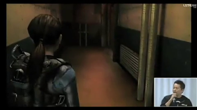
Alongside the game’s use of detailed normal mapped characters and enclosed, but also reasonably intricate scenery, the lighting engine is perhaps the most impressive component of the title’s feature-set. RE Revelations takes full advantage of the 3DS’ ability to handle per-pixel based lighting calculations, and as a result sees some key environmental objects casting dynamic lights which actively illuminate and shade both the characters and surrounding environment.
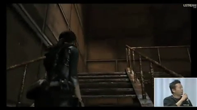
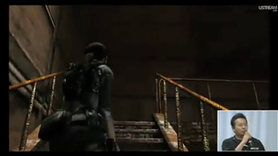
The lamp hanging above the stairwell for example, whilst swinging from side to side, projects a shadow which moves and changes according to the position of the light source itself. The environment also seems to be accurately lit according to where the lightsource is projecting from, the angle, intensity etc. Other elements, such as the texture layer based shader effects – reflections in particular, especially on normal mapping – are affected, with certain surfaces shining as light passes over them, before dimming as levels reduce.

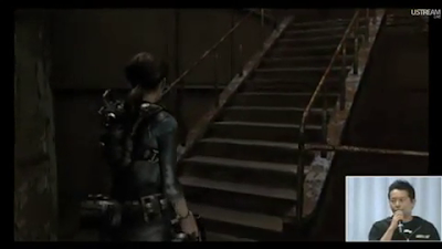
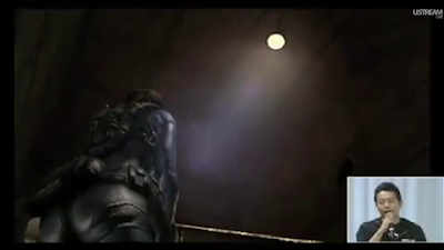

The characters benefit greatly from the real-time, per-pixel lighting implementation, with considerable depth being added to them, and the scene as a whole. This is nicely backed up with subtle use of self-shadowing, which complements the dynamic nature of the lighting and its accuracy.
Occasionally though, there are times when the game’s lighting system perhaps isn’t quite as accurate. When switching to targeting mode there is some noticeable polygon jittering, along with what looks like slightly flatter lighting. Like with the PSP, the reason from this seems to stem from both a lack of precision with geometry co-ordinate calculations, and what looks like a lack of per-pixel lighting when in this mode – on the character’s arm at least, its still present in the environment.
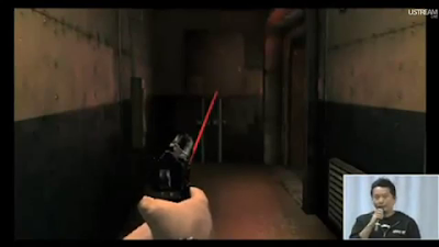

We can also see evidence of low quality shadow filtering, no doubt used to save on bandwidth, and what looks like low-resolution shadows in general. Take a look at Jill’s shadow, paying particular attention to her right hand. The effect looks like PCF, a cheap method of filtering used on some PS3 titles in order to save memory.
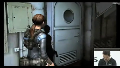
Of course, the plentiful use of such an advanced feature-set comes at the cost of environmental size and scope. From what we’ve seen so far, RE Revelations mainly takes place in tight, enclosed spaces with little in the way of distant, horizon-based scenery. The enemies we’ve seen so far, also rely a lot more on being normal mapped than constructed via lots of geometry.
Having the game set in mostly enclosed environments not only allows Capcom to bring a foreboding amount of atmosphere to the proceedings, but also to carefully budget the engine’s graphical load. High levels of bump-mapping and shader-like effects have a large memory and processing cost, so by restricting the draw distance and sheer overall complexity of any given scene, more of that budget can be spent on these effects whilst retaining that target 30fps performance.
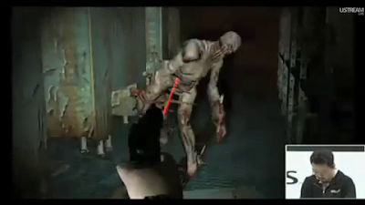
In its current state, Revelations frequently runs at 30fps in areas which doesn’t tax the engine too greatly – usually in sparse corridors or when there are no enemies around. In more complex scenes, ones which currently add in a human-size foe into the mix, framerate dips below 30fps and down to around 20fps for brief periods. No visible screen tearing seems to be present (although the poor video encoding makes it hard to tell) so the game appears to be running with v-sync enabled. This would explain the drop to 20fps when the engine is pushing a heavier load – drop to 20fps rather than tear frames when the engine cannot render them in time.
Although, with nearly a year to go and at only 20% complete at this stage, such performance issues are likely to be sorted out by the time of release. Regardless, RE Revelations is still a mightily impressive display of the 3DS’ capabilities. Here you’ve got some nice precision lighting not seen in any iPhone title to date, and plentiful supply of shader-like effects being generated by the system’s fixed-function hardware. There’s nothing else that is quite on the same level currently on competing mobile devices, and this is effectively first generation software.
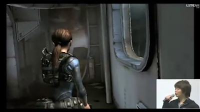
Beyond the visuals, it’s great to finally have what looks like a classically inspired instalment in the Resident Evil franchise, based on fear rather than adrenaline-centric action. Resident Evil 4 was a great leap forward, with arguably the right balance of action and atmosphere in order to generate horror. RE5 however, was a huge disappointment. Focusing purely on shooting… lots and lots of shooting, it massively diminished the series trademark tone. With Revelations, Capcom appear to be putting this right.
Perhaps more importantly, Capcom’s first proper reveal of RE Revelation’s gameplay comes as a relief for anyone expecting a hectic, RE5-like pace, in which horror and tension is subdued with all out violence in a almost fear-less shooting gallery of shorts. Revelations, although sharing the same over-the-shoulder viewpoint, is a far slower affair focusing on unsuspecting scares and fewer, but far tougher enemies. In this respect it faithfully builds upon the original PSX games whilst bringing all the benefits of RE4’s vastly superior control and camera system.
So, lets take a look.
Visually, from what we can see, it looks like the quality of both the character and environment modelling is basically identical across the cut-scenes and gameplay. Almost nothing has been lost in terms of detail and precision, sans a small error in lighting when in targeting mode, but we’ll talk about that a little later. Characters feature a reasonable amount of geometric detail, but mostly, the really fine stuff – like the small elements of clothing, round look of the arms – is accomplished through the use of normal mapping in combination with solid texture work.
Through the use of the 3DS’ fixed-function, multiple texture-layered approach to rendering effects, we can see clear implementation of normal maps, adding finer details to the characters, along with specular reflections to highlight gloss, moisture and other similar properties.
Environments too, benefit from having similar effects. Parts of the walls, floors, and various other objects are normal mapped, with some surfaces – like metal pipes – getting specular, and others simply using the more common diffuse map in order to scatter light across the surface. However, these are used somewhat sparingly, with the majority of the environment using less of a multi-layered approach.

Alongside the game’s use of detailed normal mapped characters and enclosed, but also reasonably intricate scenery, the lighting engine is perhaps the most impressive component of the title’s feature-set. RE Revelations takes full advantage of the 3DS’ ability to handle per-pixel based lighting calculations, and as a result sees some key environmental objects casting dynamic lights which actively illuminate and shade both the characters and surrounding environment.


The lamp hanging above the stairwell for example, whilst swinging from side to side, projects a shadow which moves and changes according to the position of the light source itself. The environment also seems to be accurately lit according to where the lightsource is projecting from, the angle, intensity etc. Other elements, such as the texture layer based shader effects – reflections in particular, especially on normal mapping – are affected, with certain surfaces shining as light passes over them, before dimming as levels reduce.


The characters benefit greatly from the real-time, per-pixel lighting implementation, with considerable depth being added to them, and the scene as a whole. This is nicely backed up with subtle use of self-shadowing, which complements the dynamic nature of the lighting and its accuracy.
Occasionally though, there are times when the game’s lighting system perhaps isn’t quite as accurate. When switching to targeting mode there is some noticeable polygon jittering, along with what looks like slightly flatter lighting. Like with the PSP, the reason from this seems to stem from both a lack of precision with geometry co-ordinate calculations, and what looks like a lack of per-pixel lighting when in this mode – on the character’s arm at least, its still present in the environment.


We can also see evidence of low quality shadow filtering, no doubt used to save on bandwidth, and what looks like low-resolution shadows in general. Take a look at Jill’s shadow, paying particular attention to her right hand. The effect looks like PCF, a cheap method of filtering used on some PS3 titles in order to save memory.

Of course, the plentiful use of such an advanced feature-set comes at the cost of environmental size and scope. From what we’ve seen so far, RE Revelations mainly takes place in tight, enclosed spaces with little in the way of distant, horizon-based scenery. The enemies we’ve seen so far, also rely a lot more on being normal mapped than constructed via lots of geometry.
Having the game set in mostly enclosed environments not only allows Capcom to bring a foreboding amount of atmosphere to the proceedings, but also to carefully budget the engine’s graphical load. High levels of bump-mapping and shader-like effects have a large memory and processing cost, so by restricting the draw distance and sheer overall complexity of any given scene, more of that budget can be spent on these effects whilst retaining that target 30fps performance.

In its current state, Revelations frequently runs at 30fps in areas which doesn’t tax the engine too greatly – usually in sparse corridors or when there are no enemies around. In more complex scenes, ones which currently add in a human-size foe into the mix, framerate dips below 30fps and down to around 20fps for brief periods. No visible screen tearing seems to be present (although the poor video encoding makes it hard to tell) so the game appears to be running with v-sync enabled. This would explain the drop to 20fps when the engine is pushing a heavier load – drop to 20fps rather than tear frames when the engine cannot render them in time.
Although, with nearly a year to go and at only 20% complete at this stage, such performance issues are likely to be sorted out by the time of release. Regardless, RE Revelations is still a mightily impressive display of the 3DS’ capabilities. Here you’ve got some nice precision lighting not seen in any iPhone title to date, and plentiful supply of shader-like effects being generated by the system’s fixed-function hardware. There’s nothing else that is quite on the same level currently on competing mobile devices, and this is effectively first generation software.

Beyond the visuals, it’s great to finally have what looks like a classically inspired instalment in the Resident Evil franchise, based on fear rather than adrenaline-centric action. Resident Evil 4 was a great leap forward, with arguably the right balance of action and atmosphere in order to generate horror. RE5 however, was a huge disappointment. Focusing purely on shooting… lots and lots of shooting, it massively diminished the series trademark tone. With Revelations, Capcom appear to be putting this right.
Tuesday, 11 January 2011
Uncharted 3 Tech Update
We’ve already taken an in-depth technical look at Uncharted 3, analysing both the original teaser trailer and subsequent gameplay demo. However, an extended version of the teaser has surfaced at CES, briefly highlighting some of the heavily edited, chopped up gameplay footage contained within. These segments have now been presented as full-size clips, interwoven with the rest of the trailer and show more clearly some of the stuff we were talking about.
In addition, the extended trailer also contains some short additional footage right at the very end, depicting a desert-based, hand-to-hand fight scene between Drake and an enemy assailant.
The main purpose of this report was to highlight the way certain visual effects have been created in the game. Some of the things talked about before, like water, fire, and particles, can be seen in much more detail for the first time.
With the water in particular, you can see how the main body is constructed from volume rather than individual particles, with particles simply making up the front, sides, and overall extended splashes of the effect. Use of blended normal mapping and multi-layered texturing add detail and extra animation with the inclusion of ripples and surface changes.
In the previous trailer, this could only be seen very briefly. Despite the rather poor quality footage, with lots of artefacting hiding some of the finer details, now it is overly apparent how the flow of water is built and animated.

The second gameplay clip shows Drake waist-deep, and displays a perfect example of how the volume-based effect has been animated to flow naturally, like how it would in a real life approximation of flowing water. If you think about how liquid is largely stuck together, usually only separating when impacted upon, then Naughty Dog’s solution not only caters to the PS3’s limited bandwidth requirements (by reducing the amount of individual particles used) but also in replicating water as organically as possible.

The final part of the new trailer also shows some more interesting technical observations. The footage here, like with the majority of the trailer, is pre-rendered using in-engine assets before being supersampled down to 720p. Character modelling is more detailed than in-game, and like we’ve already touched upon, shadows and lighting are far more precise – with no obvious rendering errors – than what is possible in real-time on the hardware.
Interestingly, we can see that Naughty Dog have implemented some secondary surface lighting reflections, whereby the sunlight bounces off of the ground and onto the characters. Look at the base of the enemy’s arms - or rather under - and you can see it. It’s not the light source from the sun that’s having this effect, as the light is being directed from below at an angle.
Single bounce global illumination? Well, that’s highly unlikely since it isn’t supported in Uncharted 3’s advanced lighting engine, and would be too performance intensive to use in-game as it were, without optimisation. Instead, it looks like it could be some kind of baked GI solution, perhaps some kind of occlusion mapped onto the environment. As Naughty Dog already use plenty of pre-baked techniques in combination with real-time lighting and AO in screen space (SSAO) then this seems like the most obvious conclusion.
The other conceivable way this could also be done, is via the use of some simple shader algorithms, thus saving on even more performance. Without seeing the effect for extend periods of time, it is simply well informed guesswork on how this is being accomplished, and either way needs to be clearly seen in actual gameplay footage to be of any real significance. Though, I suspect that it may well find itself entering the game’s in-engine, but not real-time cut scenes. There are a number of low-tech, performance saving ways this could be implemented; like UE3’s Lightmass GI solution for example, used in Gears 3.
The rest of the trailer is exactly the same as before, so there’s no need to go into further details here. The gameplay footage still looks like its being rendered in 720p compared to the rest of the footage, before also having its image quality decimated by GameTrailers poor video encoding.
Outside of the CES updated version of the original teaser trailer, there have also been two extended gameplay videos of the Chateau stage released a few weeks back. The beginning of the first video shows some crisp, white HDR lighting, intermittently complemented by the implementation of bloom. Bloom appears in some scenes clearly, whilst being completely absent in others. Like in Uncharted 2, its use appears to be more artistically controlled than simply being an early rendering bug.
HDR also looks very similar to both Uncharted 2, and in turn God Of War 3, meaning that it is likely that ND are using a similar if not the very same RGBM version of the technique. In any case HDR appears to be a tad subtler on first impressions, although that could well be down to the environment and artistic use, than anything else. UC2 had areas in which both HDR and bloom were highly prominent, and areas where neither seemed to have much of a noticeable presence.
You can also see solid evidence of MLAA in the works too. There’s very little in the way of edge-based shimmering in the higher contrast areas of the scene, only the usual sub-pixel artefacts not covered by the technique. But overall, it’s a noticeable improvement over the second game’s solid use of MSAA.
In terms of Uncharted 3, I think that about covers it for now. The range of screenshots and videos showcase what appears to be a range of subtle, and quite substancial – in some areas – improvements to the core technology powering the game. On the whole it’s not drastically different to Uncharted 2, but more an evolution of the engine than a complete revolution. Although, you could easily argue that is all the game really requires.
Up next... a few 3DS bits and pieces to cover.
In addition, the extended trailer also contains some short additional footage right at the very end, depicting a desert-based, hand-to-hand fight scene between Drake and an enemy assailant.
The main purpose of this report was to highlight the way certain visual effects have been created in the game. Some of the things talked about before, like water, fire, and particles, can be seen in much more detail for the first time.


With the water in particular, you can see how the main body is constructed from volume rather than individual particles, with particles simply making up the front, sides, and overall extended splashes of the effect. Use of blended normal mapping and multi-layered texturing add detail and extra animation with the inclusion of ripples and surface changes.
In the previous trailer, this could only be seen very briefly. Despite the rather poor quality footage, with lots of artefacting hiding some of the finer details, now it is overly apparent how the flow of water is built and animated.


The second gameplay clip shows Drake waist-deep, and displays a perfect example of how the volume-based effect has been animated to flow naturally, like how it would in a real life approximation of flowing water. If you think about how liquid is largely stuck together, usually only separating when impacted upon, then Naughty Dog’s solution not only caters to the PS3’s limited bandwidth requirements (by reducing the amount of individual particles used) but also in replicating water as organically as possible.

The final part of the new trailer also shows some more interesting technical observations. The footage here, like with the majority of the trailer, is pre-rendered using in-engine assets before being supersampled down to 720p. Character modelling is more detailed than in-game, and like we’ve already touched upon, shadows and lighting are far more precise – with no obvious rendering errors – than what is possible in real-time on the hardware.
Interestingly, we can see that Naughty Dog have implemented some secondary surface lighting reflections, whereby the sunlight bounces off of the ground and onto the characters. Look at the base of the enemy’s arms - or rather under - and you can see it. It’s not the light source from the sun that’s having this effect, as the light is being directed from below at an angle.
Single bounce global illumination? Well, that’s highly unlikely since it isn’t supported in Uncharted 3’s advanced lighting engine, and would be too performance intensive to use in-game as it were, without optimisation. Instead, it looks like it could be some kind of baked GI solution, perhaps some kind of occlusion mapped onto the environment. As Naughty Dog already use plenty of pre-baked techniques in combination with real-time lighting and AO in screen space (SSAO) then this seems like the most obvious conclusion.
The other conceivable way this could also be done, is via the use of some simple shader algorithms, thus saving on even more performance. Without seeing the effect for extend periods of time, it is simply well informed guesswork on how this is being accomplished, and either way needs to be clearly seen in actual gameplay footage to be of any real significance. Though, I suspect that it may well find itself entering the game’s in-engine, but not real-time cut scenes. There are a number of low-tech, performance saving ways this could be implemented; like UE3’s Lightmass GI solution for example, used in Gears 3.
The rest of the trailer is exactly the same as before, so there’s no need to go into further details here. The gameplay footage still looks like its being rendered in 720p compared to the rest of the footage, before also having its image quality decimated by GameTrailers poor video encoding.

Outside of the CES updated version of the original teaser trailer, there have also been two extended gameplay videos of the Chateau stage released a few weeks back. The beginning of the first video shows some crisp, white HDR lighting, intermittently complemented by the implementation of bloom. Bloom appears in some scenes clearly, whilst being completely absent in others. Like in Uncharted 2, its use appears to be more artistically controlled than simply being an early rendering bug.
HDR also looks very similar to both Uncharted 2, and in turn God Of War 3, meaning that it is likely that ND are using a similar if not the very same RGBM version of the technique. In any case HDR appears to be a tad subtler on first impressions, although that could well be down to the environment and artistic use, than anything else. UC2 had areas in which both HDR and bloom were highly prominent, and areas where neither seemed to have much of a noticeable presence.
You can also see solid evidence of MLAA in the works too. There’s very little in the way of edge-based shimmering in the higher contrast areas of the scene, only the usual sub-pixel artefacts not covered by the technique. But overall, it’s a noticeable improvement over the second game’s solid use of MSAA.

In terms of Uncharted 3, I think that about covers it for now. The range of screenshots and videos showcase what appears to be a range of subtle, and quite substancial – in some areas – improvements to the core technology powering the game. On the whole it’s not drastically different to Uncharted 2, but more an evolution of the engine than a complete revolution. Although, you could easily argue that is all the game really requires.
Up next... a few 3DS bits and pieces to cover.
Monday, 10 January 2011
3DS Battery Life: Unsurprisingly As Expected
Nintendo has been showing off much of its new 3DS system at their World Event in Japan, with confirmed date and full launch line-up for the system’s Japanese release – February 26th – along with a small barrage of impressive video demonstrations of this year’s biggest games for the platform. We may be taking a small, updated tech-themed look at some of these later on in the week, but for now our attention has been turned to the console’s confirmed battery specifications.
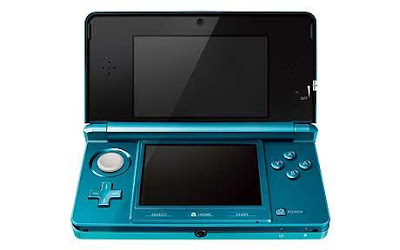
Using a 1,300 mAh rated battery, Nintendo has revealed that 3DS games running on the system would give the user around 3-5 hrs of playtime, while original DS games would yield an average of between 5-8 hours before charging is required - noticeably less than the 9 to 14 hours possible on the DSi and 15 to 19 hours on the DSL. Charging itself will require around 3.5 hours.
As to be expected, how long each charge lasts will be dictated by both the screen’s brightness setting and the software being played. Nintendo themselves have stated that screen brightness will have the most affect, although we know that other factors also regularly come into play.
Titles that use up more of the GPU’s capabilities – to push either more geometry on screen, or with additional effects – will drain more power from the device. You also have to consider the additional power requirements of using a parallax barrier, auto-stereoscopic display, which is likely to use up more juice than a regular LCD screen.
While 3-5 hours may not seem like much, given the visuals being pushed on screen by the GPU, and when comparing it to the iPhone 4’s 4-6 hour mark playing games such as Infinity Blade, then this seems well in line with other handheld devices out there. By contrast, some Android smartphones last a mere 2-3 hours when playing high-end games, and that’s with many unessential features turned off.
The 3DS then, should provide ample playtime for most gamers out there, with only the most dedicated of the hardcore crowd likely playing games for the maximum 5 hours straight. That said, a back-up battery-powered recharging station, supplementing the system's usual power supply, looks like an essential add-on for all those looking to regularly travel on long commutes.
Saturday, 8 January 2011
PSP Phone Specs Revealed
The PSP Phone may have been a no-show at Sony’s CES press conference, but that didn’t prevent further details surrounding the machine being posted on yet another Chinese website. Earlier today, IT186 posted – then reported at Engadget - what can only be described as a full run down of the device’s specifications, outing tasty internal info such as GPU/CPU type and clock frequencies, along with details on the system’s memory make-up and LCD display.
Looking at the baseline internal specs for a moment, the PSP Phone is powered by a Snapdragon QSD8255 system-on-a-chip (SoC), which contains both the main processor and the system graphics chip. Onboard the SoC we have a Qualcomm Scorpian CPU, based on ARMv7 tech, which is running at 1GHz, and a Adreno 205 GPU, both of which can also be found powering the Samsung HTC Desire HD.
In addition to the SoC responsible for processing data on the device, we also see that the PSP Phone has 512MB of RAM. Currently, it isn’t clear if this is the total amount of memory available to the device, or if a separate pool of VRAM is available exclusively for the Adreno 205 GPU. In any case, 512MB is far more than the 64MB present in the PSP Go, and should be enough to suffice.
In terms of overall performance, that overall configuration puts Sony’s device almost on par with the iPhone 4, and almost certainly at the high-end of the spectrum when it comes to smartphone technology, but behind the rumoured specs of the PSP2. Surprisngly the system appears to be far more powerful than what previous sources led us to believe.
Here we have graphics hardware that supports OpenGL 2.0, along with shader model 4, which puts it firmly above that of the 3DS, and allowing it to handle similar visuals to that of Infinity Blade running on an iPhone 4 – that is to say, capable of producing 1st gen 360-esque graphics.
The familiar architecture, and use of the Android 2.3 OS, should also allow the device to play current games powered by the Android platform, along with titles designed purely around the system’s specific hardware, running only on the PSP Phone. Unlike with games tailored to run in the confines of the Android OS and its API’s – which have to maintain compatibility with a range of different devices – PSP Phone specific titles could be developed to take full advantage of the hardware, delivering better visuals and higher levels of performance.
That said, some of the best looking Android compatible titles already look stunning - A version of the Epic Citadel demo, running on Android plus NVIDIA Tegra hardware, and Infinity Blade on the iPhone 4, are both a good indication of what software is expected to look like on the platform.
Compared to the 3DS, custom, fully programmable pixel shaders allow for a more precise, diverse range of effects, along with fully customisable lighting and shading routines over and above what fixed-function hardware can do – the 3DS supports only programmable vertex shaders – no pixel shaders - and fixed-function, per-pixel lighting. However, its per-pixel, fixed-function set-up can yield similar, if less accurate, results compared to programmable shader hardware.
Moving on, and the device also features a a 4” 854x480 resolution LCD display, which compares favourably to the iPhone 4’s 960x640 Retina screen, and provides around double the vertical and horizontal resolution of the PSP Go’s a 3.8-inch 480 x 272 display. You’ll also find a 5 megapixel autofocus camera complete with LED flash, and a range of slots including a microSD slot, SIM slot, and a micro-USB input.
Software-wise, the PSP Phone will be using something described as the ‘PlayStation Pocket’, which sounds very similar to earlier leaked info surrounding a network hub for downloading PS specific games – either PSone titles or ported PSP games and PSP Phone exclusives.
At present, it’s not yet known what games will be heading onto the device - speculation hints at PSone and PSP games, although PSP games would have to be ported, seeing as full-speed emulation isn’t really possible on the hardware. PSone on the other hand, would be easy to do. The obvious downside would be that most titles are rendered in 240p vertical resolution, with only a few using a 480p framebuffer, which would mean they would have to be upscaled to fit the PSP Phone’s screen. However, as we’ve seen on the PS3, this doesn’t always result in poor image quality.
But how does this ‘PlayStation Pocket’ fit into things in general? Over the last few months we’ve heard reports stating that a new Google ecosystem will be largely powering software and content distribution across the device, in-line with other new Sony Ericsson products. However, Sony themselves have also stated their intention in branching out the PlayStation Network brand across to other devices, such as MP3 players, TV’s, and smartphones.
While the PSP Phone seems to the perfect container in order to finally unify the brand across platforms, different strategies between SCE and Sony Ericsson may well prevent this from going ahead quite so soon. Both divisions are looking to trial and expand different concepts into the market. At present, it very much looks like the PSP Phone may well be a compromise of sorts – using a separate PlayStation branded area for games alongside the main Google ecosystem delivering content to the device.

All in all, the PSP Phone is certainly an interesting piece of kit. It is considerably more powerful than previous leaks had suggested, almost matching the iPhone 4 in terms of raw performance – going by the specs of the main SoC and RAM configuration – and has all the features of a regular multimedia smartphone.
It is then, perhaps a little surprising to see Sony pushing for two separate devices: a largely PS-less branded PSP Experia phone, and a bleeding edge, high-end PSP2. Considering the power of the PSP Phone, it would make far more sense to sell a device that both plays games, while also doubles up as a phone. Why not simply keep the phone integration, but for gamers who don’t want it, exclude the sim card package needed for its use. This makes far more sense than having two differering PS handheld products on the market, each further splitting it further.
Apple has shown that convergence between multiple devices – especially higher-end – is by far the way to go. Some analysts have already described the PSP2 as ‘dead on arrival’ admittedly along with the PSP Phone. However, Sony could use this Xperia/PS branded device as a natural successor to the PSP (ditching the PSP2), whilst also reaching out to the mainstream iPhone 4 consumer in general, thus avoiding all the pitfalls of having an expensive ‘gaming centric’ device that doesn’t completely rival its more mainstream competitors.
How the PSP Phone will fare is anyone’s guess, especially in a crowded market in which even Sony’s plans for full support are in question/unknown. With the PSP2 all but confirmed, and certainly in the pipeline, Sony’s gaming/cellular crossover may well not be quite the iPhone rival some of us hoped it would be. That said, it will be interesting to see just how the company positions this device alongside the PSP2, and in direct competition to Apple’s leading smartphone.

Looking at the baseline internal specs for a moment, the PSP Phone is powered by a Snapdragon QSD8255 system-on-a-chip (SoC), which contains both the main processor and the system graphics chip. Onboard the SoC we have a Qualcomm Scorpian CPU, based on ARMv7 tech, which is running at 1GHz, and a Adreno 205 GPU, both of which can also be found powering the Samsung HTC Desire HD.
In addition to the SoC responsible for processing data on the device, we also see that the PSP Phone has 512MB of RAM. Currently, it isn’t clear if this is the total amount of memory available to the device, or if a separate pool of VRAM is available exclusively for the Adreno 205 GPU. In any case, 512MB is far more than the 64MB present in the PSP Go, and should be enough to suffice.
In terms of overall performance, that overall configuration puts Sony’s device almost on par with the iPhone 4, and almost certainly at the high-end of the spectrum when it comes to smartphone technology, but behind the rumoured specs of the PSP2. Surprisngly the system appears to be far more powerful than what previous sources led us to believe.
Here we have graphics hardware that supports OpenGL 2.0, along with shader model 4, which puts it firmly above that of the 3DS, and allowing it to handle similar visuals to that of Infinity Blade running on an iPhone 4 – that is to say, capable of producing 1st gen 360-esque graphics.

The familiar architecture, and use of the Android 2.3 OS, should also allow the device to play current games powered by the Android platform, along with titles designed purely around the system’s specific hardware, running only on the PSP Phone. Unlike with games tailored to run in the confines of the Android OS and its API’s – which have to maintain compatibility with a range of different devices – PSP Phone specific titles could be developed to take full advantage of the hardware, delivering better visuals and higher levels of performance.
That said, some of the best looking Android compatible titles already look stunning - A version of the Epic Citadel demo, running on Android plus NVIDIA Tegra hardware, and Infinity Blade on the iPhone 4, are both a good indication of what software is expected to look like on the platform.
Compared to the 3DS, custom, fully programmable pixel shaders allow for a more precise, diverse range of effects, along with fully customisable lighting and shading routines over and above what fixed-function hardware can do – the 3DS supports only programmable vertex shaders – no pixel shaders - and fixed-function, per-pixel lighting. However, its per-pixel, fixed-function set-up can yield similar, if less accurate, results compared to programmable shader hardware.
Moving on, and the device also features a a 4” 854x480 resolution LCD display, which compares favourably to the iPhone 4’s 960x640 Retina screen, and provides around double the vertical and horizontal resolution of the PSP Go’s a 3.8-inch 480 x 272 display. You’ll also find a 5 megapixel autofocus camera complete with LED flash, and a range of slots including a microSD slot, SIM slot, and a micro-USB input.

Software-wise, the PSP Phone will be using something described as the ‘PlayStation Pocket’, which sounds very similar to earlier leaked info surrounding a network hub for downloading PS specific games – either PSone titles or ported PSP games and PSP Phone exclusives.
At present, it’s not yet known what games will be heading onto the device - speculation hints at PSone and PSP games, although PSP games would have to be ported, seeing as full-speed emulation isn’t really possible on the hardware. PSone on the other hand, would be easy to do. The obvious downside would be that most titles are rendered in 240p vertical resolution, with only a few using a 480p framebuffer, which would mean they would have to be upscaled to fit the PSP Phone’s screen. However, as we’ve seen on the PS3, this doesn’t always result in poor image quality.
But how does this ‘PlayStation Pocket’ fit into things in general? Over the last few months we’ve heard reports stating that a new Google ecosystem will be largely powering software and content distribution across the device, in-line with other new Sony Ericsson products. However, Sony themselves have also stated their intention in branching out the PlayStation Network brand across to other devices, such as MP3 players, TV’s, and smartphones.
While the PSP Phone seems to the perfect container in order to finally unify the brand across platforms, different strategies between SCE and Sony Ericsson may well prevent this from going ahead quite so soon. Both divisions are looking to trial and expand different concepts into the market. At present, it very much looks like the PSP Phone may well be a compromise of sorts – using a separate PlayStation branded area for games alongside the main Google ecosystem delivering content to the device.

All in all, the PSP Phone is certainly an interesting piece of kit. It is considerably more powerful than previous leaks had suggested, almost matching the iPhone 4 in terms of raw performance – going by the specs of the main SoC and RAM configuration – and has all the features of a regular multimedia smartphone.
It is then, perhaps a little surprising to see Sony pushing for two separate devices: a largely PS-less branded PSP Experia phone, and a bleeding edge, high-end PSP2. Considering the power of the PSP Phone, it would make far more sense to sell a device that both plays games, while also doubles up as a phone. Why not simply keep the phone integration, but for gamers who don’t want it, exclude the sim card package needed for its use. This makes far more sense than having two differering PS handheld products on the market, each further splitting it further.
Apple has shown that convergence between multiple devices – especially higher-end – is by far the way to go. Some analysts have already described the PSP2 as ‘dead on arrival’ admittedly along with the PSP Phone. However, Sony could use this Xperia/PS branded device as a natural successor to the PSP (ditching the PSP2), whilst also reaching out to the mainstream iPhone 4 consumer in general, thus avoiding all the pitfalls of having an expensive ‘gaming centric’ device that doesn’t completely rival its more mainstream competitors.
How the PSP Phone will fare is anyone’s guess, especially in a crowded market in which even Sony’s plans for full support are in question/unknown. With the PSP2 all but confirmed, and certainly in the pipeline, Sony’s gaming/cellular crossover may well not be quite the iPhone rival some of us hoped it would be. That said, it will be interesting to see just how the company positions this device alongside the PSP2, and in direct competition to Apple’s leading smartphone.
Subscribe to:
Comments (Atom)
