You know the original Kane & Lynch was another one of those titles I’d rather forget, a game which not only failed to live up to its potential but also seemed oblivious to its failings, almost like it was content with merely being an idea, a proof of concept without proper execution. Coming from the developers of the successful, but slowly fading Hitman series we should have expected something much better, a title that maybe wasn’t so filled with sloppy control issues, poor AI, and repetitive online play.
Perhaps what is so surprising about this sequel, is that it manages to rectify a whole lot of problems found in the original creating a vastly more polished experience overall. Playing the brief demo for Kane & Lynch 2: Dog Days is quite an eye-opener when you look at just how much has been changed, and that what you have standing right in front of you is a largely different game on the whole.
Rather than resting on their laurels IO Interactive have managed to address many of the issues and concerns we had about K&L whilst also expanding on the atmosphere which worked so well the last time around with a new unique look that is as gritty and grimy as the game’s two lead protagonists. Set deep within the chaos of the Hong Kong underground, the developers have created a more tightly controlled, intense kind of game; a fast-paced third-person shooter reminiscent of a good John Woo actioner, making things all the more enjoyable as a result.
One of the main improvements with this sequel is that it runs a staggering 60 frames per-second most of the time, with only a few expected bouts of slowdown. The use of having such a high frame rate goes beyond making the game look reasonably impressive compared to the original, instead also improving the controller responsiveness and providing faster paced action overall. Upon booting up K&L2 this is immediately obvious; running around and swiftly getting that first headshot is faster and more immediate than before. Your level of control is improved not only in how quickly you can react, but also how accurate you can become at high speed.
Changes to the cover system also help in maintaining this fluidity. It is now possible to quickly move in and out of cover by pushing the ‘Cross’ button, or to move out by pushing on the analogue stick in the opposite direction to whatever your wedged hard up against. The system works pretty well, and is an improvement over the first Kane & Lynch, although isn’t as responsive or as manoeuvrable as the one found in Gears of War and Uncharted 2. I didn’t have any problems getting into cover, and then popping out and blasting a few enemies in the face before running towards the next suitable spot after a few minutes of play. Although things could be improved as there were times when I’d become stuck for a brief second or so in cover after pushing the required button to dislodge myself.
Gameplay-wise K&L2 is a much faster paced affair than the original. It really feels like the developers at IO Interactive have taken a leaf from Call Of Duty’s rulebook, specifically Modern Warfare’s. The way enemies pop up from behind cover and move between areas in order to flank you appears much like in Infinity Ward’s title. The same thing applies when they accurately take aim and attempt to gun you down with varying degrees of success, with foes constantly bestowing damage upon you if you get too careless, adding even more to the game's atmosphere and attempt at realism. Surprisingly, the constant duck and cover, run and gun nature of the game works very well, never feeling tired or strained throughout the limited time offered in the demo.
The action isn’t quite as furious as it is in Infinity Ward’s title, although is very smooth, and incredibly polished at the same time. Originality though is the one thing the game lacks, and in this case there’s very little outside the YouTube style presentation to set it apart from other comparable titles. Except perhaps the framerate, which improves things to no end, fully justifying the steep graphics cutbacks that have occurred in making this possible.
If there is one major complaint to be found however, then it’s with regards to the enemy AI. During various points throughout the demo I had several enemies jump out from behind cover and begin to run circles around Kane, while at the same time I could stay in my current cover position gunning them down as they did so. Not only that, when going around in circles they effectively failed to attack either me or my partner, instead looking like they had gone a little bit mad in the process.
This definitely needs to be cleaned up before release as not only does it make the game look a bit silly, it also breaks some of the atmosphere in the process. What they need to do is keep in some of the cool stuff; like how enemies pop in and out of cover, quickly moving to different spots trying to flush you out, whilst getting rid of the annoying glitches that break the illusion of a intensely staged gunfight.
Some of the NPC’s also suffer from quite stilted and stiff animations. These look rather outdated and much like the kind found in various on-rails arcade shooters. However, both lead characters move with much greater fluidity and rarely suffer from the same problems, with only occasional animations that appear out of place, or a little odd.
Visually, K&L2 looks reasonably impressive with regards to its smooth framerate but also has issues in other areas, mostly surrounding the game’s incredibly soft, and often fuzzy look. It is apparent that in order to achieve 60fps that the developers have sacrificed overall screen resolution, and in that respect the game falls down. K&L2 is decidedly sub-HD, with upscale artefacts being visible at most times and jaggies crawling the many clean lines on display. The varying inclusion of different filters used to create a security camera style look to the game, although a pretty nice touch adding even more atmosphere to the game, also do little to hide the low rendering resolution, and instead make things appear even softer and more undefined.
That said the grimy, understated, YouTube-esque screen presentation of the title fits in well with the characters and world that the developers are trying to create. The shady underworld of Kong Kong isn’t meant to look vivid, saturated and full of colour, its tone instead balanced against two unattractive and vile lead protagonists who would do equally as well at playing the role of the bad guys in this experience. Another cool touch is the ‘buffering’ message displayed when the game is loading, again adding that sense of being in a live surveillance feed of sorts.
So far, Kane & Lynch 2: Dog Days is shaping up to be a huge improvement over the first game, and seems like a largely enjoyable experience from the small sample offered up to us in the demo. The much faster-paced gameplay reminiscent of a third-person Call Of Duty makes the whole package feel tighter and far more exciting than before. While the unexpected decision to target 60fps makes for a smoother, more graphically impressive and responsive game as a result.
A few flaws still remain, such as the dodgy enemy AI, and the stiff animations of the NPC’s, which feel rather outdated. But if both of these issues were ironed out by the time of the game’s release in late August, then there shouldn’t be all that much to complain about. Bar perhaps the low-resolution nature of the game, and the fact that the two lead characters are still initially as unlikeable as ever, spouting a myriad of abuse whilst keeping their stark moral indifference to the world intact.
Hopefully, IO Interactive will surprise us with that last one. This is supposed to be Lynch’s story after all - something far more personal, so we expect to see some kind of humanity to be brought to the surface of the character at some point. After all he isn’t a militarily trained killer like Kane, instead being a far more wild and uncontrolled type. Dare I say more emotional, and arguably this provides at least a good starting point to get underneath and into the inner workings driving him to this kind of lifestyle.
That is of course, if the script writing and characterisation is as good as the gameplay. But I guess we’ll just have to wait in order to find out.
Thursday, 29 July 2010
Tuesday, 27 July 2010
Editorial: Moving On From The NDS
In 2008, when the Nintendo DS was at its peak, nobody really expected a slump in sales to be heading its way. Although in hindsight, all the signs were there, albeit subtly rising to the surface with Nintendo providing the obvious reactionary response by releasing new hardware in the form of another restyled Nintendo DS console.
You could argue that after nearly five years on the market, that it was time for the company to be thinking about new hardware - about replacing the existing NDS with something considerably more powerful whilst also adding in another standout feature, a talking point which could convince existing owners to move over to the new machine; the recently unveiled 3DS.
That feature, and the talking point of the latest machine, is 3D - a format brought back to the attention of the mainstream by movie studios in an attempt to re-invigorate cinema screen ticket sales, whilst also fending off digital downloads and the increasingly popular digital rental market. The very nature of the format makes it far more suitable for gaming than film however, with depth perception being far more important in trying to gauge your next jump, or in making that critical headshot. Interactive content demands high precision and definitively accurate reactions, all of which can be increased via the added depth afforded by 3D.
It’s a natural fit, and one that has the potential to immerse the user into the experience beyond what was possible with current tech, while at the same time giving Nintendo that difference for a second time running. Nobody else has 3D gaming hardware like this. No one else has a portable 3D solution outside of the cell phone.
So, given the large drop in sales and rampant piracy that has plagued the DS in recent years a change in hardware is really for the best, and in that respect not really all that unexpected. 2008 marked the highest point for NDS sales. Riding high after the constantly repeating success of Brain Training and its sequel, New Super Mario Bros, Nintendogs, and various third-party hits like Professor Layton, cracks began to appear in the machine’s previously unblemished record.
Software sales for first and third party titles were down across the board, and despite an initially strong uptake of the new DSi console, sales started to tale off a few months later. Third party publishers for the first time began cutting back on all DS operations, sighting both piracy and a saturation of games being produced for the casual market as the cause of this change. Nintendo themselves had barely released any notable titles for the system outside of the new Layton game, and another instalment in the Mario & Luigi series of RPG’s, instead relying on more sales of existing products and me-too third party clones of its own titles.
But why the sudden drop off in sales, and how come after four straight years of success is the platform slowing down so rapidly?
A number of factors have to be considered. Firstly, the casual market has seen a massive explosion ever since Nintendo struck gold with the likes of Brain Training and Nintendogs, with competing titles covering practically every avenue of potential interest, from pets, to playing doctor, and string of brain teasing games and puzzle-based adventure titles.
A crowded market is rarely a healthy market, especially when consumers are so bogged down with choice that they simply decide to vote using their wallets, by not buying anything, or simply to look elsewhere for entertainment otherwise provided by the DS. This over abundance in choice it seems is equally restrictive in the sense that the choices available are limited to certain genres and titles that casual gamers have grown accustom to appearing on the format. Outside of these genres there is little innovation, and titles aimed at the ‘core’ gaming market are mostly ignored due to a lack of familiarity even if some of those are perfectly suitable.
It appears that the bubble has broken, and that a string of similar experiences simply won’t be enough to sway a vast number of new owners to the platform, especially when there are over a hundred million of them already. Combined with the fact that the world market has just hit a sudden downturn due to the recession, and that leaves consumers vary of splashing out, something that the gaming market, despite early signs pointing otherwise, is not immune to.
The other reason why so many publishers and developers have recently been turning away from the DS, and in turn why consumers find themselves with a lack of imaginative new software is piracy. That old dog is once again up to its old tricks in a re-run of what has happen countless times before with the old gaming platforms of the 1980’s, the original PlayStation, and continuously to this day with the PC market. Like with any popular platform the NDS is far from immune from the problem, instead further feeding the pirates with its gigantic userbase.
Simple piracy in it self isn’t a huge problem for the DS, it’s the widespread scale of the issue, and the fact that it has become a fairly commonplace thing amongst casual gamers, and not just the technologically literate hardcore. Everyone from the little girl next door to parents simply out to save a few quid have turned to illegal downloading and game sharing for the DS. The popularity of many micro SD card readers for the system, such as the infamous R4, has made this phenomenon possible, and the ease of obtaining both the hardware required and the games themselves, so widespread across so many demographics.
Although Nintendo have in recent months begun to heavily crack down on large illegal game distribution operations, and hardware manufacture, they may have inadvertently left it too late. The R4 and other similar devices have too much market share now in order to be effectively combated to a point of no longer being a problem. Plus with the DS platform itself aging rapidly (it’s five years old already) there is little financial sense it trying to salvage and rebuild the success that it has seen over those five years with the same hardware. Instead it makes far more sense to concentrate on a new console altogether, one which will feature much greater protection from the pirates, and that can also instil fresh imagination into the gaming public.
Enter the 3DS.
With the selection of original NDS games quickly depleting, and the machine largely falling out of favour with the hardcore crowd to the less successful PSP, Nintendo have a chance to re-build bridges with that audience as well as provide a platform that doesn’t alienate the current casual consumer. In fact the use of 3D however gimmicky it may at first seem, may just convince those very people to jump aboard and experience a more traditional form of gaming. After all, what is there to loose, you have complete backwards compatibility with the existing DS, making the 3DS more of an upgrade than a complete replacement, along with a whole host of visualy alluring titles. Granny or little Suzie may not see the appeal, but many others will.
Importantly, the 3DS more than anything else will provide a safer development environment for developers away from the piracy ridden confines of the current NDS platform. This new sense of security will also be backed up with a fresh way of looking at handheld titles. Maybe not fresh, in the sense of new gameplay experiences, but fresh in the sense of experiencing PS2-like blockbusters in full 3D anywhere you go, in addition to fan favourites such as Mario, Zelda, Resident Evil and Metal Gear Solid.
The NDS has definitely run its course, and now you can so easily see why and where most publishers development resources have gone. The shrinking selves of DS games will surely be replaced with a greater amount of 3DS titles come next year. Some may just be enhanced DS games aimed at the mainstream, whilst most look likely to be titles bread and nurtured for the ‘core’ gamer. It’s no surprise to learn that most Nintendo-based handheld software projects are being lined-up for the 3DS, both from first and third parties, and this in turn represents why DS software has dried up of late.
In the end, while it may seem like the DS is somewhat dying, and in a way it is, the future of the brand remains intact and ready for its second phase. Backwards compatibility ensures that the 3DS won’t alienate the current audience, or destroy the existing DS software chain overnight. But it will ensure the healthy continuation of the platform as a whole.
That is, of course if it becomes successful, although all signs point to it having an initially bright future. The rest, as always is up to the software and marketing, being able to convince the right people that this IS the right product for them. And with Nintendo’s recent track record that shouldn’t be a problem.
Sunday, 25 July 2010
Street Fighter X Tekken Unveiled!
Late yesterday afternoon at the Comic-Con in San Diego both Capcom’s Yoshinori Ono, and Namco’s Katsuhiro Harada took to the stage together in order to announce the latest fighting crossover title, Street Fighter X Tekken.
It’s been hotly rumoured over the last couple of weeks that something was in the pipeline between the two companies, with many sources pointing to a ‘Namco Vs Capcom’ of sorts, a collaboration that would see franchises from each company battle it out like never seen before. However, instead of a cast taken from a pool of franchises the developers have decided to work in bringing the two most popular ones together in perhaps the most unexpected and unusual versus game yet. Although don’t call it a ‘vs’ title, as apparently it’s not one of those.
“This is history we're making. Two fighting games that have rivalled each other are finally standing on the same stage. This isn't just a showdown between Tekken and Street Fighter, but a decisive battle for Capcom and Namco Bandai Games. So I'm going to give it my all.”
Developed by a team at Capcom, and using the same engine that powered Street Fighter IV, Street Fighter X Tekken is the newest in a long line of crossover games created by the company, stretching back to X-Men Vs Street Fighter in 1996 and up to Marvel Vs Capcom 3 (released next year). The game will be rendered in the same 3D hand animated, hand painted art style as SFIV, and will feature the same solid 2D gameplay in keeping with such a title.
The game will feature Traditional ‘Versus’ and ‘Training according to Capcom, although they also plan to introduced new features to these modes in order to bring even more depth to the game. In addition to these enhancements players will be able to go head-to-head in teams of two via a ‘Tag Team’ mode. Like with the ‘Vs’ titles you will be able to combine the two characters special attacks together for stupidly powerful combo strikes, and visually impressive super moves. Things like crossover counters will be possible, along with a range of other team-up and assist moves.
After the announcement a trailer was showcased for the game in the same art style as the ones used for SFIV, along with a proper gameplay demonstration, in which both Yoshinori Ono and Katsuhiro Harada battled it out in a quick tag team match. Impressively the game looked to not only keep in all the signature moves of the four characters used (Ryu, Chun Li, Kazuya Mishima and Nina Williams), but also managed to successfully integrate the Tekken characters into the 2D fighting engine. Naturally Ono went for playing as the Street Fighters, and Harada as the Tekken Zaibatsu.
Interestingly, this Capcom developed instalment in the series might not be the only one we’ll be seeing. Namco have also confirmed that they will be producing their own Tekken X Street Fighter at some point later on down the line, much like with Capcom Vs SNK, and SNK Vs Capcom Chaos, by both Capcom and SNK respectively.
Street Fighter X Tekken is being developed for both the PS3 and Xbox 360 - currently without a release date - and marks the second collaboration between the two companies. The first being the little-known, Japan only RPG Namco X Capcom.
We’ll have more details on the game at IQGamer as soon as they arrive. Until then, why not check out the awesome teaser trailer in HD right here.
Friday, 23 July 2010
Tech Report: A Look At LBP2's Graphical Upgrades
Despite being a platformer with a slightly cutesy disposition, Little Big Planet is no stranger to technical excellence. You might not think that just by looking at it, but under the hood the original LBP was as interesting from a tech point of view as it was from a gameplay perspective.
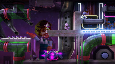
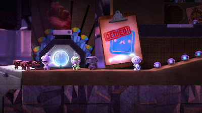
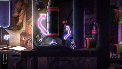
Little Big Planet 2 then, appears to be much the same in this regard; the characteristic real-world physics of the title so integral to the very core of the game backed up by some impressive, and downright interesting engine enhancements. This is precisely the reason for us to be taking an extended look at the title. What we have here could almost be described as a full tech analysis of sorts, but in reality it’s more of a small glimpse, and dare I say, intriguing update into what media Molecule are doing with this sequel.
The first thing to notice, obviously, when going over the screenshots is the abundance of clean lines and smooth looking edges, or rather the distinct lack of any jaggies spoiling the scene. Now you might be thinking ‘supersampled’ when seeing the quality of the screens, and initially that’s exactly how I felt about the situation. However, this isn’t actually the case as all the screens you see on this page are direct-feed captures rendering in native 720p (1280x720), and are not downsampled from a higher resolution, as is usually the case with most PR shots released to the press.
The reason for the game’s lack of jagged lines and supersampled look then is clear - the use of morphological anti-aliasing has been implemented into the graphics engine.
Although the above anti-aliasing method has been confirmed by Media Molecule themselves you can still see some evidence of sub-pixel based jagged edges, another hint as to the inclusion of MLAA, as with supersampling this just wouldn't occur
MLAA has been featured a few times before here at IQGamer, namely when covering Santa Monica Studio’s God Of War 3, and more recently Guerrilla Games’ Killzone 3. It feels like not a month goes past without some new first-party title using the technique, a technique which is not only cost saving in terms of memory, but also in terms of securing the highest levels of image quality in a console specific release.
From the screens featured on this page it is apparent that the MLAA does far more for the image than what is possible via the more traditional MSAA, only to be beaten by supersampling (SSAA) which isn’t doable, realistically, on consoles due to the additional rendering performance incurred.
In LBP2, like with GOW3 the use of MLAA provides up to 16x MSAA coverage on some surfaces, and better than 4x on most others. The only area in which this form of AA falls down is when dealing with sub-pixel aliasing, where by any polygon edges smaller than the size of a pixel (this is a sub-pixel) receive absolutely no AA coverage at all. The same is true for MSAA as well, but not for supersampling which covers all aspects of the entire image. Regardless, this new form of anti-aliasing is a huge improvement over the 2xMSAA used in the first game.
Of course, the use of MLAA is just one part of many fundamental changes to the underlying graphics engine. For this sequel the developers have also opted for a solely forward rendering approach throughout the entire game, making transparencies and shadowing much easier to do.
Previously the original LBP used a differed solution to rendering lighting and shadowing in the game, which meant issues with displaying certain effects and also a reduction in shadow quality.
By switching to the traditional forward rendering approach this time around, the developers have been able to easily upgrade the shadowing system used in this sequel. Soft shadows are present throughout, which look much nicer than the hard-edged ones used in LPBP1, with shadows being cast for every main light source you can see, now without the need to pre-calculate them as shadowmaps like before. These soft shadows also blend in well with the game’s newly implemented use of screen-space ambient occlusion (SSAO), which is performed in real-time along with most of the lighting and shadowing.
This use of SSAO also gives an even greater depth to the image not found in the last game, complementing the range of visual enhancements on offer.
Seeing as the computational requirements for producing such graphics effects have probably also gone up, the resolution of these shadows is still relatively low compared to the rest of the game. I’m not sure how much resolution loss is occurring, although it is apparent that all shadows look slightly softer than you’d expect them to be, especially compared to if they were rendering in same resolution to match the rest of the game.
Transparencies however, now look to be rendered in a higher resolution than the first game, using proper alpha coverage, whereas before they were rendered in a half-res of sorts using the bandwidth saving alpha-to-coverage, which lead to a slight screen-door effect being present on all objects that featured it.
The true nature of the translucency is a nice touch, and goes well with other enhancements being made to the whole particle/effects system used through the game.
From what we can see LBP2’s use of soft dynamic shadowing in combination with SSAO is undeniably impressive, providing an incredibly life-like appearance to how the whole scene is lit at any given time. The tightly woven nature of the lighting and how it commands the way shadowing occurs in the game cannot be understated, and to this the addition of a global illumination (GI) style solution adds more believability into the mix.
In LBP2 light on some stages looks like it travels down from a main point (the sun, or a singular internal light source) into the world appearing like it reflects off some objects and onto others as it shades and lights the environment. An impressive visual trick, as in reality it isn’t being done in real-time at all, but instead is a pre-calculated simulation that uses something along the lines of a lightmap, moving these around on certain surfaces to create this effect.
The illusion of proper GI, and some cleverly implemented god rays is the focus here, convincingly backing up the original LBP’s realistic lighting model. Alone, these elements are merely hot discussion points. But when all brought together they bring a real sense of naturalness and cohesion to an abstract game world, much like in the way the use of physics provides us with some tangible connectivity between the game and our own experience of reality.
There's still a disconnect for sure, seeing as the whole style and notion of the game’s world is completely off-the-wall, but in it’s own little confines feels completely organic, succinct even. And that’s perhaps Media Molecule’s biggest success, not the visual wonderment that all these effects and improvements provide, but the ability for them to casually sink in and blend together so seamlessly into being part and parcel of the experience.
Low resolution shadows aside, and maybe some stray un-anti-aliased sub-pixel edges, LBP2’s tech has seen some noticeable changes, and some ingenious solutions to problems most lesser developers tend to flake over. The game isn’t visually outstanding from a ‘wow factor’ point of view, but instead has its moment in delivering small subtleties that do more for the overall experience than just for the sheer technical hell of it.
Labels:
LBP2,
little big planet 2,
MLAA,
ps3,
tech report
Wednesday, 21 July 2010
Editorial: Why Sony Mandates 720p For 3D Gaming
Creating games in 3D is an arduous task, with the need to render two separate frames (one for each eye) baring a heavy load both on the consoles and for the developer, the quest to reach that mythical 18080p status weighing in on the back of their minds against the ever increasing demands of the consumers this generation.
The solution then, it seems, is simply not to participate in such an endeavour in the first place, instead dictating somewhat more manageable terms to developers and anyone looking to venture into the 3D space. And this is exactly what Sony are said to be doing, mandating a standard of 720p for all developers wanting to make their games in 3D.
Just a few weeks after Housemarque and Ilari Kuittinen revealed on the PlayStation Blog that they had Super Stardust HD running at 1080p and 60fps in 3D, Sony's Simon Benson recently commented at the Develop conference in Brighton that the company was planning to enforce a 720p maximum resolution mandate to developers. This means that even if you are able to get your game running at a higher resolution it will be downscaled by the machine into 720p, much like what will be happening Super Stardust HD as soon as the next PS3 firmware arrives.
The reason behind the move is simple. It’s partly due to the HDMI 1.4 specification not supporting 1080p60 officially (1080p24 is the highest it will go), and to make things easier for developers by taking the pressure off in trying to get things running in 3D at 1080p by removing the option. Perhaps that is not such a bad thing as many games struggle to render in native 720p let alone 1080p, and at 60fps that whole scenario dramatically worsens considerably.
Benson also came to this conclusion and mentioned at the conference that despite the mandate being applied to most games, some ‘more cinematic’ titles which could benefit from using a higher resolution and lower framerate would be allowed access to the 1080p24 3D rendering mode supported by the console. No games would be able to use 1080p60 even if the developers had comfortably implemented it.
Sony’s argument over the use of 1080p60 then, or rather, 1080p for 3D gaming in general seems to be directly aimed at the stresses of getting games running to that standard in the first place. Benson emphasised the difficulties that many developers would be facing and told attendees that this mandate was a way of curtailing that. A preventative measure of some sorts, restrictive but at the same time ultimately beneficial, especially when you think that having more stuff on screen at 720p is usually far more impressive than a game being cut back in order to hit 1080p.
However, rendering at 1080p60 in 3D doesn’t have to mean rendering one frame for each eye, as Crytek has shown so enthusiastically at this year’s E3. Instead it is possible to render in one single frame for 3D, like with normal 2D rendering, and to simply apply a form of 2D displacement tech to the image (2D to 3D conversion) thus creating a final 3D display without any of the usual workload involved. We talked about Cytek’s solution here, although Sony have also said in the past that they were working on something very similar.
So the question is why are Sony restricting the rendering resolution on 3D games when clearly they have, or will have in the near future, a solution which circumvents rendering two frames instead of one. Surely that in itself would make things much easier for developers without taking away another all important check-box feature. But perhaps that’s the point, that for this generation 1080p is largely just that, a check-box feature that has more use on paper than practically in games development, and when you consider the potential performance costs incurred by running in 3D then it makes perfect sense.
Either way, the removal of 1080p60 and 1080p24 does very little to harm the end user. When you consider how many titles actually use the resolution effectively, and that contain more detail and visual effects when running in this mode, you can see why the chase for the supposed holy grail that is 1080p isn’t particularly justified, and could even be described as wasted.
That said, there is no doubt that some of us out there will still salivate over the potential of seeing another title pushing that magical 1080p60 resolution on consoles. It’s an incredible feat when you see it in 2D, so how much more spectacular would it be seeing it in 3D, full 1920x1080 no less. This is not something that we will be able to tell you with Sony’s proposed plans, but is it really going to make all the difference? I suspect a resounding no is the answer.
Personally I’d much rather be seeing more titles running in full 720p and with at least 2x multisampling anti-aliasing, or morphological AA at 60fps than a misguided attempt at 1080p with absolutely none of those benefits. And judging by Sony’s reaction, and indeed Crytek’s 2D displacement tech, many developers feel the same way.
Tuesday, 20 July 2010
New Xbox 360 Announced, Kinect Pricing Revealed
Yesterday we brought you our in-depth hands-on with the new 250gb Xbox 360 S, and a few days before we reported that a potential replacement for the 360 Arcade was on the cards. Well, today Microsoft officially announced not only the brand new version of the ‘Arcade’ console, but also full pricing details and bundle information for Kinect.
For the latest version of the 360 Microsoft have dropped the ‘Arcade’ suffix instead naming both the current S and the new machine by their memory capacity. The 4gb Xbox 360 becomes the new entry level console, and will be released on 3rd August in North America, priced at $199.99, and 20th August in the UK for £149.99, with the rest of the world taking delivery of the unit sometime later this month.
This new 360 will have 4gb of flash memory instead of a 250gb hard drive, whilst keeping the full functionality and other features of the 250gb model, including the built in Wi-Fi adaptor. The hard drive used inside the 250gb slim will also be compatible with the new model (in which the expansion bay is empty), although Microsoft currently have no plans to release it separately, or in any other sizes at this point in time. You can probably expect another announcement about this later on down the line.
Like with the 250gb 360 S that launched last month in the US, and last week in the UK, the 4gb version will feature the very same slimmed down design, complete with the trademark chrome highlighting and touch sensitive buttons. However the shiny aesthetics of the 250gb S model has been discarded for a more favourable matt finish, much like the old model 360’s and PS3 Slim.
Along with confirmation of the Xbox 360 Arcade’s replacement Microsoft also announced full pricing details for Kinect, both as a solus bundle (Kinect + game) and as a package with the new 4gb 360 console.
Kinect will be released sometime this November (date to be confirmed) and will come bundled with Kinect Adventures. The device will retail at $149.99 in the US, and £129.99 in the UK. All first-party software will retail for of $49.99, and £39.99 respectively. Third-party games will have no baseline retail price, with the publishers of individual titles being able to set their own price brackets accordingly.
Both the Kinect and 4gb Xbox 360 S console will be available as a package. It will be available the same day Kinect launches and will retail for $299 in the US, and for £249.99 in the UK.
Microsoft also confirmed that around 15 games will be available at launch, with a large selection of first and third-party titles being available.
On a final note, the revelation that the console and Kinect bundle will contain the 4gb version of the machine is perhaps unsurprising.
Previously many people suspected that the Kinect + 360 would contain the higher-end model of the console. However, this simply isn’t the case with Microsoft opting to instead package their entry level model with the device in order to maintain a cheaper price point. Interestingly this puts the machine and Kinect in the same bracket as the stand-alone 120gb PS3.
Monday, 19 July 2010
Feature: Hands-On With The Xbox 360 S
On Friday 16th July gamers in the UK were finally graced with the release of the brand new Xbox 360 S; a slimmer, quieter version of the current Elite model 360, with a 250gb hard drive and built-in wireless adaptor. It comes as no surprise that early sales of the machine have been brisk, with many stores opening up on midnight in order to generate further hype for the launch. And by and large it has been largely successful, bar perhaps the odd complaint of having a faulty hard drive, or trouble with the new machine recognising the Data Transfer cable.
Naturally, I took it upon myself to pick up one of these new slim consoles in order to write this in-depth report for IQGamer, in which we’ll be covering the machine’s design, connectivity, build quality, and of course operating noise.
On first impressions, and before holding the unit for the first time, the 360 S appears better in every single way than the old ‘fat’ models that came before – especially compared to my original 20gb launch unit (just about going strong) – although on further inspection it is clear that not all is quite so perfect. But then again, it doesn’t really matter given the massive improvements that have been made in almost ever area with the new machine.
The first thing you’ll notice is that upon initial viewings the packaging is pretty similar to the one that housed the old 360, featuring the same square shape, whilst instead having bottom-opening flap allowing easy access to the contents inside. If you haven’t seen the old box in a while then the new one looks to be the same size, maybe only slightly smaller. However, side-by-side comparisons show a clear inch or two being cut off the sides, whilst being slightly taller overall.
Seeing as the actual console is almost the same size as the old 360 it isn’t at all surprising to see a similarly sized box that keeps it all together. However it does weigh noticeably less than my 20gb Premium when boxed up, although by no means light, simply commanding less strength in order to lug it from the retail store to the bus stop, and then home than the older model.
Inside, the 360 S is packaged similarly to before, except that now the individual compartments for holding the controller and other accessories are better organised allowing for things to be unboxed and boxed up again more easily. Underneath where the actual console sits are four distinct compartments, each housing the different peripherals that come with the machine. The largest one contains the controller and wired headset, whilst the two on either side contain the power cable and composite lead, along with the scart adaptor. At the end of these three compartments is where the power supply lives.
The overall internal layout is much simpler this time around, thus making it easier to pack away the console if need be in the future. Also, two of the sections are clearly marked with small stickers dictating what should occupy these specific spaces just in case you forget. Yet another improvement over the horridly packaged ‘fat’ model 360.
In terms of the actual console, noticeably, Microsoft have gone to town in producing a sleeker, more high-end looking aesthetic for their new Xbox 360 S. The old matt plastic look has been replaced with a smooth, glossy finish that only comes in black. Chrome highlights provide a small contrast between the black contours synonymous with the Xbox 360 Elite; the new power button and both outer edges of the machine benefiting from this touch of class. Round the back the aesthetics again change slightly, instead becoming a combination of the new shiny gloss design with a slight hint of the old matt finish around the various ports.
Annoyingly, this new shiny design as stylish and sexy as it is, is prone to attracting dust and fingerprints which can cover the machine in seconds if you’re not careful. Likewise, the 360 S also scratches really easily. Even using a fine micro fibre cloth regularly used for cleaning the PSP and ‘fat’ PS3 can leave very slight marks. Although these are only visible in certain lighting conditions and from a specific angle, so its not too much of a problem.
The previous inhaled design remains on the ‘S’, although now it is complemented by a new angular focus with sharpish curves leaning inwards on both the front and back of the machine. Initially this looks somewhat strange, especially when resting the machine in its standard horizontal position. However, standing upright it looks incredibly stylish and far more desirable than the old console. This new look and feel is accentuated by the use of touch-sensitive buttons for powering on/off the unit, and for opening and closing the disc tray, which remains a traditional slot loading drive.
Surprisingly, the new 360 S is still rather heavy, more so than I expected, and the overall build quality is superior to the old versions of the console. However there are some parts of the design which feel decidedly cheap to the touch. Like with the plastic casing on both the top and bottom of the machine, which tends to creak as you hold it. The console also feels a touch softer and more flexible too - no doubt made this way to better enable the plastic to constrict and contract as the internal temperature of the machine heats up during use, and cools down after.
Compared to the old 360, the ‘S’ is only slightly smaller in size covering almost the entire length of the original console, though it is slightly shallower as well. For something rumoured, and sometimes officially recognised as the 360 Slim in passing it’s quite disappointing how similar in size to the original it is, especially when you consider that the power supply is still external. Sony, with their Slim PS3 should really be commended on their engineering prowess seeing as both the power supply and hard drive are both built-in, and the machine itself runs a little bit quieter overall.
Despite this, Microsoft’s first entry into redesigning a console midway through its life-cycle has much to offer, and the use of the old-fashioned slot-loading DVD makes shrinking down the internals that much harder. Effectively how much smaller can you make that drive, is the question you should be asking.
Either way the new ‘S’ variant of the 360 hardware looks far more sophisticated, and highly stylized.
In terms of connectivity the new 360 S features the standard two USB ports situated around the front of the machine, under a flap next to the new rectangular shaped controller sync button. The disc tray remains a slot loader like the previous models of the console, although it is much quieter and feel a tad more solidly built. Round the back you have a further three USB ports, along with an Ethernet port, optical output, one HDMI port, multi-AV out, and a special port design solely for powering and interfacing with the Kinect unit.
Like with the Pro and Elite model 360’s, it is still possible to use the HDMI cable with the AV audio adaptor if you require the option of analogue stereo sound from the machine going into a hi-fi system or external amplifier.
The machine also features the use of a semi-built-in hard drive located on the bottom, or right hand side of the unit depending on whether you have it laying flat or standing up. I say semi-built-in as although the HDD is housed inside the 360 itself, it is fully removable and comes locked away in its own plastic casing. As we first revealed here, the HDD is a Hitachi HTS545025B9SA00 1.5Gbps hard drive which connects to the 360 using a standard SATA connector.
Moving on to the controller, and you can see that Microsoft have made similar aesthetic changes in order for it to match the new style of the console. The entire controller, save for the four face buttons and the Guide button have been made uniformly black. The underside of the pad is now finished in glossy black rather than the matt grey of the Elite and Pro models, or the shiny metallic silver of the Core and Premium units. Both the D-Pad and analogue sticks have also gone through a similar change, appearing black instead of dark grey, while the Guide button has given a shiny chrome finish representative of the highlights present on the console.
Other than the look of the controller not much else has changed. The D-Pad does feel slightly more responsive compared to the one that came with the controller with my launch unit, although it doesn’t appear to have full eight-way precision like the on the Japanese Sega Saturn pad. In that respect, playing fighting games using this new D-Pad is still a chore with certain quarter-circle type movements being incredibly fiddly to pull off. At least all four directions actually work this time around, unlike on my launch 360 controller in which parts of the D-Pad have always been largely unresponsive requiring a heavy push in order for the press to be recognised.
Outside of the console and controller both the hated power supply unit, and AV cables have been given a complete makeover, appearing to match the new styling present for the entire range of ‘S’ accessories and hardware.
Styled in black, with a matt finish, the PSU is now much smaller and lighter than before. Curved in its appearance it can finally be considered stylish for the first time, though more importantly it seems to accompany the main hardware pretty well, rather than looking like an eyesore trailing out from behind the 360. The power cable that goes from the PSU to the 360 also slots into the back of the machine almost effortlessly; a stark contrast with the constant wiggling and pushing required to get it coonected with the old non-HDMI models.
The same principles when it comes to styling have been applied to the AV cables, which now have a more angular look to them. They are less rounded compared to the old ones, but still display just enough of the smooth curves to be consistent with both the 360 brand as a whole while matching the new 360 S console.
Sure enough, from a purely design and aesthetics point of view the new 360 S is lovely, but all that isn’t going to count for much if it still sounds like a Jumbo Jet taking off from Heathrow now, is it? And the less we talk about the noise problems of prior versions of the old console the better.
However Microsoft have made waves with this new design, the newly fabbed Valhalla chipset demonstrating some noticeable decreases in operating temperature, and most importantly, noise, especially when inserting a game disc into the system.
Powering on the console for the first time using the touch sensitive button on the front of the unit, you are almost immediately graced with a fairly loud, but smooth ‘bing’ sound coming from the machine. It’s s very welcoming and goes well with the aesthetic style Microsoft have created for the console, and the new sound effects used in the NXE 360 dashboard.
Reassuringly, this is the most noticeable noise to come from the console at start up.
One of the main complaints about previous models of 360 was the high level of operating noise coming from the machine, especially when a disc-based game was inserted into the system. Installing games onto the hard drive partially solved this problem on the old 360, but now this is no longer required for an all-round quieter experience. Claims by Microsoft of the new unit being ‘whisper quiet’ were initially to be taken with a pinch of salt. However, when idling the new 360 is actually barely audible unless turned on in a completely silent room. By contrast my 20gb launch unit can be heard at all times whether or not a disc has been loaded into the system.
Like with my 20gb Premium, installing games into the new 360 S leads to an even quieter gaming experience. When playing a game via a disc however, the fan speed still ramps up on this new model and the familiar electronic humming noise appears, albeit no longer drowning out the sound coming from the TV. Installing the game means that this never happens, with the fan speed sticking at idling levels for the duration of your gaming session.
Installing games then is still the best possible way to experience just what the 360 can deliver, with less noise leading to greater levels of immersion and less in the way of a distraction. But does the new HDD equate to shorter install times and quicker loading compared to standard disc-based approach?
In short, yes and no. You see whilst I found the new 360 S quicker to load up games off the hard drive I also found it slightly slower in installing them in the first place. Right off the bat I can tell you that average install times for the few games that I tested (Alan Wake, Halo 3, VF5, Gears 2, and Resident Evil 5) was about one to two minutes slower than on my 20gb Premium. Loading times however, were either on par or slightly faster, as was the case when trying out Bungie’s Halo 3 on both machines.
This is an interesting find to say the least, but also somewhat confusing as I’m not too sure why it should be happening. Could the size of the hard drive have something to do with it? Or perhaps something to do with cache size and speed. Maybe we shall do a proper investigation into this later on at IQGamer, as our initial results are surprising.
In conclusion, from all my time spent with the new Xbox 360 S I can definitively say that the machine IS what the original 360 console should have been. Even though it isn’t that much smaller – in fact it’s pretty much the same size – it looks a whole lot nicer and runs far quieter than any of the old models. It should also be noted that we shouldn’t be seeing any more of that RROD death problem which plagued most original and Falcon chipset 360’s, not least of all because the rend ring physically doesn’t exist on the new model, but simply due to the reductions in operating temperature and better cooling provided by the 45nm Valhalla revision to the CPU and GPU.
So, in the end the 360 S represents an improvement over the previous design in almost every way, minus perhaps the shiny finish which will certainly see the unsightly disfiguration of many consoles before reaching the end of their natural life-cycle, and shows how much time has been spent consolidating the hardware, and making changes where necessary.
Outside of the sleeker look, quieter operating noise, and built in wi-fi and 250gb hard drive there isn’t much to sound off about, and a much to be content with. Some may complain that the machine isn’t really a ‘slim’ version of the console, but given the technological and financial constraints it is unlikely at this point in time that Microsoft could have done any better. The end result is a highly polished successor to the long running line of original Xbox 360 consoles, and a brief look at the future of the platform.
Saturday, 17 July 2010
Killzone 3 To Have More Responsive Controls
Killzone 2 suffered a lot of criticism from many gamers surrounding its controller response time, as a fair few found it laggy, and somewhat inaccurate at high speed compared to the likes of Call Of Duty. Initially, it was simply believed that the developers had attempted to deliver the sensation of weight much like when physically holding each of the weapons in real life - a crude approximation if you will. Although later on it was discovered that there was more latency between button presses compared with other comparative first-person shooters.
Some sites reported that Killzone 2 featured lag up to 150ms from when pressing a button on the controller to a visible response on screen. Compare that to the likes of Halo 3, which provided just 100ms of delay, and you have an either a noticeably more sluggish experience, or a heightened sensation of weight envisioned by the development team for the title.
For the upcoming sequel Killzone 3, Guerrilla Games has been looking into the issue and aim to bring about the same sense of realism without the lag that so many found intrusive to the experience.
Via the official site Guerrilla Game Director Mathijs de Jonge wrote:
"Our first priority when we started working on the controls for Killzone 3 was to listen closely to Killzone 2's players - what they liked, what they disliked, and how they felt things could be improved," He said. "Accuracy and responsiveness consistently came up as the top issues. At the same time, a lot of players were saying they loved the weighty feel."
On top of this he also stated that the team were hard at work in delivering an optimal degree of controller response time for Killzone 3, hopefully preserving the feeling of weight without sacrificing the fluidity required, and indeed expected from such a high-end FPS.
"Right now it's still a work in progress," Mathijs explained. "But we're definitely getting there. We've recalibrated the dead zone to be more responsive and significantly reduced the input lag, resulting in far better accuracy. Best of all, we've managed to retain that sense of weight that set Killzone 2 apart from other shooters. I can't wait for people to try it out."
This can only be good news for the people who felt Killzone 2’s controls to be a little too slow for their needs, especially when the sensation of weight doesn’t necessarily have to mean any additional input lag to facilitate it.
Thursday, 15 July 2010
Review: Earthworm Jim (XBLA & PSN)
Earthworm Jim was one of my favourite Megadrive games of all time, although it didn’t start out that way. When I first played the game I was confronted by a steep difficulty curve and a unforgiving level design structure that confused me more than it cared to entertain. After a few goes over three days I took the game back to the rental shop thinking that it nowhere as good as the likes of Aladdin or Cool Spot; two of Shiny’s best MD platformers.
However, a few months later something finally made me pick up EWJ again and alas, I found myself renting it for the second time. Surprisingly the game made more sense this time around. The previously confusing level layouts and cheap enemy positioning didn’t seem half as bad, merely providing a much needed challenge to an otherwise simplistic title. Maybe Sega Magazine was right about Jim - that it was one of the most essential must have titles released that year, along with Treasure’s guaranteed spectacular, Dynamite Heady. Or so it seemed.
Out of the two challengers to Sonic’s crown it was Shiny’s Earthworm Jim that most caught on with the general games playing public. The story was as simple as it was idiotic; a man-sized space suit had came crashing down from the sky and the stars above, landing straight on our invertebrate protagonist turning him from an ordinary earthworm into a alien blasting, cow saving super hero. This suit brought Jim intelligence, plus a whole host of enemies wanting to blow him to pieces and steal back that powerful suit he was wearing.
Tasked with battling your way through a bizarre mix of enemies, and something about saving a princess who’s name he can’t remember, the game saw your jumping, blasting, and swinging your way through eight levels themed around junkyards, hell, internal organs, a laboratory, and an underwater base, whilst also delivering its own unique brand of humour.
EJ was always a funny game, with enemies ranging from a psychotic cat with genius levels of IQ; a goldfish with an eye for world domination; and a wealth of bizarre creatures ranging from killer crows to a Jekell and Hyde type puppy dog. It was also incredibly tough, requiring some precision jumping, and extremely quick reflexes in order to navigate some of the devious levels the designers had waiting for you.
Earthworm Jim HD then, is more of the same. In fact, it is almost exactly the same, right down to the obviously amusing character designs and twisted level layouts. What you have here is the 1994 original, remade with brand new, hand-drawn HD graphics, a reworked soundtrack, and disappointingly, completely new voice acting for all the characters and some less than stellar sound effects.
In terms of looks you can tell that every single frame of the original game’s animation has been re-drawn in HD for this version. The vast majority of animations still look really smooth, and almost Disney-like at times - just one of the trade marks of Shiny’s 16bit output. Everything from when Jim scrunches up his face in anger, to when his big eyes almost burst out of his face when hit are all accurately represented here in this HD take on things. Jim’s range of moves is also identical, being armed with a plasma pistol and his own wormy body as a whip, used both to grapple on hooks and to slap the enemy into submission.
The only qualm is that the new flash-like visuals lack some of the personality and raw detail to be found in the original’s 16bit bit sprites, though admittedly not all, with much of the humour based off the graphics still coming through. More importantly, every last sprite created for this remake is at least trying to accurately represent the original artwork, rather than completely re-envision it for modern day audiences. Essentially the flash-style nature of the work does this instead without cheapening the overall look and feel of the game too much.
Gameplay wise, some fifteen years on from its original release Earthworm Jim is still a solid enough title, challenging and reasonably fun after a while, even if being a little too abstract in its design to be completely successful today. Initially frustrating, the game regularly presents you with some rather confusing level design choices and some limitations with regards to how much Jim can use himself in order to traverse certain areas of his environment. For example, he can only jump down from hanging onto wires or hooks, rather than being able to jump up to reach higher ledges or platforms. Instead the game makes you find alternative routes to reaching a previously unreachable destination. Sometimes this pays off and reveals a rather cleverly thought out approach to the strange level design. More often that not though, it simply leads to more frustration and another trip to the continue screen.
However, It is also apparent that EWJ isn’t all that hard once you get back into the swing of things, learning the layouts of each stage and knowing where to jump, and which parts of the environment to touch or avoid. In this respect EWJ HD is as faithful as it could be to the original MD game, and to an extent that is actually a good thing. Some of the design choices that initially seem bizarre to modern day audiences start to make some kind of sense, and you can begin see how the developers have tried to craft a fine balance between a fair challenge and impossible odds. Jim has always had less in common with contemporary platform games in this regard, although in 2010 this maybe does him more harm than good.
Combined with its off-the-wall sense of humour, strange characters, and filled with originality, EWJ is still a potentially enjoyable game even if it doesn’t quite hold up as well as you remember. Newcomers to the series, and old fans without the patience required to enjoy it will surely be disappointed. Give it a chance though, and Jim can be a reasonably entertaining and particularly challenging alternative to other 16bit platformers of the time. Worthy of the HD remix treatment? Maybe not, but better than another poor attempt at a 3D sequel.
Sadly, not everything is quite as forgivable with this release. Whilst some of the gameplay deficiencies can be overlooked (more a deliberate part of the design than anything else), the use of new sound effects and poorly arranged soundtrack simply cannot.
The developers at GameLoft have taken the liberty of changing the voice work for Jim and some of the other characters, making them sound annoying different whilst also taking away some of the endearing personality they had in the original. Voices sound scratchy, and appear to be slightly compressed lacking the clarity they need, thus doing more harm than good for the experience. The brand new arranged soundtrack doesn’t fare so well either. It’s more upbeat and electric than the16bit tunes of the MD original, giving the game a more modern feel but at the cost of becoming intrusive during play.
However, the new sound effects, voices and music do suit the new flash-styled visuals on offer in EWJHD, which is not really all that surprising as the visuals themselves lack some of the detail and personality contained within the original’s 16bit pixel art, but appear fresher and more modern as a result. But perhaps that’s the problem; all these changes cheapen the experience somewhat, and only help to heighten the gameplay issues as you become less immersed in Jim’s world as the game’s outrageous humour loses its sparkle throughout all the tampering.
Despite some annoyances with this HD remake, Jim holds itself together pretty well and provides fans of the original with the best conversion of the first EWJ game since the Win 95 and Mega CD releases. Misguided audio aside there’s very little to complain about in terms of the game being authentic, and certainly, there’s none of the sloppy control problems and graphical slowdown which ruined both GameBoy Advance iterations of the first two games. Perhaps the only real downer is that the game design hasn’t aged very well, often proving to be incredibly frustrating at times, and that the new multiplayer features included in this release are next to useless seeing as very few people appear to be playing it online at the moment.
Earthworm Jim HD may well be worth checking out for die-hard fans of the series, who are likely to quickly become accustomed to its unforgiving nuances, though it isn’t quite as easy to get into as it should be with the level design and gameplay issues putting a dampner on some interestingly twisted characters, and a genuinely warped sense of humour. It that respect, it is almost exactly as you remember it, which is both a blessing and a curse, depending of course just how you decide to approach it and whether or not you care to get around the game’s initially confusing design choices.
VERDICT: 7/10
Wednesday, 14 July 2010
New Xbox 360 S 'Arcade' Coming Soon?
The brand new 250GB Xbox 360 S was just the beginning of Microsoft’s strategy for the their remodelled version of the console. After replacing the now discontinued 360 Elite the company now apparently have plans to reintroduce an arcade version of the 360 based on the new slim design.
According to Amazon.de an new "Xbox 360 4GB Arcade System Bundle" will be released on the 20th August and comes with a speculated 149 Euro price point. However the news isn’t exactly fresh, as Microsoft has recently discussed their interest in releasing another Arcade model 360 based on the new design exclusively for the US market, although European support seems at this point to be out of the question – officially at least.
In an interview with Eurogamer, Microsoft’s Neil Thompson stated that the company had no plans to launch another model of the new 360 in Europe, instead focusing on the current 250GB slim and the continuation of the original 360 Arcade unit.
"The Elite model we'll slowly phase out, but we're continuing with the Arcade model as it stands,"
This response was the exact opposite to what Microsoft’s US arm has said in the past, although that would explain the current situation with many retailers in which the Elite model is completely sold out, but the Arcade in comparison is still reasonably stocked.
The other point is that he could mean that the existing Arcade SKU will be moved into the slim design but without the 4GB storage space listed by Amazon, being more or less an exact continuation of the current system. Of course this is very unlikely, and all signs simply point to his stance being more centred around the company wanting to make a proper official announcement on the matter nearer the time, and after supplies of the old 360 Arcade have run dry.
Either way we should find about this ‘new’ version of the 360 Arcade soon enough.
Monday, 12 July 2010
Tech Analysis: Infamous 2 - Early Screens & Trailer
Infamous 2 made its debut at this year’s E3 showcasing a slight change in art style and numerous graphical upgrades. For the first time the series looked reasonably impressive, throwing around more detailed characters and environments with even greater use of the fancy lighting effects which propped up the first game.
The look was clearly refined, and the tech powering the game enhanced over and above the original. And that is exactly why we are going to be looking at Infamous 2 today, having a peek at what lies beneath the graphical upgrades you might have witnessed in the game’s E3 trailer and demonstration footage.
The original Infamous wasn’t particularly graphically impressive, with no anti-aliasing creating loads of crawling jagged lines, and the somewhat poor texturing, combined with the dark and gritty art style often counteracting the game’s technical proficiency. So it pretty surprising to see this sequel actually appearing relatively impressive this early on in the game, especially when you think about how the build shown off at E3 was pre-alpha code with many engine improvements yet to be implemented.
Sucker Punch has looked at the criticisms levelled at the first game’s visuals and has set about improving them in every way, with a more refined art style backed up with a range of noticeable technical enhancements.
Most interestingly is the announcement that the developers are targeting 60 frames per-second in time for the game’s release – that’s double the framerate of the first game, no mean feat considering the series open world nature. Coincidently, I actually stated whilst playing Infamous, that I though it looked like a 60fps game but running at 30fps, one that appeared to be held back by a lack of optimisation and certain compromises usually associated with titles striving for that rarely seen benchmark in smoothness.
Considering the size and scope of the game it is unlikely that a constant 60fps will be obtainable in this sequel. Instead I expect that Sucker Punch will be able to deliver a framerate that fluctuates between 60fps and 30fps, with the average count hitting around 40-45fps in most scenarios (much like in God Of War 3). So better than 30fps, but not quite the revelatory solid 60fps that is considered the Holy Grail then? We shall have to wait and see.
Like with the original, Infamous 2 appears to be rendering in 720p (1280x720) with no anti-aliasing of any kind, though given the compressed nature of the screenshots it can be quite hard to tell. It could well be 640p, no AA, but both the blur effect combined with the compression artefacts prevent any flawless pixel counting from taking place. Either way, from these screens the game looks closer to 720p with blur than anything else.
In terms of the no AA claim, initially I found that there could be some kind of selective edge smoothing could be going on, however this isn’t actually the case at all. What is basically happening is some reduction in jagged lines caused by the games use of blur and post process effects, which in motion do little to alleviate the overall appearance of aliasing, but in stills do help to cover up the jagged nature of the game’s visuals - although not to the extent of using a proper AA solution. Evidence of aliasing can be found in parts of the image being blurred, which again further proves the lack of any AA.
However, seeing as Infamous 2 is only at the pre-alpha stage it is possible that the developers may well include some form of AA in the game. A strong possibility is the use of morphological anti-aliasing, which is relatively easy to implement if you have a few SPU cycles spare. Although just a guess, it would make perfect sense, and it’s pretty unlikely that someone at Sucker Punch hasn’t already considered the approach for this sequel.
Outside of the resolution and lack of anti-aliasing Infamous 2 is sporting a whole host of obvious engine improvements. The characters in particular have been completely reworked, looking far more detailed than before using more geometry and greater levels of texturing. The art style, although still dark and gritty, now has strong influences from Naughty Dog’s Uncharted series, in particular Uncharted 2, looking smoother and more polished as a result.
Looking closer still, you’ll find that it’s not just the characters that have seen a large increase in detail. The buildings which make up the cityscape, and the cars which populate it have also seen noticeable improvements. The buildings are more detailed, and like the characters, benefit from having better use of texturing and increased levels of geometry. In particular the game’s LOD system seems to be less aggressive compared to the first Infamous with buildings retaining detail much further on in the distance compared to before.
Of course, texture detail and geometry complexity are only part of what makes up a graphically impressive game world. In order to make it truly convincing you need to have a balanced and consistent lighting system, with realistic and dynamic shadowing - something which the developers are keen to showcase with Infamous 2.
From the screenshots used in this feature, and from the E3 live demo, and recent trailers it is clear that Infamous 2’s light sources have a greater range compared to the ones used in the first game. Notice not only how the light travels further away from its point of origin, but also how it affects objects all around it, lighting up surrounding shadowed areas and casting some new shadows in others. Unfortunately, at this point none of the dynamic lighting given off by the games visual effects actually casts a shadow of itself anywhere on the environment. Instead it simply creates new or extended shadows for environmental objects.
Enemies do however cast shadows this time around - the fact that they didn’t before is something that looked a little odd, and there appears to some evidence of screen-space ambient occlusion (SSAO) going on in the environment. Just focus your eyes on the signpost to the right-hand side of the street, looking at the shadowing behind it. There are clear signs here that SSAO has been included in this sequel, and the result is a greater amount of natural depth to the overall image. This was something that the original Infamous sorely lacked, and is something which clearly benefits this sequel.
Moving on, the particle system featured in the first Infamous was quite impressive at times, especially when the screen became filled with lightning and sparks began to fly off surrounding metal objects and vehicles. So for Infamous 2 Sucker Punch have also upgraded this part of the engine. Particles are larger and the lightning effects themselves seem to have more of an effect on the surrounding environment than with the first game.
Most of these visual effects all appear to be running at the same resolution as the rest of the game, although compression once again prevents us from accurately gauging this one hundred percent. We can also see that some are clearly rendered using a lower resolution alpha buffer, though the difference is very slight indeed. Sadly the same cannot be said of the smoke particles to be found in the game, which are not only low res, but are also flat 2D sprites which occasionally stand out when combined with the other 3D effects. Still, this issue is only apparent in certain situations, and is unlikely to be noticeable during gameplay as it is in still video captures.
On top of all the improvements that Infamous 2 is delivering we can also glimpse from the E3 live demo, and recent trailers that there is far more in the way of destructible scenery compared to the last game. The sheer amount of things that can be blown up, and that can catch on fire is noticeably greater, as is the level of detail in these objects, which have all benefited from improved texturing and better modelling.
From what we’ve seen so far Sucker Punch has upped the ante for this sequel, refining and building upon an already solid game engine with an even better one. The improvements to character and environmental modelling are obvious, as is the improved lighting and larger special effects, all of which help to create a better sense of depth to the image and generally gel together in creating a more polished look in accordance with the adapted art style.
Surprisingly, the developer also hope to have the game up and running at 60fps by the time of release sometime next year. Surprising, because Infamous 2, like its predecessor, is an open world game, one which features sprawling environments, and at times, densely populated areas which will no doubt compromise the engine’s ability to maintain the targeted 60fps.
However, if this sequel sticks to the level design blue print of the first game then there shouldn’t be so much of a problem. The original Infamous made use of having various tall buildings obscuring distant streets, and denser parts of the environment in order to maintain framerate, so it’s highly likely that the developers will do the same thing here in this sequel. This controlled use of your viewpoint in a game in which the player controls the camera, and in which the engine cannot predict the load, is particularly important in maintaining a smooth framerate - let alone 60fps, especially when optimisations in other areas may not be so convenient when you’re pushing around more onscreen at any given time.
Either way, Infamous 2 is shaping up rather well. Graphically, at this early stage (its pre-alpha) it already looks noticeably superior to the last game and still has ways to go until it’s finished. Nailing down that now seemingly mythical 60fps is going to be the toughest challenge the developer faces, along with maintaining resolution and overall environmental detail at the same time. But so far it all looks to be going smoothly, with controlled use of lower-res transparencies, and only minor such cutbacks in image quality in order to sustain the various improvements we are seeing.
As more developments surface we shall be taking another look at the technology behind Infamous 2 in the future. Hopefully some uncompressed framebuffer grabs come our way finally allowing us to properly determine rendering resolution and clear up any inconsistencies we might be finding.
Subscribe to:
Posts (Atom)