Sunday, 30 May 2010

Tech Analysis: Red Dead Redemption (360 vs PS3)

There’s no doubt that Rockstar are onto another success story with Red Dead Redemption. Piece together the same kind of open worldliness as in Grand Theft Auto IV, along with some traditionally styled old west action, and you have another finely crafted and life-consuming experience. If there were ever a game to make your Clint Eastwood fantasies come true, then RDR would be it.

The underlying engine behind the game is based on the same impressive tech that powered 2008’s GTA IV, expanded upon, tweaked and refined, perhaps pushing the most it can get out of the current consoles. Well, without a complete rewrite that is. And like with the GTA IV conversion, there are many similarities between the two games. Everything from the rendering resolution and the use of anti-aliasing can be plucked right out of Rockstar’s last multiplatform title, so it’s no surprise that some of what you’ll be hearing today is at least vaguely familiar.

Starting off, as always with the rendering resolution. RDR is presented in 720p (1280x720) on the Xbox 360 using 2xMSAA (multi-sampling anti-aliasing), whilst on PS3 is rendered in a slightly lesser 1152x640 and using the alternative QAA (quincunx anti-aliasing).

Straight away you can see that Red Dead is exactly the same as GTAIV in this regard, with the 360 benefiting from decent edge smoothing, and the PS3 having to make do with the blurrier quincunx solution. This choice appears a little odd, as both 2xMSAA and the standard QAA take up roughly the same amount of memory and processing requirements. So why use the poorer QAA option in the first place?


Well, the most obvious explanation is that the QAA in theory delivers more edge smoothing for the same memory cost as the conventional MSAA, so thus there should be less in the way of jagged edges. However the consequence is that QAA not only smoothens polygon edges, but also blurs general pixel details in the entire scene. So textures along with geometry become blurred, creating a softer overall image. Bizarrely the use of this QAA seems to be selective, with some edges getting clear levels of jaggies reduction, and others without.

Unlike in GTAIV, in which the blur effect actually added an ambience and a layer of atmosphere to the proceedings, in Red Dead it does nothing of the sort. The gritty environments of GTA made the QAA look fit in well with the game world, and the 360’s dithered textures made the loss of sharpness a worthy compromise on PS3. However RDR on 360 doesn’t really suffer from any dithering textures. Or rather, that the effect has been greatly reduced, and the bright and dusty open world nature of the game benefits from a sharper image, meaning that the blur effect simply heightens the differences between the two versions.

The 360 build however, isn’t free from criticism either. The high contrasting edges between the buildings with the bright blue sky often leads to noticeable shimmering, sometimes as bad as seen in the PS3 build. Most of the time these jaggies are in fact smoother than the ones seen on its PS3 counterpart but shimmer in the same way.

Essentially MSAA works by taking samples from two adjacent pixels, and then combines those samples with the final image to form an anti-aliased one. With edges in high contrast areas, there isn’t enough information to create decent samples to act as in betweens where the two pixels meet, thus the image receives either no AA altogether, or a significantly reduced amount.


In terms of texture detail and filtering, both versions are identical. Texture resolution seems to be the same on either platform with the lower 640p resolution of the PS3 game resulting in some additional blurring of the visible detail. This is caused by both the upscaled nature of the framebuffer, and the use of QAA, in which we’ve already discussed the technique’s unwanted side effects.

Anisotropic filtering is evident in the screenshots below, as is the blurred nature of the PS3 version’s textures, and general screen composition. The levels of AF don’t appear to be much higher than what is usually available with the older trilinear method of filtering. So we are looking at perhaps 4x AF for Red Read on both platforms.


One area of the game that has been noticeably paired back on the PS3, is the heavy use of alpha-based foliage. This seems to be the main reason for the lower resolution of the PS3 version and it’s use of a more aggressive LOD (level of detail) system in certain scenarios.

As we’ve discussed before at IQGamer, the use of alpha heavy transparency effects for objects like hair and foliage use up a huge amount of bandwidth, a commodity which is particularly limited in home consoles, but especially on the PS3 with its lack of high speed EDRAM. It’s this bandwidth advantage which allows the 360 to not only render more foliage on screen, but also render it at a higher resolution as well.

These two shots show exactly how much of the foliage has been cut back on the PS3 game. Notice how it is mostly only the smaller plants and grasses that have been culled, which actually has less of an impact during play than you might expect. However it’s also pretty clear that the environments in the 360 version look visibly more dense as a result of having loads more minor pieces of foliage.

Some major parts of the foliage have also been cut on PS3 too. When this happens, the Sony version of RDR looks much blander as a result, taking away some of that ‘living world’ look that the game at times possesses.
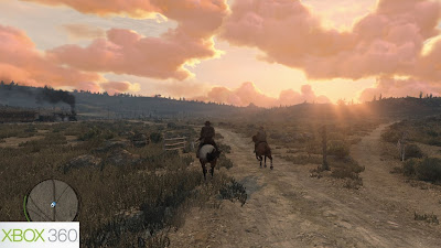


Whilst both versions use A2C (alpha-to-coverage) for the surrounding foliage - a memory saving technique for rendering half resolution transparencies in an interlaced type manner - the 360 version clearly benefits from better alpha blending through the use of A2C in conjunction with 2xMSAA.

On the other hand, the PS3’s use of QAA and low-resolution foliage makes for a poorer blend overall, and some unsightly shimmering artifacts which don’t look too great with the blurred nature of the framebuffer.

As regular readers of this blog might know, A2C also creates a screen door effect on all transparencies and textures that use it. MSAA is used to blend away this unwanted effect, and the more AA used, and the higher the resolution of the A2C textures, the better the overall result will be. For RDR the PS3 game and its use of low-res foliage and QAA simply makes the screen door effect stand out far more than it does on the 360. By contrast, it’s barely noticeable in motion in the 360 build.


Along with a reduced foliage count, the PS3 game appears to feature a more aggressive LOD system as well. It’s not so much the issue of objects being cut back on the PS3 build, but also of objects popping into view later than in the 360 one. Geometry changes, shadow pop, and object pop in are all more noticeable on the PS3. Although these do occur on 360, but to a far lesser extent.

Below you can see the differences between the two versions. Notice how the water effects and shadowing have been cut back on the PS3, with entire shadows missing altogether. Detail in the distance has been deduced, with buildings featuring simpler levels of geometry, and with some objects being completely omitted from the scene.

The PS3 version also suffers from some other LOD issues as well. In towns and small outposts, as you approach the buildings the shadows pop in a lot later in the PS3 build compared to the 360. They appear more erratically on the PS3, whereas on 360 they appear smoothly on screen from further into the distance, and in a far more succinct manner.

The reason why, on occasion, that so much detail has been reduced in the PS3 build, is due partially to the game’s lower resolution in combination with the blur inducing QAA, and what appears to be a more forceful LOD system.

Either way, the Sony game suffers far more from LOD issues and the overall more aggressive LOD system in place for RDR. Unlike in GTAIV, the whole game has been designed around sprawling vistas, and wondrous views into the far distance. So its no surprise that some large compromises had to be made for the PS3 build, especially where trying to keep a more consistant frame rate is concerned.


Red Dead Redemption aims to keep a steady 30 frames per-second framerate at all times, but both versions deal with doing this a little differently. Like with many multi-platform titles, the PS3 build is focused on eliminating screen tear at the expense of maximum smoothness, being v-synced that is, and the framerate also capped at 30fps maximum to ensure it never goes above this level.

The 360 build on the other hand is more concerned with maintaining as smoothest framerate as possible. And to that end the framerate hasn’t been capped at all, with the game running between 40 to 50fps in certain scenarios. This mainly happens when on foot, and in enclosed locations without much in the way of foliage and environment detail.

Most noticeably is the fact that the 360 game isn’t v-synced, or v-locked at all, meaning that it is prone to screen tearing in stressful situations or fast camera pans. The tearing only ever appears at the top of the screen, and stops halfway across the screen, almost like the game has caught up with the problem.

By contrast the PS3 game never tears any frames at all, remaining completely free of the problem regardless of what is happening on screen. However, it does drop framerate badly in heavy load situations, far more than the 360 game. When this happens, the screen can crawl with jagged edges and shimmering foliage in areas in which the QAA isn’t applied, and where the A2C blend fails to work successfully.

Both versions do massively drop their framerate in heavy load situations, but it’s the PS3 one that seems to be more greatly affected by such dips in performance.

So it is safe to say that performance wise the 360 version has the edge, and that the screen tearing present on that version of the game isn’t much of an issue, being barely noticeable for much of the time. By contrast, the PS3 build features a small drop in IQ over the already worse 640p resolution and use of QAA whenever the framerate drops. That said, neither version maintains the target 30fps for long, with constant dips below all throughout the game.


Moving on, we can see that in terms of lighting and shading there are differences in both versions of the game. For the most part they are both largely identical, but in certain circumstances the PS3 build actually features more light reflections and extra shadows cast in indoor areas, and the 360 build gets self-shadowing on all characters, which are absent for some on PS3.

The lighting differences don’t always seem to be technical achievements, but rather technical anomalies, in which it seems more likely that there is a rendering error on the 360 build compared to the PS3 one. Although we cannot be sure as to why this is happening without knowing the ins and outs of how Rockstar’s engine renders its shadows and lighting in detail.

In the screenshots below you can see how the PS3 version is casting a light source from outside and through the window, into the scene indoors. Whereas on 360 it is clear that the only light source affecting the characters is the one coming from the wall-mounted lamp.

The light source that is cast through the doors and windows on the PS3 game also casts shadows from the characters and onto the grown. Something that is also absent from the 360 build, which again only gets shadows from indoor lighting.

Thankfully these scenes are few and far in between as most of the game is set outside, in which there are only a few minor cloud shadow oddities in the 360 build. However it does mean that in indoor scenes the PS3 clearly demonstrates better use of lighting, whether that be due to an error or otherwise.


The 360 build however, does have the benefit of having both sharper and higher quality shadows for character and environmental objects. All characters on 360 have the benefits of using self-shadowing – shadows that are cast upon characters by themselves - which gives them an extra depth and three-dimensional look.

On PS3 characters generally look flatter than their 360 counterparts, with some lacking self-shadowing altogether, and others simply having the effect paired back over the 360 build.

It’s pretty obvious in the screenshots below how superior the shadowing can be in the 360 game. Notice how much extra in the way of depth the self-shadows can add over environment shadowing and lighting.


In the end, despite the differences we can still see that what Rockstar’s engine has achieved on both platforms is pretty impressive, with it’s ability to render miles of detailed scenery and still keep up a decent framerate outside of strenuous encounters. Red Dead Redemption may not be artistically pleasing to everyone, but is still a mean technical achievement. It is however, one which favours the strengths of Microsoft’s console, with the 360’s superior vertex processing capabilities and greater memory bandwidth.

From what we’ve uncovered today, it’s pretty clear that the 360 demonstrates superior technical prowess when it comes to handling the wide and open-world nature of Red Dead Redemption. Unlike in GTAIV, a far-reaching field of view is absolutely required in order for a game like RDR to accurately represent the time and period in which it’s set. And it’s also exactly the type of engine that is ill suited to PS3’s lack of bandwidth and vertex shader power.

It comes as no surprise then, to see that without large buildings and natural structures hiding far off areas, that Rockstar had little option but to noticeably cut back on the sheer amount of geometry present in the PS3 game. After all, you can’t start culling much in the way of unseen polygons when the game requires most of this detail to visible from far into the distance. Instead the only thing left to do is cut away at the foliage, sap away some of the resolution and try to make the best of what you’ve got left.

However most of these differences aren’t all that visible unless you’ve seen one version, and then moved on to playing the other. Someone whose only ever seen the PS3 game is more than likely not to notice most of the issues we’ve highlighted in our tech analysis, and will still enjoy the many superb experiences Red Dead has to offer. Perhaps the only thing that IS noticeable is the blurred nature of the game owning to the use of QAA. In that respect it is the game’s largest issue, and the one which takes away the most from the experience.

In conclusion, our recommendation rests with the 360 version. There’s simply no doubt that it’s use of a higher resolution, proper MSAA, better LOD detail, better shadowing system, plus more stable overall performance makes it the better of the two. This isn’t a case of GTAIV, in which the slightly blurred look adds to the visual style of the game world, but rather that every part of RDR benefits from having a generally cleaner and clearer look about it, with more detail and a smoother framerate all gelling it together.

However, that said there’s no reason for people with access to only a PS3 not to pick up Rockstar’s latest. As we’ve stated above, that unless you’ve seen the two versions running you’ll unlikely to notice most of the differences, and the game itself is the same on both platforms, being an utterly absorbing experience at times, and one of the best open world games to date.

Thanks to MazingerDUDE for the majority of our comparison screenshots, and as always, to Quaz51 for his exemplary pixel counting skills.

Thursday, 27 May 2010

Review: Split Second (PS3)

Have you ever wanted to be speeding down a central city block as other cars are being flipped over? As explosions erupt from the sides of buildings, with the spray of glass blasted all over the street? As superstructures collapse, and dust and debris are flung everywhere in a sea of carnage? All the while, your hearty determination and exemplary grip of the road sends you careering into first place. Rivals burned, fame guaranteed, and all in a days work in the name of late night entertainment.

That right there is Split Second in a nutshell. BlackRock’s latest racing endeavour is more of a battleground of high-powered and fast-moving machinery, all dolled up in the form of a brutally entertaining TV show. Contestants aren’t just expected to race – is this actually possible? – But to use every single method available to them in order to take down their opponents and secure victory. The more chaos, the more points and popularity that ensues, and with that, the game expects you to go all out to secure that coveted No.1 spot.

This mixture of arcade racing and carefully orchestrated destruction perfectly embodies just what Split Second is about; having as much crazy fun in a car a possible, whilst still trying to retain some grounding in reality. The road becomes a blast-filled battleground, in which getting to first place is only half the challenge. Keeping it on the other hand, is altogether different matter. It’s in these heated contests of power drifting around corners and detonating explosives that BlackRock’s latest really comes alive, delivering a solidly fun, but frequently flawed experience.


The game is basically presented like a fictional TV show. Each of the courses are elaborate sets filled with destructible scenery such as buildings planes, industrial equipment etc. Set across 12 episodes, which act almost like the cups in Mario Kart or the events in Burnout, there are four races initially available, with one being the end of show ‘elite race’. Your goal is to drive and battle your way through various challenges earning a number of points per race – depending on position – in a bid to get faster cars, and thus to complete more challenges and finally unlock the finishing ‘elite race’. This special race acts as the game’s episode finally, and victory here decides on whether you move on to the next show of the season.

A number of different challenges are available to you before you reach the final race. These give you a choice as to what types of events you want to do, and its possible to earn the required number of points to unlock the final race without placing first in all of the events. Effectively, if you get stuck trying to complete for example the ‘eliminator’ event, then you can simply skip over it and move onto one in which you might be more comfortable with. This can be done throughout Split Second’s career mode, although later on in the game the number of points required to progress rapidly increases, and so to does your need to actually be competitive in all the types of event.


Unlike other driving games, racing in its purest form, won’t get you anywhere in Split Second. Instead your aim is to build up the games ‘powerplay meter’ by either drifting around corners, slipstreaming behind other cars, or grabbing some air, before triggering destructive events at certain points around the track. These ‘powerplays’ are designed to takedown your opponents, and can be activated when each section of your meter is full, and when a small icon appears over the other racers.

Some of theses are incredible to watch. At one point I was jostling for 3rd place right after drifting around a corner, only then to see the road collapse before my very eyes in an explosion of smoke particles and debris. The car in front flipped over and burst into flames as it hit the deck, while I went flying off the end of the track and into the battle for first place. At other times, you’ll be confronted with airplanes taking off right in the centre of the course, buildings falling down, random explosions, and a constant barrage of chaos - both a curse and a blessing.

Using the ‘powerplays’ actually requires great skill to be used as consistently effective takedowns, whilst also staying out of harms way. Seeing as your opponents also trigger these very same events, you can often be on the receiving end of one if you’re not careful. And this can happen at any time during the race. In essence the game becomes less about fighting for position, and more about learning the tracks and planning that next ‘powerplay’ strike. The only need for racing it seems, is purely for the purposes of building up ‘that’ meter and staying within reach of the opposition.


At times the overly excessive use of the destructive scenery, and constant bombardment of vehicular carnage feels a little bit too much. Not quite a one trick pony, but it does start to feel really drawn out, and in the end proving maybe too intrusive for its own good. Racing can become overshadowed, with its inclusion merely servicing the overseeing powerplay mechanics.

That said, the scenes of chaos and the edge of your seat action is hard to put down, with that ‘one more go’ feeling constantly tugging at your exhaust pipe. This is especially true in heated races in which you’ve only narrowly missed out on first place, and are boiling up for a spot of revenge.

The racing itself, during points in which it’s possible, is pretty good for the most part. Although the handling is quite loose and floaty, constantly veering between having too much over steer, and being overly slidey. It’s a strange driving mechanic, I’ll give you that. And the game’s arcade sensibilities come out through and through, feeling almost like a combination of say PGR and Burnout, and maybe just little OutRun.


Unfortunately, like with most arcade racers, a fluid sixty frames per-second is really required for such a handling model to shine, and in Split Second the game fails to do so, being serviceably fun, albeit flawed. Of course when the screen is being filled with large clouds of smoke, collapsing buildings, large explosive scenery, bleached out and intensely bright HDR lighting, it’s no surprise that the magical 60fps isn’t obtainable.

At times Split Second looks awesome, and with so much going on it never misses a beat, maintaining a solid 30fps throughout with only the occasional screen tear for company. However, when the game’s two distinct elements come together perfectly, the framerate and handling seem inconsequential, and the real fun aspect begins to shine through. Sadly moments like these are ether rare, or rather, broken up by the split racing and ‘powerplay’ aspects of the package.


That said Split Second is pretty fun and rewarding to play at times, although perhaps missing some of the succinct polish that made Pure so great. Evidence of BlackRock’s unique style and personality are plastered all over the game, with everything from the presentation and bleached coloured lighting following on from the art choices made in their last title. The radical ‘powerplay’ mechanic is an entertaining sight to behold and puts a new spin on arcade racers like Burnout Revenge, or action driving titles like Stuntman, favouring combat over sheer driving ability.

In the end Split Second succeeds in entertaining, if only for a while. Scratch the surface and you’ll find a highly playable racing game, simply let down by a little too much emphasis on the explosions and action, and not enough on the driving. What we have here, is a game in which the main mechanic sits somewhere between a bombastic spectacular and unusual curiosity, providing solidly differently take on the traditional arcade racer, but which lacks the true greatness compared to the genre’s most defining titles.

VERDICT: 7/10

Tuesday, 25 May 2010

Gran Turismo 5 To Feature 3D, Move Support?

This week more rumours have surfaced as to the increasing delays surrounding Polyphony Digital’s flagship driving game. According to the trade publication MCV, sources close to Sony are saying that the latest instalment in the GT franchise, due for release sometime this fall in the US and in Europe, will support both 3D visuals and inclusion of PlayStation Move control options.

The source goes on to state that the numerous delays that have been constantly pushing back the game, is due to the developers needing extra time in order to properly include these two new features.


Previously, Sony, when displaying the PS3’s upcoming 3D enabled capabilities, have nearly always showcased Gran Turismo 5 to demonstrate the depth effect 3D provides in more realistic circumstances. It is a known issue that rendering games in 3D takes considerably more processing power than to render the same scene in 2D, as most objects essentially need to be rendered twice before the two are combined to form a final 3D image. Usually, the resolution or framerate takes a cut as a result of this.

In GT5’s case, the game was displayed at 720p and running at 60 frames per-second, something that would require a great degree of optimisation. So it is perfectly believable that a lot of extra work and optimisations would need to be done.

So far Sony have failed to comment, although with previous demos shown off to the press, the 3D part of the rumour is at least likely to be true.

Gran Turismo 5 has been in development since late 2004, and has cost an estimated 65 million dollars to make so far. According to director Kazunori Yamauchi, the game is around 90% complete, and is due for a late summer release in Japan, with the US and Europe hopefully getting the game by the end of the year.

With E3 2010 just around the corner, it is likely more information about the game will be forthcoming from the event.

Monday, 24 May 2010

Review: Alan Wake (360)

I can tell you two things right here about Alan Wake. One, that this isn’t quite the game you might have expected it to be. And two, that what we have been given is a mostly fitting reward after five long years of waiting; an alluring adventure which although doesn’t quite reach the bar set by the likes of Silent Hill or perhaps Resident Evil 4, is a firmly solid attempt at crafting a new kind of exemplary survival horror.

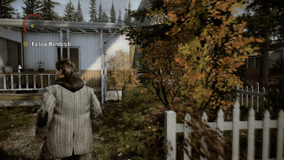
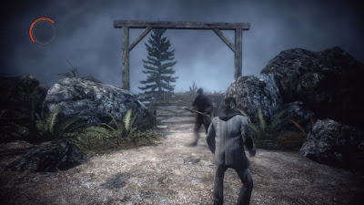
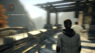
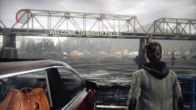
Alan Wake may have started out as a free-roaming action thriller, with the emphasis firmly on the thriller part, but its final appearance as a far more straightforward action game isn’t to be looked down upon. Remedy have provided a title with incredible atmosphere, an intriguing storyline that keeps you guessing, and a lovely looking playground in the form of Bright Falls, all of which envelops you as you try to fend off numerous amounts of ‘Taken’ along your travels.

The action is tightly focused, and most of all, edges just enough on the right side of being fast-paced without feeling too much like a shooter, and instead more like an tense psychological ride into chaos. That said, the experience isn’t quite perfect, and there are times in which the game would benefit more from you actually driving forward the story through investigation and discovery, rather than scripted point to point moments. But don’t let that fool you into thinking that Alan Wake is as tightly controlled and linear as Resident Evil, because it really isn’t, and often allows you to wonder off the beaten track into the foreboding wilderness in search of that next vital manuscript.


Interestingly, the story and narrative structure is presented in a similar style to an episodic TV show with a defined beginning and end to each episode. Each one starts with an opening cinematic recapping past events, or an introduction the first time you play the game, although there is no mock credits sequence which is a little disappointing, and would have made the TV show effect much more convincing. Whichever way you look at this, it definitely makes a change from the ‘end of chapter’ and ‘score tally’ used in most survival horror games.

Cut-scenes are pretty short for the most part, and are mainly used to gel together the other forms of storytelling keeping that TV show feel consistent throughout the game. The vast majority of the narrative is driven forward by the use of in game dialogue, and the many pages of manuscript left lying around Bright Falls. These pieces of manuscript reveal interesting snippets of backstory surrounding the ‘Taken’ and the town of Bright Falls, whilst also describing key occurrences which happen in the game. Sometimes you will find a page that blatantly describes an event that is only moments away from happening, taking any feeling of surprise and significantly reducing the amount of fast-hitting tension you’d otherwise be presented with.
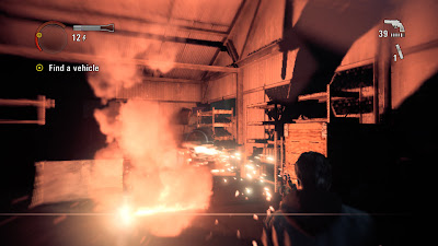

Alan will himself also sound off one of his many monologues during his time spent in Bright Falls, mostly speaking out on his thoughts and innermost fears as you explore the shadowy landscape so beautiful but foreboding in nature. Like with the manuscripts, Alan has a tendency to describe the obvious. A lot of the time he will simply describe just what is happening in front of him, rather than shed light on what he thinks might be going on. Towards the end of the game, his little mobile soapbox moments actually begin to feed the player deeper into the story and the twists that it provides. It goes from a vaguely pointless inclusion, into an essential part of driving forward the experience.

Thankfully, there is a reason for both the initially obvious dialogue choices, and some of the seemingly pointless manuscript pages – it’s not quite as well thought out as you might think, but the continuing script and storyline is rather cleaver overall, revealing that it isn’t just trying to state the obvious for lack of originality, but instead attempting to direct the player down various paths and conclusions. Everything that might at first feel quickly rushed in, serves a deliberate purpose. And later on in the game those revelations start coming thick and fast.

To this end, some of the writing and voice acting is a little contrived, and in rare occasions pretty hoaky overall. Regardless, it can be totally captivating at times, and never falls into the artsy and often-pretentious trap that Heavy Rain went down. At the same time some of the game’s big reveals aren’t perhaps as psychologically cleaver as you’d hoped them to be, feel a little bit dialled back for the sake of presenting the player with another large action sequence, and of course the inevitable sequel.


No sooner after Mr Wake and his wife have touched down in Bright Falls and made their way to a quaint secluded cabin retreat, the wife mysteriously goes missing, and Alan finds himself bruised and battered in the middle of the forest with no recollection of what happened. Strange events and occurrences begin to happen, and people with a thick black mist surrounding them start attacking you. A mysterious voice calls your name, and a bright light shines out drawing you ever closer to its source. All the while a sinking feeling hits your gut and shivers run down your spine, as you reluctantly take the first steps into a world about be turned upside down.

There are two parts to the actual gameplay featured in Alan Wake, two individual elements of the experience that are intricately linked together, but at first seemingly at odds with each other. You have the fresh and sedated daylight sections, in which the bulk of the main story progression and characterisation occurs; and the night time scenarios in which most of your time will be spent, fending off scores of ‘Taken’, and avoiding a range of deadly supernatural presences.

At first the hellish events that occur at night are largely unseen by the people of Bright Falls, with the odd disappearance or two being the only evidence to show something’s gone awry. But as you delve further into battle with the dark forces at work, and become closer to finding your wife, the events in one world begin to radically affect the other, with the ‘dark presence’ ultimately taking hold of the entire town, providing you with a series of spectacular set-piece events.


The ‘dark presence’, which manifests itself as a veil of black fog, can take over both living and inanimate objects, called the ‘Taken’, presenting you with a danger beyond possessed townsfolk and into the realm of the insane. Light is your most important weapon against this evil force, with you having to use it to burn away the foggy shroud before you can either kill the people behind it, or extinguish the control the ‘presence’ has over lifeless objects.

Your arsenal initially consists of just a pistol and a lowly torch, but as you make your way through the town facing increasing amounts of ‘Taken’, you are given everything from high-powered industrial torches, to flash bangs and flare guns to take down your adversaries. The left trigger controls your torch, and pushing it down gives off an intensely bright light that helps burn away the ‘Taken’ more quickly, but at the expense of battery life. It is possible to aim the torch at enemies by gently holding down the trigger, allowing the initially weak light source to impact their progression before using your firearms to shoot them down.


High-powered torches weaken enemies more quickly, also using more batter power; flares instantly remove all traces of the fog allowing you to focus on immediately gunning down the people underneath before they get to you; flashbangs explode and destroy all enemies in the blast radius instantly, as does the powerful flare gun, which all help greatly in battling off the various supernatural sources at work when surrounded by them.

The more powerful the items, the more battery power they use. However, along with the inclusion of several torch upgrades, you’ll also find longer lasting lithium batteries, which give off a stronger blast of focused light, and faster power regeneration abilities.

Better guns can also be picked up as you make your way through the game, with several types of shotgun, and a powerful hunting rifle, which can kill most ‘Taken’ in a single shot. Ammo is in fairly short supply, and the game often sets up encounters with scores of enemies requiring you to leave that trigger happy persona at home and conserve the ammo you have, using a range of guns, flares, flashbangs, and the environmental light sources in order to stay alive.


The first half of the game is largely based around slowly giving access to all the tools you’ll need to battle the ever-increasing strength of the ‘Taken’ as it sifts through Bright Falls. Sadly, after the first two or three hours of play, the game starts going through the motions of constantly surrounding you with enemies, and having you deal with them by routinely cycling between, and using, various weapon types and well-timed evasive techniques.

About halfway through, this familiarity begins to fade, and as the game pushes further towards its conclusion, starts to up the ante, with large and particularly intense set pieces steadily growing as you reach the end of the game. These become somewhat ridiculous in nature, taking a fairly believable supernatural horror and turning it into a bombastic struggle for survival. During these latter parts of the game, you’ll once again be forced to battle everything from possessed construction vehicles, to roofing structures, along with what looks like the bulk of the now ‘Taken’ townspeople.

Perhaps this was a step too far, as although stunning to look at and exciting to play, these parts are also the most frustrating in the game. It is also at this point that some of the game’s rather cleaver narrative choices betray itself, with some of the big reveals being somewhat of a let down compared to the mysteries they provided. The lure of DLC and continuing story means that Remedy are content to almost use this first instalment as an opening episode as such, delivering what looks like a conclusion (at this point I haven’t quite finished the game) but at the same time leaving other questions left unanswered.


One thing that is so exceptionally good about the whole experience is that one more go factor that Alan has. Every time I sat down to play a short one or two-hour session, I was hooked for nearly double that before having to drag myself away from the controller. It’s a sign of truly engrossing game design and masterful atmosphere creation, all of which leaves you wanting more until the end of chapter cut scene finally plays out.

Alan Wake’s biggest success however, isn’t the incredibly polished gameplay mechanics - repetition aside there’s very little to complain about - but instead the ability to create a deeply dark and disturbing atmosphere in which to completely immerse the player. With shadows crawling all over the surrounding environment; the rustling wind blowing through the tress; and the eerie mist flowing throughout the air, the game’s night time sections are utterly gripping, and often veer on edge of your seat territory.

It’s this atmosphere, and suspenseful nature, which is really Alan’s talking point. Many people speak about immersion, about disconnecting the player from reality and into the game world. And at times, this is exactly what Alan Wake does, combining cleaver storytelling and visceral action-packed gameplay to form a largely compelling, if not slightly cheesy ride into psychological madness and supernatural chaos.


Beyond the impressive graphics, solid gameplay, and mixed storytelling devices, Alan Wake is a mostly sublime experience. Not quite as refined or perfectly scripted as it should have been after five years of work. But nevertheless, a highly promising first outing for a franchise that has enough potential to really turn into something awe inspiringly good. Remedy aren’t too far away from that point, and whatever issues I have with Mr Wake, I was utterly gripped whilst playing the game, not wanting to put the controller down even in the most frustrating of situations.

Alan Wake may be at heart, a Stephen King inspired Resident Evil, a title that clearly wears its influences on its sleeve, and one that isn’t afraid to still feel like a traditional videogame. It isn’t quite as revolutionary as I’d first hoped, and in that respect the question that bubbles around in my head – does it really need to be? – Is a hard one to answer, as all throughout my time in Bright Falls, I was almost completely hooked every step of the way.

The tense atmosphere, partially original narrative approach, and exciting action sequences highlight just some of the things that Remedy’s five-year opus does so well. But they also highlight a realm of missed opportunities and a conscious decision to tow the more traditional gameplay line, a line that could have been broken down, thus creating a true masterpiece rather than just a extremely entertaining, and often excellent experience.

VERDICT: 8/10

Saturday, 22 May 2010

Tech Analysis: Lost Planet 2 (PS3 vs 360)

The original Lost Planet represented exactly how not to not to do a PS3 conversion. Sticking to the basic approach of trying to port the overall engine in a like for like manner, despite clear architectural differences, resulted in one of the worst multi-platform PS3 conversions to come out of any studio at the time.

Missing a large amount of geometry and texture detail from its 360 counterpart, in addition to featuring low resolution effects, and only temporal 2xMSAA, the port suffered greatly losing a large chunk of image quality in the process. It also struggled to maintain a smooth framerate, thus accentuating the game’s poor use of anti-aliasing and lack of fine detail.

Lost Planet 2 on the other hand is nothing like that dreadful port of the first game. Instead Capcom have built upon the finely tuned refinements they made with the first MT Framework engine on Resident Evil 5, carrying over the optimisations to the new 2.0 version used here in Lost Planet 2. Many of the improvements that were to found in the PS3 version of that game are also found here too. However whereas Resi 5 demonstrated some significant differences in anti-aliasing, texture filtering and framerate, LP2 is a far closer affair, for the most part achieving platform parity throughout the game, minus a few issues here and there.

Like with Resi 5, Lost Planet 2 is rendered in 720p (1280x720) on both formats, with the 360 getting the standard application of 2xMSAA and the PS3 game getting no AA of any kind. The result is that both versions appear clean and very sharp, with jagged edges surprisingly manifesting themselves in almost equal amounts in certain scenes.

The differences are easily spotted in the shots below, where we can see that both versions look almost like for like, with only very subtle differences that are mainly caused be the two machines internally different gamma levels, and the PS3 version missing a few effects in places.

With regards to the 360 version displaying almost equal amounts of aliasing to the PS3 one, this can be explained away by how the game is rendering its lighting. LP2’s use of heavy HDR and high levels of strongly defined light sources all create high contrast edges, so when edge samples are taken by the MSAA they are so similar to the un-anti-aliased edges, that in the end some parts of the scene just don’t get any AA at all. This means that the screen can crawl with jaggies on both versions, though it is more apparent on the PS3 version as it has no AA to help control the problem.


In terms of texture detail and filtering both versions seem to be pretty much equal in most scenarios, which is particularly impressive given the scale of the environments and the amount of bandwidth stealing particle effects on screen at any given time.

Some subtle differences in texture quality are apparent between both platforms, but they aren’t really all that visible during actual gameplay. In some scenes textures appear more detailed on the 360 than on the PS3. You can also just about see that the 360 version edges it ever so slightly when it comes to fine detail, though you can only see this when scrutinising still screens, and not when the game is in action.


At some points however, there are noticeable cut backs in overall texture quality on PS3. Although this isn't apparent in all areas of the game, when it does happen it definitely takes away from the experience.

Some stages seem to be more affected than others, and below is a clear example.


What is surprising is that both PS3 and 360 versions of the game feature the use of anisotropic filtering (AF). Previously it was pretty much a given that games on the PS3 would benefit from the use of AF when the on 360 the same game would be using only a trilinear or bilinear solution.

Because the PS3 has more texture units in its RSX GPU than 360’s Xenos, AF basically comes for free on Sony’s machine. Whereas on Microsoft’s system there is normally some sort of memory or performance hit for using it, much like in the way that 2xMSAA is usually commonplace for the 360 but not for PS3.

Either way, both versions benefit from having clean and clear texturing that is visible for several feet into the distance. This was also apparent in Super Street Fighter IV, which first showed Capcom’s improved multiplatform use of AF.


Shadowing looks to be identical between both versions, with any differences being down to the gamma levels of each system. What is noticeable is that in really dark areas of the screen some shadow detail is mildly crushed in the 360 game, with the darkest parts appearing almost completely black instead of clearly showing the faintest of details. The PS3 game with the console’s higher gamma manages to achieve greater amounts of shadow detail, which show up a lot more clearly in dark sections and in character and object shadows.

There are of course downsides caused by the lighter shadows on the PS3 version despite the welcomed increase in noticeable detail. The sense of depth is slightly lessened leaving an overall image with less three-dimensionality compared to the 360 game, although the like for like quality of the actual shadows means this is more of an observation than a complaint.


Visual effects in general have also seen major improvements in Lost Planet 2, with the vast majority of effects looking the same on both platforms. Again, like with the texturing, certain scenes do take a noticeable hit, while others are practically identical. Smoke and particles are once again slightly lower res on the PS3 game - although not the extent of the first Lost Planet - and are less noticeable here than they were in Resi 5, particulary with the larger effects which I believe are the same in both versions.

This shot below shows off the worse case scenario of the PS3 game missing various effects found in the 360 build. Water and some shiny surfaces seem to be the main area in which certain effects have been cut back on.


Despite these differences in some scenes, it’s pretty impressive seeing how close Capcom have managed to create near-identical copies of the game visually on both systems, for the most part at least. In motion it’s only the PS3’s lack of AA which consistently shows up crawling jagged edges and a very slight drop in IQ in these areas.

Sadly, there are times when the game looks noticeably worse, though thankfully this doesn't happen all that often, especially nowhere near to the level of the first game on PS3. When it does happen however, it manages to undermine some of the hard work Capcom have done on the conversion. Which is a shame, because at times the two versions really do look identical.


So, you could say that it’s mostly par the course for parity then? Well, not quite, as whilst both versions maintain similar levels of graphical fidelity, with some exceptions in certain areas, the same cannot be said when in motion.

Like with Resident Evil 5, both PS3 and 360 versions of LP2 deal with framerate and screen tear differently. The PS3 game tends to hold v-sync in order to prevent any untoward screen tearing, along with what looks like the return of double-buffering – a process of generating a spare frame just in case the one about to be used gets torn – but in the process at the expense of obtaining a stable framerate.

This means that screen tear is pretty much non-existant in the Sony game, but the framerate instead constantly takes a dive from the targeted 30fps update in busy scenes. In large boss battle and parts of the game filled with large enemies the framerate hits between 10 to 20fps, creating what can only be described as a brief slideshow of movement.

I also noticed that the controls seemed to be a little more laggy on the PS3, which aroused my suspicions to the inclusion of the double-buffering. Although this isn’t a 100% conformation, but a solid assumption based on both this controller lag and Capcom’s previous use of the technique.

The 360 game on the other hand, instead allows the screen to tear more frequently but consequently maintains that 30fps update far more often. Interestingly, LP2 actually seems to be v-synced on 360, at least partially – something that was absent completely from Resi 5, and this on occasion can lead to terrible drops in fluidity which are pretty unsightly to say the least.

However, this only really happens during certain boss battles, and usually manifests itself in the cut-scenes rather than in actual gameplay, so although it isn’t too impacting, you can’t help but notice it.

Perhaps this is the most substantial issue between either version of the game, which is a shame as Capcom have really excelled at making Lost Planet 2 at times, a near identical experience regardless of which version you own. Everything but the use of AA, and the lower-res, paired down effects are basically the same between both versions - occasional texture issues aside - and it’s only the frequent drops in framerate that really set them apart the majority of the time.


In the end Capcom have pulled off a pretty successful multiplatform title in Lost Planet 2. It may be too much to expect a complete identikit release graphically, but most of the glaring flaws and visual differences have been addressed to some degree. Sadly the same cannot be said for the game itself, in which we awarded a rather disappointing 6/10 in our review.

For all the technical achievements the developers have managed to weave together, the underlying gameplay issues and fundamentals almost break the game at times. So much so, that for the most part Lost Planet 2 is a partially polished but unsatisfactory experience.

Tech analysis updated: extra screens and further details representing the more severe differences.

Thursday, 20 May 2010

Tech Analysis: Alan Wake

I will warn you now, that this tech analysis for Alan Wake is an incredibly long and in-depth affair. With Remedy’s latest there is so much going on, and individual parts which make up the overall look and feel of the game, that after you’ve covered one thing, you’ve also just discovered another.

So, rather than skimp over the little details which might actually have a pretty large impact in he overall scheme of things, what we’ve done, is to try and deliver the most comprehensive look at the tech present in making up the world of Bright Falls, one of this years most defining visual achievements.

Usually it’s Sony’s PS3 exclusives that garner such attention and technical praise, often delving deep into the hardware to deliver an visual experience that on so many technical levels is almost unmatched by most other titles on competing platforms – PC of course excluded, but that’s a given really. Microsoft on the other hand, have a machine with a comprehensive set of development tools that are so much more traditional and easier to get to grips with what Sony have provided for the PS3, that in most cases developers are quite happy to think inside the established box when it comes to crafting that show-stopping visual showcase expected for current-generation games.

However, some developers such are beginning to break out of that cycle, creating a graphical experience which rivals that of Uncharted 2, Killzone 2 and God Of War 3. Both Bungie with Halo Reach, and Remedy with Alan Wake, are pushing the envelope of what is possible on MS’s machine, showing gamers and developers that what is possible in a PS3 custom-made approach title is also possible on the 360.

Last week we took an in-depth look at Halo Reach, casting our critical eye over the overall workings of the tech. Today IQGamer looks closely at Remedy’s Alan Wake, a game no stranger to controversy or our very own tech analysis, in which for this feature, we will be finally evaluating the tile whilst also attempting to fully uncover the truth behind that 540p rendering resolution.

Alan Wake, to cut away any lingering doubts or speculation does indeed render in 960x540 resolution, which is then upscaled by the 360 to form a final 720p image. Not all aspects of the game are rendered in this sub-HD resolution – with some effects actually being closer towards 720p – and the game does use an impressive 4x multi-sampling anti-aliasing at all times, a side effect of which is not only a clear reduction of jagged lines but also a much cleaner upscale.

The result of rendering in 540p isn’t quite as bad as what you might expect, with fine detail still being present, and the soft look of the game actually appearing quite clean and clear compared to some other sub-HD games. No doubt that the use of 4xMSAA actually helps in reducing any upscaling artefacts, whilst keeping the image relatively clean in the process. Softness, as obvious as it is, is the by-product of this, but its inclusion actually helps in creating the creepy atmosphere found in the game, along with the shadowy and foggy night time visuals all feeding a real sense of immersion.


It’s pretty clear from the screenshot above just how good Alan Wake looks for a game that is decidedly more sub-HD than many others on the market. But why did Remedy opt for using such a low resolution so late in the development cycle? And what happened to claims of rendering in 720p with 4xMSAA?

Well, you only have to look at last years gameplay footage in order to find out, which does indeed render in full 720p whilst sporting 4x multi-sampling anti-aliasing. Before this, Alan Wake was rendering at the standard 720p with 2xMSAA, in addition to having full resolution particle and transparency (framebuffer) effects. However the game suffered from constant screen-tearing and drops in framerate, no doubt as the engine struggle to cope with the game’s intense bandwidth requirements

It is pretty obvious that Alan Wake as a game is extremely bandwidth heavy, rendering all those fog, mist, smoke, and transparent particle effects. Transparencies are littered all over the game’s fictional town of Bright Falls, and the engine unsurprisingly was struggling to cope.

Originally Remedy simply decided to change from rendering full resolution effects to instead using half-res alpha-to-coverage effects (A2C), thus saving some bandwidth needed to keep performance up. However, A2C has the unfortunate side effect of giving all transparencies that use it an unsightly screen door effect. The only solution is to effectively up the level of anti-aliasing to 4xMSAA in order to blend away the A2C into the rest of the scene.

Despite these changes it’s clear that the game still suffered from severe performance issues, with tearing once again being at the forefront of those. In an interview the developers stated that the screen tear would be part and parcel of the experience, a sign that maybe they where having trouble in keeping things running smoothly. In light of all this, it seems that in order to claw back performance they finally opted to render in a sub-HD resolution to give them a smooth 30fps update and very little screen tear, whilst still having all the benefits of 4xMSAA improving the overall image quality (IQ).

In the end the use of A2C does very little to damage the overall look of the game. Alan’s hair for example (see below screenshot), is using it with very little in the way of noticeable side effects, though if you look closely you can indeed see some of the dithered nature of the A2C at work. The 4xMSAA manages to prevent any noticeable upscaling effects from being visible, and the soft look provided by the lower resolution isn’t particularly intrusive.


There’s not doubt that the game would look much sharper as a result of rendering at 720p over the current 540p framebuffer, however it is likely that many of the outstanding graphical effects and small visual touches would have to have been sacrificed in order to keep performance levels up. With this in mind it’s much better to have a smoother, graphically more impressive game as a whole, than to have a clearer albeit simpler one instead.

Resolution and framebuffer issues out of the way, the rest of Alan Wake’s engine is just as interesting, and serves as a clear technical benchmark for many 360 developers to follow.

The stable framerate for one is a pretty exceptional achievement. Alan Wake maintains a rock solid 30fps ninety-nine percent of the time, with the game instead opting for screen tearing in situations where the engine is struggling to keep a steady hold on things. As a result the game basically never drops frames at all, and when it does, the drop is so insignificant that it is barely even noticeable at all. The downside is that the tearing can get pretty messy at times, covering the image right in the centre of the screen where it is most noticeable.

Thankfully, these situations aren’t too common place, with most of the tearing smoothly appearing for a split second or so, before vanishing as quickly as it came. It should be pointed out though, that the game does tear regularly, although it isn’t at all intrusive in these smaller amounts.

Adding to the stable framerate is the games use of camera-based motion blur, which helps to create that smooth look and feel that the game has throughout. The motion blur is very subtle, never at all intrusive, instead being an organic part of the camera movement. Its implementation is just another part of the artistic flair that is running through every aspect of the game’s visual make up. The screenshot below shows the effect in action, though it seldom has that much of a dramatic impact on the game in motion.


What is surprising, is that the engine in Alan Wake is running at a almost constantly solid 30fps with a high level of dynamic visual effects - from fog, smoke, and particles - whilst also capable of delivering incredible draw distances without dramatically paring back the visual through the use of an aggressive LOD system. The game is full of sprawling vistas, from dense forests to towering mountains, and all of it is largely reachable, with the player travelling between these iconic places many times.

Perhaps, it is for this reason that the game engine has had sacrifices in other areas. Both the framebuffer, alpha effects, and textures have been downgraded by using a lower resolution, as to has parts of the game’s lighting and shadow system.

Originally Alan Wake was going to be a fully-fledged open world action horror, in which the player would be investigating the various paranormal and supernatural occurrences whist trying to find wife Alice and fend off scores of ‘The Taken’. In much of the final game you can clearly see the original open world nature of its design, with large organic multiple paths to take, long draw distances, and the ability to backtrack, go off the beaten path, before heading to you next destination.

The engine used in the final game is still highly optimised for such an experience, so despite the change to a more linear and controlled affair, the engine still has to draw vast distances in high quality, whilst also having to render all those alpha effects, shaders and textures, and keep up framerate at the same time. It’s like having a version of GTA or Just Cause with Uncharted 2 levels of graphical polish, something which is beyond any of the current gen consoles.

A good example can be seen below, in which the game renders detailed scenery for miles for many miles away from the player, with no additional visual effects hiding the incredible draw distances that the engine is capable of.


Texture detail is reasonably high, although the actual textures themselves appear to be of very low resolution. Up close any detail begins to break up, and from a distance they look clean, but at the same time a little blurry. The quality overall is very good, given the game’s 540p framebuffer and various effects that the engine is pushing around on screen, it’s just a shame that much to the intricate details get so broken up in close range, or blended away when at a distance. Nevertheless there are times in which the combination of artistic flair and attention to detail really show of the textute work.

In term s of filtering it’s not entirely clear what is going on in Alan Wake. Assessing levels of texture filtering by eye is always a difficult proposition, however it is possible to make so well placed judgements as to what is happening.

At times texture detail is visible for a good 16 feet or so into the distance before becoming blurry, whilst in other scenarios texture fidelity is lost just a few feet away from Alan himself. In these later scenes, it would appear that the game is perhaps using bilinear filtering (BF) at best, although that would fail to explain the clarity in other scenes. Instead, my best guess is that Remedy are actually using a combination of anisotropic (AF) and bilinear filtering for the textures, alternating between large amounts of AF and BF combined, to very little AF with no BF at all.

You could call this a ‘filtering bias’ with some scenes getting more filtering that others. But at the same time witn all the fog, mist and other effects going on at night, it is hard to make a solid judgement call on this. At the very least TF is definitely present, with small levels of AF in parts.


Unmistakably though, the use of high levels of visual effects such as volumetric fog, smoke, particles, and the impressively accurate dynamic lighting and shadowing system, is what puts Alan Wake above so many other titles available on either the 360 or the PS3. It’s these effects that work so well with the A2C and 4xMSAA that any hit in pure sharpness taken away by the 540p resolution isn’t on many occasions all that apparent. Especially in night time scenes in which all the visual effects come together, with loads of moving elements on screen pretty much most of the time.

The fog, shadows, light, foliage and physics based objects are cast their own shadows, some simply being pre-baked shadow maps, other being fully dynamic reacting to a multitude of light sources and environmental objects. The fog for example, interacts with the game’s lighting, with light shining through it, moving over the trees and the foliage, casting shadows for most objects in its path.

A hazy mist is also present during the environments at dusk and at night, which both reacts with light along with blending into the black fog which appears as ‘The Taken’ arrives, creating an ambience that adds to the tension felt throughout the experience.

Some of these effects do appear to be rendering at a lower resolution than the rest of the game. The fog in particular is pretty low res, which tends to blur everything in its path, obscuring detail and almost warping the game world. The blur doesn’t impact too much on the overall graphical feel that Remedy is going for, and at times actually benefits it. Sadly when the fog makes its way to cleaner areas, such as town buildings or remote gas stations, the blur effect is more noticeable, and less impressive.


For shadowing the game uses a combination of high and low resolution shadows, both static (pre-baked) and dynamic. The ones used in doors are most noticeably low res, as are some of the dynamic shadows cast by the players touch as they explore Bright Falls. However in outside areas, in which there is so many other effects going on, it’s incredibly hard to notice the odd poor quality shadow.

The games lighting also helps to back the mixture of shadow quality and various other visual effects. Light given off by the players touch casts shadows from objects all around the environment, as do flares and flashbangs, which dynamically change the surrounding shadows. This is perhaps the most impressive thing in Alan Wake’s graphics engine, the uniformity between light and shadow, the dynamic interaction between both, and how this helps create a beautifully organic look to the visuals on offer.

It is safe to say that the quality of these effects on offer in Alan Wake is perhaps some of the best we’ve seen in any console or PC title to date. Resolution issues aside, the consistency and quality seen here is a pretty impressive feat, given the constraints the developers have had to work with and the many issues faced along the way.


Overall the tech behind Alan Wake is extremely impressive. The game is at times combining several different transparency heavy effects together, along with a fully dynamic lighting and shadowing system, whilst maintaining incredibly high draw distances at a near perfect 30fps.

Certainly, things have been sacrificed in order to achieve this level of visual performance, but those sacrifices haven’t damaged the game in any significant way. In fact, most of the issues caused by the low resolution effects and 540p rendering resolution are barely noticeable during most of your time spent in Bright Falls, which is spent in a surreal world of darkness. This darkness helps hide much of the game’s graphical shortcomings, blending them in, and actually increasing the level of immersion to be found all through Mr Wake’s adventure.

Remedy, like with all the most highly talented developers, have shown just how to work in and around any limitations of the current platform they are developing for, making concessions in certain areas, whilst scaling back in others to ensure that the whole visual make up is as polished as it is balanced.

Alan Wake in this regard, represents exactly the right design choices made for the game at hand. Generating atmosphere to completely embody the player is paramount to the experience, and is something that the developers have achieved with the underlying engine behind the game. It isn’t always about getting all the elements together in the most technically advanced way possible. But instead, about making sure that each of the individual pieces fit together succinctly, and not just as separate visual standpoints in which to admire.

In conclusion, there’s no doubt that Remedy have achieved exactly what they have set out to do with Alan Wake, creating a game which is as gripping as it is visually alluring. For all the use of high-end tech that is powering the game, it is the carefully and often cleverly crafted nature of the art design which makes the package such a success. And whilst it may not have all the high definition goodness of Sony’s Uncharted 2, it more than matches it in sheer technical brilliance and pure artistic direction.