Thursday, 29 April 2010

Editorial: No Instructions Included?


Late last week Ubisoft announced that it was ditching the use of printed instruction booklets for all of its upcoming games released later this year, starting with Shaun White Skateboarding, and following through with every new title thereafter. Their recent decision will effect all future PS3, 360 and PC titles in a scheme that the company says will not only save them a considerable amount of money, but that will also be responsible for a more environmentally friendly approach to producing videogames - they have already commissioned the use of the eco-box for its PC games, packaging which uses less overall plastic than regular boxes used for DVDs and games.

Laurent Detoc, president of Ubisoft North America stated that "Eco-friendly initiatives are important to the global community and introducing in-game digital manuals on Xbox 360 and PS3 is just the latest example of Ubisoft's ongoing commitment to being a more environmentally conscious company".

The company also claimed that the removal of instruction booklets would be beneficial to gamers, as more work would be put into creating a “more robust” digital manual held on the game disc, which would provide “easier and more intuitive access” to game information on the fly, when they say gamers need it the most.

Of course, Ubisoft’s statements uttering the fact that in this day and age that the ‘instruction booklet’ as we know it is largely redundant, is a viewpoint also held by a vast majority of mainstream gamers, evident by the lack of complaints, or even comments surrounding the increasingly paper thin booklets given with most new releases these days. One only has to look at the recent Call Of Duty outings (especially Modern Warfare 2) along with Need For Speed, and Ubi’s own Assassins Creed, to determine that by and large, in their current form, these booklets are pretty pointless. Almost to the point it seems, of being there just to fulfil a tradition started with single-coloured square pixel type games of the late seventies and the early eighties, a time in which videogame graphics were far too basic to effectively house an in-game tutorial.

Looking at these modern instruction booklets, the vast majority these days for the yearly franchise titles, and for the big annual heavy hitter sequels (COD, NFS etc), seem mainly to contain a brief handful of pages, filled with black and white text describing the controls, and maybe providing a single in-game screenshot showing off the HUD. In which case their inclusion is pretty pointless at worst, and complimentary at best, being ignored I imagine by the vast majority of gamers who pick up those titles.

Other games, like with Epic’s Gears Of War Series, Capcom’s Resident Evil 5, Street Fighter IV, or Nintendo’s Super Mario Galaxy, all have well thought out and carefully crafted booklets, which not only show players how to control the game, what the items are, and weapons available, but also provide a gamers with a back story for it’s characters, unseen artwork, hints and tips, or even just a nice read through about the world you’ll be entering as soon as the disc enters your chosen gaming machine.

Mario Galaxy for example, has detailed artwork showcasing the various moves the character has in the game, along with the various power ups he can pick up, and how they change his abilities and interactions with his environment. All of which are represented with numerous images and notes, and are a pleasure to read as well as to lovingly gaze at. Nintendo it seems understands the value of such an inclusion, not necessarily because casual gamers need to have such a thing, because most are just as likely to ignore it, but because largely, it is something that not only fans will appreciate, but also because it is a tried and tested tradition of out industry, to have a cool and colourful set of printed materials with every new purchase. It makes an item of its kind feel complete.

Likewise, the inclusion of a printed booklet in Epic’s Gears Of War serves to highlight the rich back-story surrounding the characters and locations in which the game is set, describing ‘emergence day’ and the early conflict with the Locust forces long before Marcus Fenix was imprisoned for treason. Filled with a muddy, reddish brown hue throughout, and containing intricately hand drawn artwork complementing the words about the weapons and conflict surrounding the game’s universe. It is far more than just a quick guide to how the game will, control, acting as more of a reference to a bigger world than what the actual game provides.

The same thing can be seen in most of the old 16 and 8bit titles, with games like Sonic The Hedgehog featuring descriptions and drawings of most of the enemies in the game, along with the stages that you’ll be playing through, minus the secretive last few stages, and most importantly, the actual game story itself. All this also applies to the likes of Mario, James Pond, Mortal Kombat, Street Fighter, Shinobi and pretty much every single title released in that era worth its salt.

Looking at instruction booklets in this way, you can see why there is still some value left to be had including one in your latest blockbuster hit, not just for completion sake, but perhaps to add a little more to the experience than just the digital content stored on the disc. I for one, like the ability when unsealing the game for the first time, to take a few moments to look over what’s included, maybe have a whiff of the box and manual when it first opens, before flicking through the pages in anticipation of what the game has in store for me.

Most, I suspect won’t care about this ‘feature’, and with the likes of Call Of Duty and Assassins Creed, I completely agree. The inclusion of the three or four page booklet with a brief controls description and photo of the game’s HUD, along with the obligatory warranty details is utterly pointless, and in my opinion a waste of time for all involved. In that case, it’s a perfect example of a series (or a game) which would benefit in not having a booklet included at all, especially when in both aforementioned titles, a definitive and easy to access controls refresher is available from the in-game pause menu.

Of course, maybe companies like Ubisoft should perhaps be looking at this from another angle entirely. Most games today are designed around strong narrative progression and focused character driven gameplay, so it would make a lot of sense in keeping the fat down with regards to background in-game cinematics, with a brief look on such a thing in the game’s instruction booklet instead. Combined with fresh, unseen artwork, introductions to all the lead characters, along with all the usual stuff, it could well be something to consider investing in. Maybe, and I would hate this to happen myself, is that the instruction booklet we know could become some checkbox feature on some collectors edition, doling out content that would have been commonplace in games just a decade or so ago, with the standard edition completely barren of such wares.

Overall, this debate on whether or not we ‘need’ or require an instruction booklet to go along with our games, is something which will definitely rear its head again. I imagine that in the near future we will have some developers that absolutely value what the inclusion of printed materials does for a product, whilst some all too keen to cut back costs and provide a perhaps more customisable digital alternative to suit the 21st century gamer. Either way, I can still see a road in which the loved, hated, instruction book can continue.

For better or worse times are changing, as are the people that play games and make games, in which it is inevitable that certain things will change in order to find the right balance between necessity and nostalgia.

Personally, I won’t be shedding any tears for lack of printed materials in any of Ubisoft’s, Activision’s, or EA’s offerings, but if the day comes when developers who put so much efforts into crafting a finely designed traditional instruction booklet comes to an end, then I suspect that I won’t be in the least bit pleased, and decidedly saddened by the whole affair. Maybe it’s time that more gamers stood up and actually started to care about what comes inside their much loved videogame packages, rather than trying to get everything for as little as possible, or maybe, we should except that the market and its audience as changed so much, that the ‘gamer’ and ‘videogaming’ as us old timers know it, is well and truly a thing of the past.

Wednesday, 28 April 2010

Review: After Burner Climax (PSN & XBLA)

Before wanting to be a videogames journalist, or before that a palaeontologist, I have always wanted to become a fighter pilot, shooting down those pesky Migs just like in the 1986 movie hit Top Gun. No rules, no regulations, or training required, just some awesomely cool dog fighting action. As it so happens, I got my first taste of this first-hand in one of my local seaside arcades when I was about five or six years old. I had encountered Sega’s mid-eighties spectacular After Burner, a jet fighting, rip-roaring, aerial action game complete with a really, really, cool moving cabinet.


I only had one go. That was all I was allowed. But it would be an experience I would never forget, a rush of excitement and exhilaration that few games today have delivered in such a concentrated dose. And despite never making it past the first stage, I yearned for more, not ever having the chance to properly sample delights of such similarity again… until now.

In 2006, Sega unleashed upon a dying arcade world the little known After Burner Climax, one of their first next-generation arcade outings. Running on their newly formed Lindbergh arcade board, it brought to the screen fast-paced aerial action and a hint of 1980’s excitement, all at the pre-requisite sixty frames per-second with a slew of smoke and particle effects. Finally my chance to sample once again my childhood delights had arrived, except for the fact that a scarce one or two go’s would be my only chance of salvation. As per usual, Sega had decided it seemed, to completely overlook such a title for an early next-gen console launch, instead relegating it to the ranks of forgotten arcade gems.

Today, all that has changed, and Sega, in combination with Sumo Digital (their usual porting house) have seen fit to release this nearly forgotten arcade non-hit to both PSN and XBLA. Get Ready to re-enter the danger zone, Kenny Loggings style!


Graphically the game is pretty much arcade perfect on both platforms running at the expected 60fps, featuring basic but fairly detailed texture work, with bump-mapped and shiny (specular and diffuse effects) surfaces, and plenty of smoke and particle effects expected for a 2006 game. As with Virtua Fighter 5 on PS3 and Lindbergh, no AA is present on the PS3 version although at least 2xMSAA is used on the 360, but then again, the game does render in 720p on both formats.

The 360 version however, seems to feature slightly better lighting than the PS3 one, matching the arcade version like for like, whereas on PS3 the lighting is ever so slightly less intense. It’s not even an issue for me, and despite with myself being just a little bit of a graphics whore, decided to make my final purchase of the game for my PS3, to go along with OutRun Online arcade and Tekken Dark Resurrection (amongst others) in my growing collection.


The premise of the game is the same as in the 1986 original; flying around at varying speeds above and below the clouds, you are tasked with blasting enemy planes and ground vehicles into obliteration, whilst relying on just a few well-aimed missiles and an unlimited use of a paltry machinegun to get the job done. Along with your limited assortment of weapons, you also have the ability to out-manoeuvre enemy craft using the series trademark ‘barrel roll’, mixing it up between all out shooting, and cleverly skilled avoidance of the impending doom heading your way.

Did, we also mention, blue skies, bright white clouds, and a variety of different environments, each making little sense in the grand scheme of things when it comes to aerial combat. But they sure as hell look really cool, an infusion of colour in an increasingly drab modern videogaming world, just what we need to see a lot more often.

The dossier on the game reads something like this: three selectable aircraft, check; skilful but simplistic gameplay; check; cheesy 80’s rocking arcade soundtrack, check. And so on. It’s After Burner through and through, and one of the last truly decent games created by Sega geniuses at Sega-AM2, minus Virtua Fighter 5 of course.


Staring off by selecting one of three planes, the F/A-18E, F14D Super Tomcat and the F-15E, and then choosing the colour, the game has you flying through a multitude of different, beautifully colourful environments, barrel-rolling and blasting your way through hordes of enemy aircraft and resistant ground forces. Twice along the way the game’s stages branch off to create two separate routes to take, each with new stages and a different second set of routes to take. Should you meet hidden objectives set out for you by the game, you might also encounter a secret stage or two, usually absent from your somewhat short progression to the end.

The experience as a whole is pretty short and really very linear, much like Star Fox 64 or any on-rails shooter worth it’s salt. There’s not much more to do once you’ve completed all the routes available and seen the end credits a handful of times, not even all that much in the way of added depth, or hidden skill to master outside the basic ‘roll and shoot’ and ‘Climax Mode’ mechanics.

However, mastering the basics (is there anything beyond?) isn’t quite as easy or straightforward as it might seem, though lacking the depth of say, OutRun or Sega Rally, but having more to do than the likes of Virtua Cop, or Ghost Squad.


Your basic machine gun fires off rapid shots used to take down most close range enemy aircraft, whilst your missiles are used primarily to initiate an early strike against forces yet to reach your position. Missiles have to be locked-on, much like in the movie Top Gun, and you can target up to a handful at any given time. For each one to be launched you have to push down on the fire button, rather than hold, hit, and fire, which simply will leave you firing off a single missile against one target instead of the group you’ve just locked-on to. This, along with the game’s titular ‘Climax Mode’ brings some much-needed depth to the experience, regardless of how light it actually is, making you learn and remember enemy attack patterns, before blasting them down seamlessly for that barely obtainable ‘100% rating’.

Movement, as with most on-rail shooters, is restricted to flying around between all for corners of the screen, flying into the screen and the oncoming environments and enemies. It’s possible to perform a ‘barrel roll’ using a quick flick of the analogue stick in the opposite direction to which you are moving, whilst the camera automatically pushes you down a fixed course.

Unfortunately, I found it all too easy to accidentally initiate the ‘barrel roll’ whilst attempting to quickly move and target enemies on the opposite side of the screen, rather than change direction and shoot em’ down with some missiles. Maybe it would have been better to have a ‘button and stick movement’ system to activate such a move, thus avoiding the issue from ever coming up. Saying that, the current control set up does make the game feel more like you are flying an unwieldy fighter jet at a fast and frenetic pace, for better or worse.


Moving on, the titular ‘Climax Mode’, activated when the ‘Climax Gauge’ fills up to its maximum position, basically slows down time Matrix stylie, allowing you target and takedown a multitude of enemies far more easily than at high speed. A small counter also appears telling you the amount of enemies that are on screen, which if you manage to destroy all at the same time, you’ll receive an added increase in your score outside that given for simply taking down enemies.

It’s all as simplistic as it gets, with most of the depth and replay value coming from trying to get a perfect ‘takedown’ rating, or by achieving the highest score on the leaderboards - the game’s only online option. It’s also pretty hard, and very chaotic at times, sending a screen load of adversaries at you at any one time, repeating the process over and over until the game ends. Certainly you can tell, that like the 1980’s original, this next-gen sequel was also designed specifically to keep you pumping 50p pieces into the machine.

Challenging, and sometimes unfair, especially later on, is how I would describe After Burner Climax, though never to the point where the wild ride on offer becomes just another bag of stress rolled up and ready to be thrown across the room. Authentic, yes, but expected all the same. After all it’s in the series heritage to be this way.


If you are finding the whole experience a little to hard for your liking, then the game features what can only be described as a ‘dip switch’ style ‘EX Options’ mode, in which you can customise everything from the amount of continues on offer, to powering up your weaponry and allowing an auto lock-on function. It is also possible to change the parameters for how the game’s scoring system works making it easier to gain higher bonuses and other such extras. These ‘Ex Options’ only work in the game’s ‘Arcade Mode’, leaving ‘Score Attack’ free of any unwanted tampering for competitive online play, or rather rankings, as there is no multiplayer on offer.

After Burner Climax is a rather short but reasonably sweet dose of vintage arcade gaming, delivering the quick thrills and spills of such great 1980’s hits like OutRun, Space Harrier and After Burner long since forgotten by the general gaming public. It is also extremely short and pretty repetitive compared to the likes of OutRun 2, in which mastering your drift, and replaying every route in the game can become an obsession. Still Climax offers you a similar feeling, just in smaller doses and with unrelenting fury, without the substance inducing style addictiveness to be found in Sega’s 2004 drifting arcade smash.

Sadly, it also seems like part of the experience is missing without ‘that’ trademark hydraulic cabinet so firmly ingrained in our minds from twenty years ago. Surround sound we may have, and that works brilliantly, but really, having the full-on moving cabinet throwing you all around was part and parcel of the enjoyment behind the game.


For anyone looking for a slice of childhood gaming goodness, or those who perhaps spent too many hours playing through Panzer Dragoon, OutRun or even Star Fox on the N64, will find a highly enjoyable albeit short slice of aerial action, let down by its lack of additional modes, and its strict devotion to its late 80’s roots. For me, and I suspect a few others at least, After Burner Climax could be one of the most played PSN or XBLA releases this year, drenched in blue skies, beautiful artistically designed environments, and quick-fix shooty action.

This game is probably the last solid arcade title to come out of Sega’s dwindling development studios since OutRun 2, and the continuing instalments of the Virtua Fighter series. It’s not perfect by any means, being a little too short for its own good, and rather chaotic, but worth picking up for fans, and perhaps people longing for some more arcade action.

VERDICT: 7/10

Tuesday, 27 April 2010

Sony Revises Slim PS3 Internals

Over the last two months or so there has been a growing worldwide shortage of PlayStation 3 consoles. Most people that I have spoken to seemed to have believed that this was due to the increasing demand for the machine whilst Sony struggled to make enough to go around, especially in lieu of their hard hitting ad campaigns for both Heavy Rain and God Of War 3.

However, like with most hardware shortages there is something else at work behind the scenes. In this case an internal revision of the insides found in both the 120GB and 250GB model slim PS3’s. First discovered at a site called PocketNews, we lay out the info for you right here at IQGamer.


The latest revision of the console, which should come with the CECH-2100A model number, features a new 45nm size RSX GPU shrunk down from its existing 65nm production node, and keeps the existing 45nm version of the CELL CPU from a previous process reduction. With this also comes a smaller cooling solution, and a lighter power supply unit, which naturally draws less electricity to match the reduced power in put required by the internals.

In addition to these changes, the system’s traditional use of four separate 64MB XDR RAM modules has been replaced with two 128MB versions instead. Again keeping overall costs and complexity down. The motherboard has also seen a reworking in order to accommodate these new components, being simpler to construct, and cheaper as a result.

With all the changes at hand inside the machine, it makes this latest revision of the slim PS3 the cheapest, coolest running, and most power efficient version of the console yet. This should translate into an increase in revenue made on each console, maybe even allowing a route to another price drop further down the line. Seeing as both Natal and PlayStation Move being launched in fall of this year, Sony are clearly positioning themselves to allow a better degree of flexibility on both machine pricing and maximising their revenue stream, with an eye, no doubt, into closing the ever smaller gap between both PS3 and 360 consoles.

Now that these new PS3 slims are rolling off the production line and into stores, there should be an end in sight for the shortage that has hampered PS3 sales recently. I expect there to be an abundance of shiny new consoles at your local retail outlet in the next couple of weeks. If not, then shortly thereafter.

Update: It has since been confirmed by Sony that the process node used for the new RSX inside these latest slim consoles is in fact a 40nm one, and not at 45nm as originally thought. This is rather surprising news, seeing as nobody thought that Sony would be using its 40nm fabrication process for its PS3 GPU. It was original going to be used for memory components only.

Sunday, 25 April 2010

Review: Splinter Cell Conviction (360)

Sam Fisher’s latest exploit is a very different beast to past Splinter Cell titles, and after five years of waiting many fans of the series trademark gameplay may not be happy with what they get, especially compared to what they might have expected. ‘Conviction’ in many ways seems more driven by its personal narrative and characterisation than by providing players with a wholly realistic setting and story in which to sneak their way through. It is however, a much more exciting game as a result.

Instead of a highly polished and mostly grounded title, in which extreme stealth and careful planning are required, what we have here is a something which has been turned into more of a 24 style blockbuster, in which cleaver use of stealth and cunning are blended into a more action-based approach to the series traditional gameplay values. Call it ‘heightened cinematic realism’ if you will, rather than the previously cold, harsh and somewhat sedate style inspired by the Tom Clancy novels.

The same thing can be said about the forthcoming ‘Ghost Recon Future Solider’, a title which although keeps its squad-based gameplay mechanics intact, also brings to the table a faster paced, more action oriented adventure, dependant on thrills rather than the familiar steady and tense action most people associate with the franchise. At the same time this more accessible nature allows the developers to widen their games audience along with providing a more interesting story outside of the ‘provide target and execute’ nature cemented in previous games.


‘Splinter Cell Conviction’ starts much like previous games, in slightly confined and larger partially lit areas, having Sam Fisher sneaking around avoiding all enemy sentries whilst looking to accumulate his intended target. Even in these opening moments ‘Conviction’ familiarises players with its fresh approach to the series trademark gameplay, seeing them take a greater role in engaging the enemy, silently if not aggressively at the same time. It’s no longer a case of waiting around endlessly for patrols to clear giving a window of opportunity to move freely around, or killing them and dragging their bodies away. Instead, the aim here, as in many places through the game, is to use a combination of invisibility and distraction to your advantage.

At first the game’s use of light and darkness, along with stealth and silent aggression works rather well, and is not too dissimilar from other titles in this series. However ‘Conviction’ isn’t a game that you can play in the same way as say ‘Chaos Theory’ or even ‘Double Agent’, instead it requires you to be a lot more proactive in your choices and abilities in taking down the various guards set around the course of the levels. The game always keeps you moving towards your next intended target, driving along the story and Sam’s thirst for revenge. In many ways, despite still being driven by stealth, the game is no longer solely held back by it, with the way you approach certain obstacles being very different, and sometimes much louder and more brash.


The way the new stealth system works is a good example of this. No longer are you waiting around looking at on-screen cues to determine your status as hidden from your enemies. Instead the entire screen turns progressively more black and white as you become more and more camouflaged from potential foes. It’s an idea that works so much better than the meters used before in previous games. You can know instantly, and subtly tell exactly how hidden you are, and move/adapt accordingly on the fly almost instantly to your situation. This real-time feedback makes sneaking around and being avoided a faster paced affair, allowing you to move through guard-infested areas much more naturally if you have the skills to do so.

Another area of the game which also aids in this ‘quick stealth’ ideology is the game’s all new cover system, which it has to be said is the most intuitive and useful cover mechanic that has been implemented in any game so far. It’s surprisingly simple. Holding down a single button is all that is required, the ‘left trigger’, which sees Sam Fisher immediately squeezed up against a wall still able to move freely around. Pressing the ‘left trigger’ when your near an object, and you’ll take cover behind it, whilst releasing it frees you from your cover point instantly, after which Sam will instead crouch down whilst traversing around his environment.


When approaching an enemy silently and unseen, the game provides you with the option of making ‘hand kill’, a mostly quick and instant kill manoeuvre which when timed correctly is one of the games most useful tools in dispatching of your foes. Be a little too impatient however, and Sam may not be quite as successful, with his attempt at quickly executing a guard becoming a small but noisy scuffle, ousting your presence and forcing you to take alternative action. It’s this element in particular which feels most like a traditional Splinter Cell game, having you carefully approaching targets with a well thought out plan; who you’re going to deal with first, how to get around any potential obstacles that stand in your way, and at what point do you finally execute all you’ve been planning for.

Of course all this takes place in a matter of seconds, requiring quick thinking on the fly, along with a constant change or adaptation of tactics as the scenario plays out. This is what ‘Conviction’ is really all about, especially when you cam combine these tactics with the game’s new ‘mark and execute’ system.

The use of the new ‘mark and execute’ system is perhaps the series freshest addition since removing the trial and error nature of missions found in the first two games. This sees you mark a handful of targets for a quick and lethal attack, which if successful, won’t get you noticed by surrounding guards in the area. Failure to pull it off smoothly however, and the ruckus this will cause can immediately backfire on you, sending a squad of angry guards your way. If you do run out of attempts to ‘mark and execute’ you simply have to perform a few manual stealth kills in order to bring them back up again. It’s a system which keeps you from getting too trigger happy, and allows the game to force back some of that old Splinter Cell gameplay back into the mix.


Also playing out the always active approach taken by the game, the ‘last known position’ mechanic essentially finds you initiating contact with the enemy, through either noisy distractions or mostly, if you’re anything like me, via the ‘mark and execute’ system, in which after getting their attention you have to run away and find a good cover spot or position in which you are completely hidden. Whilst running away or reassessing your cover, the game presents you with a white icon on screen dictating your ‘last known position’, and it’s from here that enemies will start actively searching for you.

After this happens you can use their change of position to your advantage, by either being able to sneak past using a route once heavily guarded, or by gaining a better position to take out a few of the primary guards which properly hinder your progression.

Sadly, on numerous occasions, I found myself resorting to cheap Metal Gear style tactics in which I would take cover whilst pot-shooting at the enemies, moving around into other dark areas before repeating the process once more. It’s in this regard that many long time fans will be pretty disappointed, that you can, when familiar with your surroundings, get away with this when all else fails. Thankfully, upping the difficulty setting makes tactics like these impossible, and the reward for clearing heavily guarded areas that much more desirable. You have to, in essence, play the game like a Splinter Cell title, and not like a duck-and-cover shooter.


In addition, the game has also been overly simplified compared to previous instalments, lacking the ability to pick up and move downed enemies, or creating a distraction by whistling, knocking on objects etc. This in particular makes the whole experience a little by the numbers at times, with on many occasions the game making you do exactly what it wants you to do, and how it wants you to do it. This does in essence help create a more exciting game as a result, being geared towards specific action scenes and story-based segments.

However, in the same respect, people like myself who have never quite gelled with the series stubbornly harsh gameplay ideals will enjoy the fact the having the odd, or regular shootout makes the game feel far more exciting, as well as being more manageable than the previous games. At the same time, the game requires you to be stealthy in your actions, as you can only get shot three of four times continuously before falling dead on the ground. It’s this mix of quick pacing, forward-moving action, and a heavy hand of stealth, that makes ‘Conviction’ such a refreshing game to play, whilst also reworking the series for next-gen audiences. The game also never descends into Metal Gear arcade style action in the stealth sections, instead providing a wholly more grounded approach to such scenarios.

Later on in the game however, you’ll be confronted with sections which amount to being nothing more than a pot-shot cover shooting gallery, in which you lure your enemies into a position where you can easily take them out one at a time. These sections are filled with trial and error gameplay, in which one mistake will see you failing, or at other times dying quickly until you get the gist of how the game wants you to handle the situation. A far cry from the cleverly thought out level design, and thought provoking tactics so strongly featured in the series standout ‘Chaos Theory’ instalment, and a blemish on the solid stealth sections that make up the bulk of the game.


Visually, a lot has already been said about the game elsewhere on this site. Our tech analysis of the demo revealed the slightly disappointing 576 sub-HD nature of the game, and the issues that prevails as a result. The final game however, in many places, doesn’t seem to suffer as much as the demo did, with those ‘issues’ being mainly scenario based. Mostly, the game has a clean and smooth look throughout, with detailed texturing (though sometimes low resolution), and some really nice dynamic lighting and shadowing. Occasionally the upscaling leads to shimmering edges and jaggies being visible on objects far away from the screen, but it really isn’t that much of a problem. However, one thing that is always noticeable, it that the colours are somewhat less vibrant due to the upscaling (looking washed out), and the game also never looks pin-sharp as a result of its sub-HD resolution, with small details sometimes looking fuzzy.

However, Tom Clancy’s latest is perhaps the best looking 576p game so far compared to others released on either the 360 or the PS3. In many ways, the 360’s superb internal scaler makes the game almost indistinguishable from some native 720p rendering games, especially when viewed on a softer looking Plasma display screen. Whereas uber sharp LCD screens and CRT PC monitors tend to show up the sub-HD nature of the game far more frequently. Either way, the fact that the game isn’t native 720p is far less of an issue for most of the final game than our initial tech analysis made it out to be in the demo. So it still holds up pretty well, and looks pretty good overall, though not particularly impressive.


‘Splinter Cell Conviction’ isn’t quite the defining game in the series I hoped it would be. In fact, whilst the game on many levels works to create the most intuitive stealth and espionage experience yet, it’s also let down by its own admission into becoming more of a blockbuster thrill ride centred on action and pseudo-sneaking rather than the hard-edged real deal the Tom Clancy franchise is known for. In one way, it’s a better game for it, allowing the title to have an intriguing edge of your seat style storyline in places, whilst also providing the player with some of the most accomplished gameplay mechanics seen in this type of game so far.

However, the sometimes overly action-based nature, and increased simplicity, of the game derails the experience, especially in sections designed solely for the purpose of providing players with elaborate shoot outs, and tension through trial and error mechanics, which we haven’t seen since ‘Pandora Tomorrow’ on the original Xbox. Other sections also find you instead taking the aggressive route to finding a solution, flushing out guards and silently disposing of them, rather than attempting to seamlessly move past, without so much of a trace left behind. This was of course the intention of the development team all along though, and they have (mostly) nailed it, minus a few stages in the second half of the game, which turn into an all out shooter.


Despite a few criticisms, ‘Conviction’ does a lot right, bringing the franchise up to modern day standards with regards to the controls and intuitive gameplay mechanics so taken for granted by other titles. In this aspect the game almost never fails to captivate, providing a fresh look at the stealth genre, and a much-needed change of pace, making whole game flow a lot more smoothly. The hard-edged gripping realism of past games is gone, as is the use of show-stopping generation defining visuals. But their absence doesn't harm the game quite as much as you might think, instead only alienating the most ardent of Tom Clancy videogame fans.

So in the end, what we have here is a pretty successful re-envisioning of a classic franchise, lacking in visual clout, and some of the important depth found in previous instalments, but not without plenty of excitement along the way. Old fans may be disappointed, but everyone else should find Sam Fisher’s latest exploits more engrossing than before, despite being a little more flawed in its execution.

VERDICT: 7/10

Friday, 23 April 2010

Sony Outlines 3D Plans

Today at the 3D Gaming Summit in Los Angeles, Sony’s David Coombes (Platform Research Manager) discussed plans for the upcoming 3D enabling PS3 firmware update, talking about how it will affect the machine’s performance in actual game scenarios, whilst also detailing ways to curtail certain issues using a game’s existing engine, and code base. Specifically he mentioned using an existing split-screen game engine as the base for rendering the two separate images required for 3D to be displayed, as the extra work has in theory been mostly carried out already. But more on that later.

Coombes specified that the firmware responsible for delivering 3D content via the PlayStation 3, would be released in two separate waves. The first allowing the option of playing 3D enabled games on the system; and the second, to allow the playback of 3D Blu-Ray movies, which should arrive soon after the initial update. Part of the plan is to have the PS3 at the forefront of the 3D home revolution, or so they hope, along with their flagship range of Bravia 3D ready LCD TVs coincided for release at around the same time as the firmware update.

In terms of game development in 3D, Coombes confirmed that for a game to be playable in 3D it would have to have been coded and designed for the medium in order for it to work. Meaning that unless a game is specifically written to take advantage of the 3D technology, it won’t be displayed in 3D. Sony will not be providing any kind of post-process 3D conversion software into the firmware update, stating that whilst it would be possible, they are leaving that for other TV manufacturers to do.

Instead Coombes proposed a series of solutions in order to help ease the performance burden of having to develop with 3D in mind. For example rendering a scene in 3D takes roughly twice the computational power than that of rendering in traditional 2D, with each frame having to be drawn twice. However not all aspects of the scene need to be handled this way. Coombes gave the example of shadows, which are generally flat, and could easily be shared between left and right frames used to make up the 3D image as a way of rendering certain objects only once for each frame. These objects, or graphical effects, would have to be made up of ones which have no-3D information, or rather, no depth buffer, in order for the process to work. The savings however, can lead to a performance boost or could be used to leverage the remaining GPU power for other optimisations.


Some games though, are already ripe for an easier 3D conversion process. Coombes highlighted titles which featured a split-screen two player option as having most of the graphical optimisations already needed for a quicker route into rendering in true 3D. Essentially 3D works by rendering two individual frames, one for each eye, and uses shutter glasses to alternate each image to for form a single frame displayed to the user. With split-screen rendering the engine is basically drawing everything on screen twice, requiring very few optimisations in order to work in the context of creating a 3D image. Using this as a starting point, it could allow developers to better optimise their titles, keeping higher framerates and more detail that otherwise might have been lost.
PS3 3D games, and 3D Blu-Ray movies will be compatible with all 3D enabled HDTVs that meet the HDMI 1.4 standard. The ‘3D Ready’ official standard in the UK also means that TVs displaying the slogan will be compatible with all PS3 games and Blu-Rays that are available in this format. Also, in terms of scaling, it was reaffirmed that the PS3 would scale the 3D output to whatever resolution was supported by the users HDTV (720p, 1080i and 1080p), depending on which check boxes have been ticked in the ‘Display Settings’ menu in the XMB.

Lastly, Sony revealed that final 3D software development kits have been in developer’s hands since January this year, and announced that they would be showing off a whole host of 3D enabled titles at E3 later on this year. Along with this, Sony reiterated the list of known compatible titles including PAIN, Wipeout HD, and Motorstorm Pacific Rift.

With 3D being the buzzword of the moment, and with gaming potentially leading the way on early uptake of this latest display technology, we at IQGamer will be following its development very closely.

Wednesday, 21 April 2010

Revealed: Marvel Vs. Capcom 3 Is Coming!

If you thought that Tatsunoko Vs. Capcom represented a hardcore comeback for the ‘Versus’ series then you ain’t seen nothing yet, as for yesterday in the early hours, Capcom officially announced the arrival of Marvel Vs. Capcom 3: Fate of Two Worlds. The game pretty much is the first proper instalment in the original ‘Versus’ series since Marvel Vs. Capcom 2 was released some ten years ago, and is one of the most exciting things to come out of Capcom’s Captivate 10 games event.

Like with Street Fighter IV and Tatsunoko, MvC3 is coming to both the PlayStation 3 and Xbox 360 in all its 3D high definition glory, packing an estimated 30 or more characters – the amount depends on how much Capcom get done in the time limit they have – and all the series hallmark off-the-wall, hyper intense, super-combo busting action you’ve come to expect from a franchise with such larger than life icons.

So far Capcom haven’t disclosed the whole line up of characters that will make it into the game, although we do know that this bunch will at least be making an appearance. Confirmed via the trailer of the game and additional promotional art, faces shall include Ryu, Wolverine, Iron Man, Hulk, Morrigan and Chris Redfield. Whilst the artwork hints at the inclusion of Chun-Li, Captain America, Super Skrull, Deadpool, Felicia, Dante, Frank West, Mephisto, Black Widow and Doctor Doom. We have also been told to expect an end boss that Marvel says fans will appreciate.


With plenty of new franchises released between MvC2 and this game, it will be interesting to see how many new or unusual faces make an appearance in the game. Hopefully there will be some really cool surprises in the way of hidden characters, or supped up ‘evil’ versions so popular with fans with the ‘Versus SNK’ series of games. Perhaps we’ll find some of the lesser known, but far darkly and intense Marvel characters rarely seen outside the comic book universe. That would be an awesome treat for us 2D fighting fans.

MvC3 will see the return of the tried and tested system of ‘hyper combos’, ‘aerial raves’, and the return of the 3-on-3 tag-team mode that powered MvC2 all those years ago, along with new moves and another combo system. Capcom are calling it the "Evolved VS. Fighting System", although we think that its naturally par the course for a series such as this, and we expect some of the most successful elements from Tatsunoko to be included in this system as well. Capcom have also said that they haven’t quite decided on whether the main game will use and 2-on-2 or 3-on-3 system for the main game, and that way the assists work is still being tweaked.

Currently there’s no word on how simple or complicated the control set-up will be, how many buttons will be used, or whether a system similar to TvC will be in place. Seeing as this IS the next fully featured ‘main’ instalment of the original ‘versus’ series I would expect there to be a four or six button system of either light, medium and heavy, or light and heavy, punches and kicks, in additions to specials, hypers etc.

That game will fashioning the latest in Capcom 3D inspired 2D fighting, using what they are calling a "living comic-book" art style, which apparently will blur the lines between 3D and 2D graphics in a way which SFIV never could. From the trailer it looks like the series will feature a slightly more realistic and shiny look to the characters, stylised with the painted hand drawn effects used for SFIV. Different then, from both SFIV and Tatsunoko, whilst being a faithful re-envisioning of the franchise classic animated look, brought fully up to date.

The series will also mark the first time that a Capcom 2D fighting game has used their proprietary ‘MT Framework’ engine featured in Dead Rising and the original Lost Planet, and not the MT Framework 2 used in Resident Evil 5. The engine has been modified for use specifically for this game, and was no doubt chosen over the one used in Street Fighter IV in order to allow that ‘living comic-book’ style hinted at earlier on. I guess it would be easier to adapt an engine with certain features they are interested in using rather than to rework and incorporate them into the simpler one behind SFIV.

With regards to the artwork, it looks like the main cover-art for the game is being done by Shinkiro, which bares a striking resemblance to the one used for TvC, whilst the overall character art, which you can see on this page, is being done by the same artist responsible for SFIV and SFIII Third Strike. It’s not yet known just who will be providing the in-game artwork for the title, though I’d wager that the SFIV artist will be used for most of it, with perhaps Shinkiro being reserved for the box art and instruction manual work. At this point however, this is all speculation and we won’t really find out until the first playable build of the game, or gameplay trailer arrives.

All the music and sound effects are being updated, with the music in particular getting a full reworking, starting from scratch and avoiding the jazz-infused eclectic nature of the score behind MvC2. Taking you for a ride, not this time I’m afraid. Instead we’re hopeful that Capcom will take inspiration from the first three games in the series, bringing together that feel of Marvel, Street Fighter, and that uniquely stylised sound from hits such as Mega Man and Bionic Commando, all blended into one seamless ‘clash of the heroes’ type musical mash up.

Lastly, it is promsed that a more prominent storyline shall feature in MvC3 compared to previous games, which always were lacking in that department. We don’t for one minute expect a deep or epically driven narrative, but we are getting proper endings for all the characters in the game, along with SFIV style introductory cut-scenes.


Capcom will be showing off much more of Marvel Vs. Capcom 3 at this years E3, which runs from 15 – 17 June at the Los Angeles Convention Center. We are expecting the first proper gameplay trailer, or hopefully an early playable build sampling the delights of the new engine.

IQGamer will be covering the event in as much detail we can, and of course will be bringing all the latest on MvC3 from the event.

Tuesday, 20 April 2010

Review: Final Fight Double Impact (360 & PS3)

Two retro themed reviews in as many weeks, eh, not something you’d expect from a site calling itself IQGamer. However, I thought that it would be a nice alternative from the sometimes non-stop barrage of technically charged writing which can usually be found here. Also both titles were not only recent releases available on either Nintendo’s, Microsoft’s, or Sony’s online networks, but also franchises which we at IQGamer have fond memories of. So it made complete sense to cover them. Of course we’ve still managed to put in a little technical charm here and there, so overall it’s not without relevance.

Our latest retro escapade takes us back into Capcom’s world of street pugilism and swords and sorcery for Final Fight Double Impact, an XBLA and PSN release of both the original arcade version of Final Fight, and a little known title called Magic Sword, which explains the swords and sorcery bit.

The collection not only features both titles replicated arcade perfectly, minus unfortunately the original rendering resolution, but also comes complete with various display modes and online network options bulking out a rather basic arcade package.


When you first start up the collection you are presented with an online mode by default, it’s actually the standard mode of play just like in a real arcade. Although you can obviously start off by playing a game by yourself another player can randomly join in at anytime, just like if they were to plunk in a couple of pence into the local arcade machine. If you’re not a fan of this wholly arcade free-for-all nature at hand, then you can customise the game to allow for a single-player only experience. Or matches via invites only, like a private game session just for friends.

The arcade experience is pretty cool either way you slice it, and makes the package really feel like a proper arcade conversion in the home.


Another thing, which does just that, are the opening menu screens you are presented with for both games, which show off the games original arcade cabinet along with some artwork created for this XBLA and PSN release. When you go to play the game for the first time the camera zooms in on the cabinet with the screen becoming the central 4:3 picture, and the artwork on the cabinet becoming the boarders that usually fill out a widescreen picture for these old titles. You can of course start playing right away, with the screen warped like an old arcade CRT monitor and the game upscaled within that screen. In addition this mode also creates scanlines and a fake monitor glow to make it look like your playing the games through a camera filming the action or something.

Whilst being pretty cool, it is possible to select a whole range of image options to change the way these games look; from soft focus upscaling, to a nice sharpening effect much like in the XBLA and PSN release of Marvel Vs. Capcom 2, or even have the visuals untouched in what can only be described as a basic pixelated upscale. Personally, the full-screen ‘original’ option looked the best on my Plasma screen, and on my old Sony CRT (240p/480i native) in 480i looked the most faithful, although for LCD screens the games ‘sharp’ scaling option would clearly look better, as it does also on progressive scan HD CRTs.

Unfortunately there is no option to play either game in the original 240p resolution supported by standard def CRT TVs, and the Nintendo Wii for VC games. Neither the 360 nor the PS3 can output something that low, with PSone games on the PS3 via scart being interlaced out at 480i instead, just like what happens here with Final Fight DI. It’s not a major issue, but purists like myself will certainly feel like they’re not getting the entire experience as it should be.


Like with most Live and PSN releases of classic titles, there is an unlimited save anywhere option along with infinite credits also. This does take away most of the challenge from the game seeing as you respwan at exactly the same point in which you died when you choose to continue. It would have been better to have started off with something like five credits and having to earn more via playing the game repeatedly instead of giving infinite lives by default.

Alternatively it would a been a good idea to grant the option of infinite lives, but with fixed respwan points through the levels, making you do a bit of backtracking when you die. This wouldn’t have been ‘as in the arcade’ though, so it’s understandable why the option isn’t there. Also in Final Fight, it’s pretty damn clear as day that certain parts of the game was designed intentionally to suck up the last of any spare change you might have had. Not something that bodes all that well for a home conversion.


In terms of the games themselves, the first one on this collection, Final Fight, needs no explanation. It’s a side-scrolling 2D beat’em up, in which you walk along a path both horizontally and vertically through varying locals punching, kicking and smashing your way past a range of thuggish enemies, and tough end bosses. Weapons can be picked up and used, such as lead pipes, swords, knives etc, and health is obtained via eating turkey legs scattered around on the floors on each level. It’s basically just like Streets Of Rage or Double Dragon, but with a different cast of characters and better graphics.

Magic Sword on the other hand, is slightly different. The game is a weapons and magic based platform action game, stroke beat’em up, owing more to the likes of Shinobi than SOR or Final Fight. Using your trusty sword, you slice and dice through various enemies such as dragons, the undead, mummies etc, whilst throwing a few magic fireballs to even up the odds. As you progress along any one of the game’s 51 stages you pick up keys that free the many prisoners to be found locked away in the game. After they have been released they join you on your quest, helping out in taking out the hordes of monsters that lie in wait. Each of these prisoners has their own unique abilities useful against certain types of enemies, however you can only have one in your party at any given time, the last one that you freed.

It’s Magic Sword which proves to be the most interesting game of the collection, not least of all because this is the first time that I’ve played it – a rarity seeing as I’ve played most Capcom arcade titles released over the years - but also because Final Fight is a game that has been seen far too many times in the past, and Magic Sword is a refreshing discovery of an old style gameplay design so popular back in the 16bit 2D era. Both are completely worthy or your attention, Final Fight is still an excellent scrolling beat’em up, though not as accomplished as the last two SOR games, and Magic Sword is something different, but nicely familiar all the same.


Final Fight Double Impact is one of the best XBLA and PSN releases of a classic arcade or home title. A wealth of display options are available to suit the majority of tastes (again, sorry purists no 240p), along with a fully customisable online mode and a unique approach at recreating ‘that’ arcade atmosphere from some twenty years ago in your living room. Sure we have seen one of the games a little too much in the last ten years or so, a bit like with Street Fighter II on those many retro collections and VC releases. However this ranks up there as the most complete conversion yet, and comes packaged with another great title lost in the history of time, available for the first time at home.

If you’re looking for the definitive home conversion of Final Fight, and are intrigued by the inclusion of the unrelated Magic Sword, then this downloadable release is certainly worth picking up. Purists like myself might object to the lack or original resolution support, whilst everyone else will be more than pleased to see a fan favourite given so much care and attention. Playing side by side with a friend, or over Live or PSN, on games like this is a rarity, and one which Final Fight Double Impact does so well.

Resolution and slight display issues aside, there’s no reason not to recommend picking this up. Both games are as fun to play as ever, and the co-op online system is a great inclusion. More retro re-releases should be produced with this much thought and attention to detail in mind.

VERDICT: 8/10

Saturday, 17 April 2010

Tech Report: Alan Wake Not Rendered In HD

Earlier this week we sighted Remedy Entertainment’s Alan Wake as one of our top five technically accomplished games for 2010, a position backed up by the game’s impressive use of dynamic lighting, particle and transparency effects, whilst of course having 4x multisampling anti-aliasing adding to the already impressive technical prowess held the title.

However, that statement is looking partially shaky, particularly because the game has now been confirmed to no longer be running 720p high definition, but instead in an unimpressive sub-HD resolution, actually lower than what some standard definition DVDs are presented in.

Yesterday, some direct feed screenshots were released by Dutch site Videogameszone believed to be from a compressed video source, and showing the game as having a 547p resolution (960x547 to be exact). However, the screenshots in question show scenes not actually in the compressed video they were believed to have come from, instead originating from what looks like compressed framebuffer grabs directly from an Xbox 360 console.


Earlier today, these screenshots were properly identified as compressed framebuffer grabs from an actual 360, and have also been confirmed to be rendering at 960x540, and then upscaled to the full 1280x720 standard HD resolution.

So the question is, why is the game’s resolution so low, and why did Remedy change it from rendering in their originally intended 720p?

Well, it may just come down to their use of A2C for certain transparencies and their need to use 4xMSAA in order to make them look good. According to Remedy the use of 4xMSAA is vital for decent ‘alpha blending’ of the A2C transparency effects, which is required to reduce texture shimmering and transparency dithering caused by using A2C instead of the more traditional, and bandwidth heavy ‘alpha coverage’.

“We like 4xAA. Due to the alpha-to-coverage feature on the Xbox 360 GPU, it's one of the key reasons we can render a lot of "alpha test" foliage like trees and bushes without them starting to shimmer or dither (as alpha-to-coverage with 4xAA effectively gives us 5 samples of alpha "blend" without actually using alpha blend).”


In addition to this, using a lower resolution like 540p allows the developers to continue to use 4xMSAA along with all the intensive framebuffer effects, and geometry hungry tessellation features which usually put a strain on rendering performance, not to mention bandwidth (tessellation excluded). And since the game was already suffering from bouts of terrible screen tearing, it could have looked like the best possible choice in order to secure relatively decent performance from the game engine in demanding scenarios. After all, having the screen tear does less for reducing image quality than a constantly fluctuating framerate, although somewhat more distracting to some people, myself included.

Essentially, rendering at 960x540 with 4xMSAA would allow then to gain a lot of performance back from when they were still rendering in 720p with either 2xMSAA or 4x. This way they could ensure a smooth 30fps update most of the time whilst reducing overall screen tearing, although recent videos confirmed to be using this new rendering resolution still have a lot of tearing going on.

By using 4x anti-aliasing Remedy have reduced the jagged look associated with sub-HD resolution upscaling, and instead provided the game with a much smoother, blended appearance. Sharpness however, is lost as a result, and although some have said that this new blurrier look adds extra atmosphere to the game, it also makes a large dent in overall image quality. Certainly, compared to the clean looking 720p direct-feed screenshots of the past, these recent sub-HD ones make the game look much less impressive in stills. Hopefully in motion, and using the uncompressed video output of the 360 console, they won’t look quite so poor.

IQGamer will be taking a closer look at the technology used in Alan Wake around the time of the game’s release. Until then we shall keep you fully updated on this story, and shed light on more details as soon as we know about them.

The original 960x547 resolution was first discovered by MazingerDUDE on NeoGAF late last night, and the final 960x540 resolution was confirmed by Quaz51 earlier this evening.

Thursday, 15 April 2010

Tech Report: Gears Of War 3 Teaser Trailer

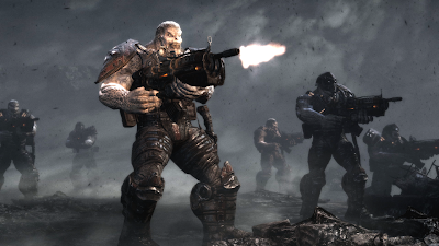
With the Gears Of War 3 trailer finally unveiled yesterday, along with a splattering of pre-release information and interesting technical facts, we though it was time yet again to bring about another tech report. This time we’ll be focusing on this week’s teaser trailer and talking about the visual enhancements planned for the title, what they mean and how they could be included when it comes to the final game.

Currently there isn’t all that much to go on. Outside of the trailer - which we’ll be analysing in a moment - only a handful of new graphical features and visual effects were mentioned, and of course the intention to further optimise the title for the 360 architecture. However today’s IQGamer report will be just the first of many, and we shall be updating you every step of the way as new information surfaces. It will be interesting to see how the first in-game shots really stack up to Gears 1 & 2, and how many of the cut visual effects from the second game make it back in, if they in fact do so.


In terms of new graphical effects, Epic Games plan to include a global illumination system in Gears 3, along with indirect lighting, an intentional side effect of GI, and increased amounts of particle effects and specular highlighting. Other undisclosed improvements to the overall game engine are also being coded into the latest version of the Unreal Engine 3, mostly in the way of optimisations with regards to existing features found in the tech.

The first of these, a form of global illumination, is a technique in which a single light source reflects and bounces off every surface it comes in contact to. And whilst something that advanced isn’t going to be possible on the 360 in its entirety, a semi-real-time, pre-calculated approach is certainly on the cards.

The second is that as a result of the inclusion of GI, we can expect there to be a lot more in the way of indirect lighting, a side effect from the light bouncing off one source and providing lighting for another. This in turn will create better ambient lighting relying less on pre-baked shadow and light maps, more dynamic in nature, hopefully being done in real-time, of half real, half pre-baked for an effective but cost saving (resource wise) approach.

Both of these effects should go a long way to increasing the sense of depth and realism into the experience, at the same time complementing the use of baked ambient occlusion and shadow maps nicely.


Looking at the trailer itself it’s pretty clear that a few of the new effects, such as indirect lighting and improved specular highlighting are visible. Although there doesn’t appear to be any sign of the GI solution they mentioned.

The trailer seems to be rendered using in-game assets and the actual in-game engine, though it doesn’t appear to have been done in real time. Much like with the first Gears 2 trailer there appears to have a higher image quality compared to both of the first two games, with better texture filtering and less noticeable aliasing. However the trailer also shows off a few low resolution textures and still doesn’t feature a useable MSAA anti-aliasing solution, meaning that in all likelihood it is a genuine in-engine rendered, which could well be matched in the final game. The trailer looks like it’s being rendered in 1080p and downsampled for AA, rather than having actual MSAA for jaggies reduction.

You can also see much greater texture detail as well compared to before. Characters now have facial hair which has a sense of depth about it rather than being just a flat texture. This is done through the use of shader techniques in combination with normal mapping, which seems to also have been improved over Gears 2. Geometry counts looked to have been upped slightly too, which would explain, along with the shaders, how a lot of that extra detail has been included. I would imagine that whilst some elements have less geometry than in previous games, due to better shader usage, other areas of the game would have benefited from a slight increase in order to give more detail.

The use of shadow maps and baked ambient occlusion appears to be present, with the AO looking to be more prominent than before, and the shadow maps creating contrast to parts of the environment not being directly affected by the game’s lighting system.


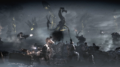
The above screenshot shows off clearly most of the new graphical effects that were mentioned earlier on. For example there is an abundance of particle effects on screen being kicked up the giant Locust boss character, and everyone from the Gear’s themselves to the standard Locust enemies have more sheen and a smoother look generally provided by better specular and diffuse maps.

Like with Gears 2 the gunfire lights up the environment surrounding the characters, although this time its reach is greater than before, reacting with increased intensity with environmental specular and diffuse maps. In addition the lighting from above the clouds also creates subtle light and dark areas on the ground, encasing characters in shadows and light as the clouds move and pass over them.

Whilst it isn’t possible however, to see any of the indirect lighting that Epic has stated would go into the game, the overall basic lighting and shadowing model has seen noticeable improvement over the first two games. With GI and indirect lighting it should look even better, even though the implementation is likely to be a simple one in order to maintain engine performance.

So far, whilst it looks better than previous the early trailers and tech demos for Gears 2, this Gears 3 trailer only scratches the surface of the improved lighting, although both the particle effects and shaders have seen significant improvements. The GI solution that Epic are working on for the title should make all the difference, and as long as they keep the image quality increases shown in this trailer we should be expecting another technical showcase for the 360.

Well, that’s all we know for now, and everything we can establish from the very short and hardly revealing teaser trailer for the game. Some of the things we pointed out weren’t exactly new to the series, but simply refinements to an existing graphical base of the Unreal Engine 3. As development progresses we expect to see much more in the way of improvements, mainly in the form of the GI lighting, and hopefully a proper anti-aliasing solution as well.

Either way this short little demo already looks to have better tech than in Gears 2, and all that remains to be seen, is how well Epic will do in keeping all the features introduced in forthcoming trailers in the actual final release build of the game.

IQGamer will be following the progress and development of Gears Of War 3 closely, with more tech news and analysis as it breaks.

Tuesday, 13 April 2010

IQGamer's Top 5 Tech Titles For 2010

Over the next couple of months this generation is set to witness another wave of technically proficient and defining titles, following on from last year’s Uncharted 2, this year’s God Of War 3, and Crysis, from a few years back. It’s for this reason that IQGamer has presented you with our top five titles to look out for on a technical level. Games which potentially, will not only push the barriers of what is possible on their respective platforms, but that will also showcase the perfect blend of art and technology fused together for outstanding graphical excellence. Some of these of course will transcend that notion, being as relevant for their gameplay as well as their graphics.

1: Alan Wake

Remedy Entertainment’s unique take of the survival horror genre has been in development for six long years, and in that time scarcely anything has been seen of the title. The recent trailers however, have shown that those six years could well be worth the wait, with an eerie, Stephen King meets Silent Hill style approach to the mood and atmosphere, and a action focused, episodic style of gameplay which looks set to bring freshness to a somewhat worn out genre. Visually, the game looks like being the poster boy for lighting for the 360, with some of the most impressive dynamic lighting seen outside of PS3’s God Of War 3, whilst also providing a range of post process filters, and some amazing texture work.


2: Halo Reach

Microsoft’s 360 exclusive sets to re-write the rulebook of just what is possible on their white box of tricks in the eyes of rabid PS3 fanboys. In reality the 360 has always been capable of such graphical feats, but having a title display them all at the same time is a welcome sign that developers are finally trying to seriously push the machine. ‘Reach’ is one of the first titles to be pushing up too 40 lights sources on-screen at once, from the glow given off from firing your Plasma rife, to the reflections shining off the surrounding lights. In addition, a healthy use of normal-mapping combined with improved texture detail, gives far more depth to the various surfaces found in the game, whilst a higher rendering resolution and trillinear filtering brings up the image quality significantly from Halo 3 and ODST.

There’s more of course, but for now why not check out the impressive gameplay video below, which showcases exactly what we mean.


3: The Last Guardian

More of an artistic inclusion that a purely technical one, but a game nevertheless that has the potential to truly blend artistic beauty with awe-inspiring technical brilliance. We’ve already seen the wonderfully smooth and completely natural looking animation from earlier trailers, which by far moved me in a way most games routinely fail to do, ‘feeling’ alive rather than just looking like it. A mixture of detailed texture work, painted textures, hand drawn inspired main character model, and lovely HDR lighting effects combined with ‘that’ animation make this one to look out for. More intriguing though, will be the bond between the boy and the creature, and the unique gamplay mechanics it could bring to the table. This is easily one of the most exciting titles for us at IQGamer, regardless of any technical merit that might be bestowed upon it.


4: Lost Planet 2

Capcom’s sequel to the 2006 hit is looking every bit as sweet as the first game, with bigger and badder enemies, huge screen-filling bosses, and some of the best particle effects we’ve seen so far on both PS3 and 360. More detailed texturing, improved lighting, better filtering and an overall higher image quality is just some of the things this sequel brings to the table. The first game however, introduced us to much of this anyway, so it will be far more interesting to see how the co-op campaign works out, and how the collecting of alien residue is still required for survival. Despite not being high on many people’s hype list it is right up there on our radar, and we’ll be sure to be taking a long hard look at the game upon its release.


5: Crisis 2

Maybe this one should be higher up on the list but you will find out why not in just a moment. The first game is still, by a long way, the most technically accomplished game ever made. If you have the PC to run it Crysis will push around on ‘enthusiast’ settings pretty much every graphical effect buzzword known to man. And at 1080p 60fps for a short while, if you’re lucky. ‘Crysis 2’ is attempting to do exactly the same thing but with a strong focus on consoles this time around.

The game already seems to be implementing ambient occlusion, along with simulated god-rays, dynamic lighting, volumetric effects and various specular and refraction techniques also. Not too mention particle effects and an impressive real-tie physics system. Sadly, it all currently looks rather poor when shown in high definition on the consoles, with low resolution textures, bilinear filtering, no anti-aliasing, and slightly sub 720p rendering res. These two screenshots here and here show what were talking about, whilst the vid below shows how impressive it can look in motion.


So there you have it, IQGamer’s top five technically advanced titles to look forward to. All of those are definitely no-brainers in terms of graphical might and technology, but some of them might also genuinely take their respective genre’s in altogether different directions, doing for gameplay what others have done for graphics. Or maybe, some will in fact do both, proving we have lots of power and imagination left to be gleamed from the current batch of consoles. Either way you can expect us to be providing our flagship tech analysis on at least three of those above five titles, and most likely full reviews for all of them too.

Lastly, you might be wondering why there aren’t any Wii titles on that list. Well, seeing as it IS a list of the most technically advanced titles coming to consoles, we didn’t think something that can push Nintendo’s little white slab to its limits quite justifies a place amongst titles running and competing on superior hardware. Artistically speaking, both Metroid Other M and Super Mario Galaxy 2 are certainly candidates for the race of ‘best visuals’, just not in the overall technical sense. Although, you cannot deny that both games are technically beautiful, working in and around the constraints of the aging Wii hardware.