Sunday, 31 January 2010
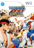
Review: Tatsunoko Vs. Capcom (Wii)
The last two years have seen an unexpected resurgence in 2d beat’ em ups, as well as various titles associated with the hardcore scene; Street Fighter, King Of Fighters and Bionic Commando all making their well deserved comebacks, with the mainstream stalwart NBA Jam recently added to the shortlist. So it comes as no surprise that another instalment of the popular Vs. series was on the cards and ready to cross-combo, super-cancel us into oblivion.
Tatsunoko Vs. Capcom has arrived!
Now nobody really expected this particular instalment to arrive on these shores, what with the many licensing issues plaguing the Tatsunoko brand over in Europe and the United States. In addition with what must have been some very obvious concerns as to whether it was worth the time and financial effort to do so, given the fact that the brand remains a virtual unknown around these shores.
However it seems that those problems have been taken care of, with the exception of Hakushon Daimao whose licensing in European left him shafted from the game. Other than that, everyone is correct and present, and making up for the delay Capcom have added in a few extra unlockable characters not found in the original Japanese version, and an online play option exclusive to us.
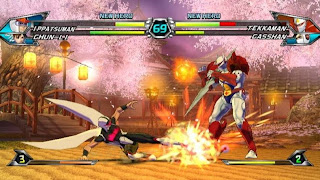
It’s a great thing; it really is, as TvC provides some of the most intensely enjoyable tag-team Vs. action since the original Marvel Vs. Capcom. Every aspect of Tatsunoko screams out personality on its sleeve, from the completely eccentric J-Pop infused theme song, to the bizarrely odd end credits sequence. You will find a mix of uniquely styled characters, impressive background set pieces, and some of the most balanced action the Vs. series has seen. And it’s all completely bonkers!
The basics are much the same as with previous games, albeit here they are slightly simplified. In Tatsunoko you only use three attack buttons, Light Medium and Heavy, with a fourth button dedicated to special attacks, like calling in your teammate for a few extra hits, or to simply tag them into action. Punches or kicks are dependent on which direction you push the d-pad or stick in combination with any of the three attack buttons. Sometimes the differences will be subtle, like going from a straight punch to a basic uppercut. Or if you happen to be jumping in for a basic combo run, a flying kick can change into a punch or throw, and then cancelled into a hyper using the P button followed by the correct motion.
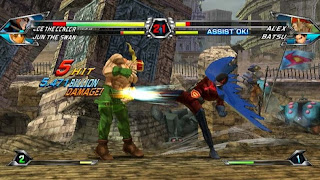
This system at first feels a little random, however after a few play throughs you find that it has a huge level of depth. Just accurately thinking about which attack to use and in combination with what direction instinctively, is almost as deep in some circumstances as having the full six-button set-up. What’s more it allows a degree of simplicity allowing inexperienced players to effectively have a good button bash and feel like they are at least kinda playing the game properly. With the same token it allows anyone to step in and have fun, more so than with Street Fighter IV.
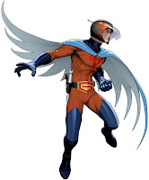
Then you have all the intricacies of the Assist Moves, Hypers, Team Hypers, and various other nuances, in which hardcore players like myself will no doubt spend many hours learning and exploiting in the heat of battle. In fact there’s so much to learn and master here, you could almost argue that it’s almost as complicated as SFVI. Just through the sheer amount of moves on offer and how they change with the different button presses and combo team-up scenarios.
Perhaps the most intriguing element of all this is, is how one special move can turn into three just by changing which button you use. The effect and outcome is completely different, allowing a great range of intros and juggles to be played even at the most basic level. You could even combine some of these with the basic L, M, and H in quick succession as a perfectly usable starter for some of the games more intricate combinations.
Of course this is using either the Arcade Stick or Classic Controllers. A much simpler Wii Remote, or Wii Remote + Nunchuck combination is also supported, which strips down the controls even further. Using this option there is only one button for regular attacks and one button for specials, with the moves you do depending on which direction the D-Pad or Analogue stick is pushed. However it’s not possible to pull of anything but simple combos along with some special moves and hypers.
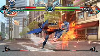
It’s lots of fun playing TvC, regardless of controller set-up, and the range of characters complement the move sets nicely. In fact anyone looking for various Ryu and Ken clone characters need not apply. Whilst the majority of moves are performed using the standard quarter-circle forward + attack technique, their styles can vary greatly. You won’t find twenty different versions of the same fireball or dragon punch here. In fact, the range on offer is something akin to an SNK fighting game, mixing many styles and personalities together.
In terms of modes, Tatsunoko Vs. Capcom simply features five; Arcade, Versus, Survival, Time Attack, Training, and Online. The Arcade Mode words as the game’s Story Mode, basically having you fight through a number of stages, coming up against a sub-boss around half way, and then squaring up against the obligatory final boss at the end. Versus, Training and Survival should all be is self-explanatory by now. And that just leaves Online.
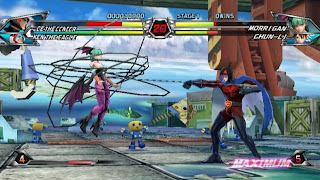
Online play in TvC works surprisingly well, with very little lag in matches both domestically and ones found half way across the world. It’s surprising good compared with the problems I’ve been having with lag in SFIV recently. Naturally, running only a 1 Meg (I’m being upgraded to 8 Meg as I write this apparently) connection means that I do frequently experience some small amount of lag in worldwide matches, though nothing game breaking. The largest problem is the barebones matchmaking system, and the hassle of having to enter those somewhat pointless friend codes. It is actually easier to set up a random match, in which the CPU automatically pairs you up with an opponent, and then select them as a friend when the match finishes rather than painstakingly add people manually.

The only real issue is with regards to paired up matches. It’s completely automatic; to the point of where you literally cannot choose whom you fight against. This means you have no way of telling if the person you have been paired with has a good connection, though you can tell if they are of a similar skill level to you. A small icon lets you know what kind of player they are; defensive, offensive, combos-based etc. Plus looking at their Player Icon (like in SFIV) gives you a good idea; a higher end player is one most likely to have unlocked some of the really cool icons not available just by playing the single-player modes.
Unfortunately, whilst I was online I found there to be only a small community of players at any one time, and kept being pared up with the same three or four people constantly. I checked back a few hours later and things got much better, though bizarrely there were times in which I would go through a few different opponents, and then others where I was being pared with the same one a couple of times. This is perhaps the biggest problem with the auto matchmaking system; it can be really annoying to play against the same players over and over in such a short space of time.
So the single player modes work well enough, and the online is at least serviceable; well it’s outstanding in terms of performance, just poor in terms of matchmaking. However the game feels a little shallow with regards to the overall content available. It won’t take long to play through the game a few dozen times to unlock the extra characters and see all the endings, and then online with its limitations certainly won’t prove as addicting as SFIV service. But despite this TvC has so much going for it, and those issues niggling away at it are just that, little niggles which disappoint slightly but that don’t really damage the game.
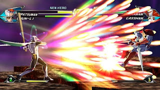
Graphically you’ll find that Tasunoko Vs. Capcom features some of the most exuberant and fantastical visuals on the Wii. The style presented here is in the same form as with Street Fighter IV; 2.5D polygonal models coated with rich hand painted textures, and some lovingly created frames of animation. Backgrounds are full of little details and moving set pieces, some displaying some lovely specular sheen and reflective effects, along with excellent texture work. In addition some of the projectile and hyper combo effects are just staggering, featuring multiple-layered textured geometry being distorted, twisted and pulled apart. Most impressive is at the end of a hyper combo, which sees the screen form into a pane of glass before shattering to reveal the characters and continue the battle.
The style really appears to be more like the Capcom 2D fighters of old, mixing in styles found in previous Vs. games with the likes of Street Fighter Alpha and Street Fighter III. You could say that the visual style is even more suited to representing the 2D sprites and animations of the past, more so than in SFIV.
With regards to the technical side of things, there’s no use of any kind of AA (anti-aliasing) solution here, though texture filtering appears to be at least of a trillinear quality, and the overall look appears to be clean and sharp, much like both Mario Galaxy and Metroid Prime 3. The game certainly looks great on a standard CRT running in 480i via the official RGB cable, and it also fares better than most when upscaled on a fixed-pixel display. Naturally jaggies are more pronounced this way, and the heath bars look quite blurry, but the game still retains its clean and rather sharp image.
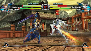
Moving on, I can honestly say that TvC represents another smooth return to form for Capcom and their incredible 2D beat’em up legacy. Whilst it may not be perfect, and lacks the long-term longevity that garners the rabid SFIV fan base, it does have its foot firmly in the dojo. And I can definitely see a small, but strong, hardcore following continuing to play and master all the intricacies available, both at home and in the arcade scene.
Admittedly, some may find the lack of recognisable faces a turn off, or the eccentric nature of the presentation and music off-putting, but I would urge them to give this a go. Especially any fans of previous 2D fighting games or even a more casual user who just recently got into Street Fighter IV. There’s a lot of fun to be had, and it would be such a shame if it all got lost due to unfamiliarity with the source material, or the inhibition to try something different.
Overall, the foundations have been solidly laid, and will no doubt be revised and expanded upon with the inevitable sequel. Given the quality and success that Tasunonko Vs Capcom deserves, it couldn’t come sooner. We highly recommend anyone with a penchant for 2D fighting games to pick this up and show your support, it’s worth it.
VERDICT: 8/10
Friday, 29 January 2010
Nintendo Reveals Metroid: Other M Details
It’s been a while since we last heard anything about Metroid: Other M, and we though the worst had happened to the series latest third person adventure. However, today Nintendo announced a summer 2010 release calendar for the title in Japan, and opened up a website to go along with the announcement.
A few details were also revealed about what we can expect from the title.
A return to heavy action-based sequences was touted, along with more traditional exploration-based elements characteristic of the classic Metroid franchise, which is extremely good news for fans. Yoshio Sakamoto (Metroid co-creator and Lead Scenario Producer) revealed that Other M will feature story progression much in the same vain as Metroid Fusion, and stated that the collaboration between Nintendo and Team Ninja is "unlike anything that's ever been done at Nintendo; it's more than just a collaborative effort -- it's one group working toward a common goal".
It is also comforting to know that along with Sakamoto, three other GBA Metroid designers are on board working on the main game design, whilst Team Ninja handle all the modelling work and actual coding.
Here is the official site.
Editorial: 3D Gaming And Why Gameplay Is Key
Everybody is seemingly talking about the 3D revolution and how it promises to be a completely immersive experience, how it will connect you and the game world together in a way simple 2D projection never could, and of course how amazing it all looks. But aren't we really forgetting something here? The reason we embrace new display technology, and in turn new advancements in graphics, is to surely to capture and create new avenues to explore and play.
Of course, that’s not to say 3D isn’t a largely visual thing. With limits being reached on just how much power can be packed into ever decreasing amounts of silicon, and the likelihood that the next generation of consoles could well be the last to see another extraordinary leap in graphics technology, 3D represents a way forward to take visuals to another level without necessarily increasing the amount of detail on screen as much as with previous generational leaps.
It could also completely enhance most of the games we play with one simple side effect, depth perception. The trick is, is that we need to be careful on how this is implemented, and whether the additional layers actually bring anything meaningful to the table.
Case in point. Games like Super Mario Galaxy or the likes of Uncharted 2 are the ones most likely to benefit from such an upgrade. Especially any title which is either having you making leaps of faith between ledges of precarious distances, or ones which require you to actively find, and exploit areas of surrounding terrain to navigate and scale. In these scenarios, the addition of depth perception created by the 3D effect could by and large help solve the age-old problem of being able to access just how far something is, whether the object you are looking at is an actual functional part of the scenery you can use, or just an impressive feat of bump mapping created to add detail for show.
The game design doesn’t have to change, and by that token I don’t need to see games blatantly making objects obviously jump out at you, directing clearly to an artificially clear-cut path, or simply firing off through the TV screen and in your face, like they trying to replicate Star Trek’s much-fantasised hollodeck.
Ultimately when used correctly, I’d imagine the 3D effect to work as a continuation of our natural stereoscopic vision, creating subtle layers of depth from our living rooms through the TV screen and into the game world. And in that world, the layers are all represented and spaced accordingly to the surrounding objects, by the sizes and distances which govern them. For us gamers if properly implemented, this whole notion of 3D could allows us to approach and judge certain things like we do everyday in the real world, and not like we have to in a current 3D game projected on flat our flat 2D displays. Essentially you can see the sense of scale being used, you can perceive how large something is relative to something else in the game world. It works very similarly to how your vision does in real life.
Take Little Big Planet for example. It’s a game which uses three distinct layers for gameplay, two in the background and one main one in the foreground, which forms the basis of most level layouts. Occasionally it can be difficult to judge which objects in those background layers are just for show between the ones which make up usable platforms for us to travel on. This is especially problematic with some of the homebrew designed creations, which lack both the planning and finesse of the developers own expertly constructed set pieces, but in which depth perception could well help with.
A recent 3D demonstration of LBP showcased to a handful of the videogames media, revealed how Media Molecule have created a distinct level of depth between each plane, and the background only layers used for show, allowing a clean and clear view on which platforms can be tackled on, and which are just there to make up the eye candy.
The same technique is being used to created a real sense of scale in Driving games like Gran Turismo 5, or in the case of Motorstorm Pacific Rift, to allow you gain a better understanding on how fast you are going, your proximity to surrounding objects, and helping you to navigate through the terrain without flying off the edge of that cliff you thought was still 20ft away. A game like Call Of Duty is also another one in which distances and spatial positioning are extremely important, and 3D could make the whole experience clearer for us to perceive, and ultimately allowing us to take an intricate level of mastery even further towards reality. Added depth in every sense of the word.
Arguably it sounds like a trivial matter, but something like depth perception is a fact we take for granted every time we pour a cup of coffee, or attempt to navigate that congested pile-up over by the traffic lights. By having the same advantage in games, we could truly be closer to bringing ourselves completely into the experience, delivering that excessively used immersion factor. Or maybe, to just be able to take things that are natural to us and put them into play in something decidedly unreal.
Granted, some developers may try the quick and easy route of having things fly out of the screen, or explode right in front of your face. But these things become tiresome very fast, and the audience will soon catch on to that fact. In some circumstances having this extreme 3D effect works really well, especially in the case of a grenade exploding right beside you, or debris falling from a dilapidated industrial site. Used in this way, the so called clichéd effects can help bring a certain level of immersion previously unseen in standard 2D presentations; certainly when combined with intelligent use of the depth afforded by this new technology. However, being used sparingly is particularly important. These effects only really work when used in context, if the situation actually benefits in a natural and organic way. Displayed in such a manner they should be pretty successful.
The truth is, is that 3D represents both sides of the coin, a visual evolution in the graphical cannon of gaming, as well as the ability for the first time in its history, to take gaming closer to what we consider reality. The first was polygon visuals, the second was 5.1 surround sound, the third was motion control, and now we have 3D bringing depth perception to the table.
The four cornerstones of gaming? Well, we’ll be able to find out later this year when 3D launches along side Natal and Sony’s own motion controller.
Wednesday, 27 January 2010
PS3 Bayonetta Gets Patched
The much troubled PS3 version of Sega's Boyonetta is to receive a patch tomorrow, one which sorts out the game's rather long load times. Once downloaded it will allow a Hard Drive Install option to be selected from the main menu, and should reduce loading to comparable levels found in the 360 version.
The patch is only being released in Japan for now, but we expect it to hit worldwide very shortly. Unfortunately it doesn't improve any of the large graphical discrepancies to be found in the PS3 game, most severly of which is the nearly halved frame rate - running frequently at an unstable 30fps compared to a mostly solid 60fps on 360.
It remains to be seen whether Sega will attempt to fix any of the other issues at present, seeing as the delayed PAL release saw little improvement. A few small tweaks may certainly be possbile. But it all comes down to just how many consumers are still interested months down the road, and whether Sega feel it's financially viable, considering those problems didn't put a dent in sales of the PS3 version.
IQGamer Launches!
Welcome to IQGamer. We started this blog as a beginning to something different, a new kind of games site, representing not only what we hope will become one of the definitive sources for the most in-depth technical analysis around, but also a fresh way of thinking when approaching conventional videogame journalism.
Of course we’ll still be reviewing the games, and hunting down that elusive news story. However we will also be providing you with accurate head-to-head comparisons and in-depth tech reports, along with intelligent discussions on subjects surrounding much of the industry and the wider media it transends. All of this delivered with our own distinct viewpoints, polarising through unbiased technical truths and the heart and souls of the individuals.
Some of these features will be posted up on here at IQGamer in the usual way, but we will also be presenting you with a regular pod cast. These will expand upon the points raised in our articles, fleshing out items of particular interest, and allow a platform for much needed discussion to take place.
Over time our plan is to expand IQGamer into a new breed of gaming site. One that we think will redefine what videogame journalism is all about, taking the fundamentals laid down over the years and gently reworking them into something more unique, and something which better represents where this whole notion of games coverage is going.
Until then this Blog will be the hotbed for us to trial out some of our new ideas, refine them down to a fine art, and eventually put them to work in an all encompassing gaming site. Or thats the idea, anyway.
We invite you to join us along for the ride.
Tuesday, 26 January 2010
Ninja Gaiden Sigma 2 - Tech Analysis
The original Ninja Gaiden Sigma (NGS) represented one of the first wave of 1080p enabled games to hit the PS3, which showed that despite the obvious limitations in pixel rendering power and somewhat strict memory constraints, it was possible to have a fully crafted next-gen title running in Full HD 1080… almost. You see NGS used a little trick of rendering in 960x1080, having only half of the 1920 horizontal resolution required for true 1080p, but also only using a small percentage of processing power, and framebuffer memory over the standard 1280x720. The PS3 then took care of scaling the horizontal res of 960 to a full 1920x1080. This didn’t look half bad to be honest, and showed up slightly more detail than the standard 720p mode. However overall IQ was diminished as a result, with more jaggies appearing on screen along with some unwanted screen-tear.
In addition to this neat 1080p trick, NGS featured some lovely HDR styled bloom lighting, coupled with hi-res texturing and improved shadowing over its Xbox counterpart, all at a glorious 60 frames per-second with 2xAA in 720p mode. This made NGS look good enough to stand against most competing titles at the time of its release, although this impact was not felt across all stages, and not at all times throughout the game.
Ninja Gaiden 2 (NG2) however did not feature a 1080p mode as such, instead opting for the 360’s scaler to do the work previously half done by the GPU in Ninja Gaiden Sigma. In addition, the game lacked intensity in its bloom lighting so heavily featured in NGS and featured some low resolution, rather flat looking texture work. The overall lighting appeared to be mostly static, comprised of pre-calculated shadow maps, which failed to react with moving objects on screen, and with just a single light source to engage with the scenery and characters. It felt like a bit of a rush job compared to NGS. Though the fact that the game was pushing around so much more stuff on screen, with limbs being hacked off and blood gushing out of every gaping wound, understandably meant that certain cuts had to be made visually.
Now Ninja Gaiden Sigma 2 doesn’t live up to the lofty claims of 1080p made by the first game. Not that it really needs to, seeing as it looks so much clearer and better polished in 720p than both the previous title and the 360 sequel. And that’s without any sniff of a good 1080p upscaling solution.
The first thing to address here is that NGS2 is rendering with a full 1280x720p framebuffer compared with a mere 1120x585 on 360 NG2, with both games using 2xMSAA for anti-aliasing. This means that before any other graphical upgrades are put into equation, Sigma 2 has a clear IQ advantage over the 360 game, both with regards to jaggies reduction, and cleaner polygon edges due to the absence of any upscaling being present.
The difference is instantly visible, as the polygon edges lose the slight softness they used to have on the 360 original, appearing much sharper and looking noticeably smoother, whilst at the same time showing increased clarity across the entire range of character and background models, along with the higher res visual effects. This in turn helps bring out more detail in the textures, which have also been either improved or completely redone from scratch. This improvement in IQ also puts NGS2 over the first NGS game on PS3 with both running in 720p as a direct comparison.
However not all is quite right, as there is something strange happening with regards to the AA in NGS2. It appears that there are times when it is seemingly disabled and then a few seconds, or even a few frames later re-enabled, with from what I can see, no logical explanation for this to occur. The loss of AA can bizarrely happen at any given time regardless of how much is being pushed on screen at once, or how the game is rendering its frames. There doesn’t seem to be a visible pattern when looking at frame grabs to determine if it’s some kind of variable AA, like seen in DMC4 or a new solution which provides a similar effect.
You can see below just what is happening, with the top screenshot clearly showing 2xMSAA and the bottom with no AA.
2xMSAA
No AA
As you can see the IQ is temporarily reduced when the AA is disabled, producing some jagged edges but hardly any real loss of meaningful detail. Of course the above is almost impossible to spot when playing the game, with only slightly more jaggies briefly appearing if the lack of AA lasts for more than a second or too. So it’s not really an issue just a strange observation, which in the interests of being thorough, felt that you guys should really know about it.
Earlier we mentioned that NGS2’s textures have either been improved or completely redone for this version over NG2. Well both have been reworked to a greater extent than what was done with the first game. Higher res textures have been used throughout, complete with a healthy dose of anisotropic filtering, which allows texture detail to be visible much further on in the distance than with basic bilinear or trilinear methods. The use of this filtering is greater than with NG2, again empathising the better IQ NGS provides when coupled with all the other improvements.
In addition moderate bump mapping and subtle specular highlights have also been applied, creating a mild sheen and depth that otherwise, would have the game’s many lovely floors and walls look flat and shallow, a problem which NG2 suffered from, and that is now absent here in NGS2.
The game’s upgraded lighting system also helps to provide both much needed depth and atmosphere to the proceedings. One of the main criticisms with the original NG2 was the flat looking, pre-calculated lighting model, which made the game look at times like an enhanced 720p Dreamcast game. Not so with NGS2, which features the return of the intense HDR bloom lighting from the first Sigma, and a greater use of spot lighting effects to create the illusion of at least some basic dynamic lighting. However the shadows cast by buildings and static objects still don’t react with Ryu or any of his enemies, with only the main lights affecting how bright of dark he becomes when in the shadows of large objects etc. There is never a transition when emerging to and from the shadows, just a subtle darkening caused by being further away, or in a different direction to the main lighting. When HDR is present this effect is heightened slightly, and distracts you from some of the last-gen shadowing on offer here.
Overall Sigma 2 presents us with a major improvement over both the original NG2 and NGS, with IQ, texture detail and lighting effects all extensively reworked giving us a much better looking game for it. Of course this improvement does come at a price, and this is in the shape of dismemberment being removed from the game, along with free flowing blood gushing from lacerated wounds. Instead we have simple decapitations, in which the heads will fade away as soon as they are cut, and the replacement of blood with a blue mist much smaller in size.
There is no doubt, whilst this change was mainly an artistic one, with NGS2 having a different director, it has played a large part in allowing the team to enhance the overall game engine back up to the standards set by the first NGS and beyond. Granted there is less chaos on the screen than before (and enemies are now more resilient to balance this out), but having a full 720p image with 2XAA is a worthy trade off compared to the lacklustre effort shown with NG2.
Lastly a point we haven’t yet touched upon with NGS2 is with regards to screen tear. Sigma 2 tears far more frequently than in Ninja Gaiden 2, which is no doubt due to the engine having to handle the extra workload of more pixels to render in addition to the other effects displayed over what NG2 had to do. It’s not a major issue, but like on occasion in 360 Resident Evil 5, can be a bit of a nuisance during a hard fought boss battle, or whilst scaling the games many attractive stages. The difference isn’t huge, but someone who’s played both versions will definitely notice.
The only other slight change we have left is with regards to the cut scenes. In NGS2 they are locked at 30fps, whilst in NG2 they are variable between 30 to 50fps depending on the scene complexity and effects used. If anything having the cut scenes locked to 30fps is a better choice as in NG2 they never reached 60fps, and barely hit a framerate close to that in most situations during those cut scenes.
Ultimately though for all the little changes, and that small increase in screen tear, Sigma 2 manages to fix most of the issues surrounding the 360 original, and more importantly manages to eclipse the first game without resorting to any kind of 1080p trickery. So from a pure technical perspective, NGS2 is the finest version of Ninja Gaiden 2 available.
Now all that’s left to see is if Team Ninja can get the Sigma engine running equally on both PS3 and 360 for the inevitable Ninja Gaiden 3, working on the strengths and weaknesses of both systems like Capcom and their MT Framework Engine 2.
Halo 3: ODST - Tech Analysis
As our first feature here at IQgamer, we though of nothing better than to start off our hopefully long-running and thoroughly insightful technical reportage, with none other than Halo 3 ODST, the latest title in a series which introduced many gamers to the world of beautifully textured, bump-mapped and overly shiny first person shooters. A series which although seems to have lost a large amount of its visual clout, still pushes certain things forward technologically that other AAA games lack altogether, even if the end result requires some unpleasant side-effects.
Before we go on, I would like to point out that ODST is essentially using the same tech built up for Halo 3 with some of the same shortcomings as that title, then simply enhanced and refined for this latest instalment. So with that, we still have the use of the dual 1152×640 frame buffers, which are combined to form a final 1280×720 image, and used to save enough bandwidth to allow the full range of HDR lighting to be displayed, whilst sill fitting the frame buffer into the 10mb edram available. This also means that there is no room for a proper MSAA solution due to the memory constraints, nor is there a clear way using a respectable amount of anisotropic filtering to clear up any blurry far away textures.
However that’s not to say that some of the issues which plagued Halo 3 haven’t be dealt with, because despite the limitations of the engine used they clearly have to the extent their current technology allows.
Firstly, the jagged edges caused by both the lack of any AA being applied, and the upscaled nature of the dual framebuffer solution, have been considerable reduced increasing overall image quality noticeably. The game appears a lot sharper than Halo 3 in most situations and this improvement is very welcome allowing for the textures to stand out, and a detail increase without upping texture usage. Now ODST achieves this clarity, not by a traditional MSAA algorithm but by some kind of post process filter, which subtlety smoothes over most of the upscaling artefacts and a large part of ODST’s jaggies. The effect understandably is less pronounced than regular MSAA in certain situations, particularly those with smaller, more intricate details, and in some indoor scenarios - in which the game appears to lose this edge smoothing filter and brings back a screen full of jagged edges and a slight loss in texture clarity.
This apparent breakdown of the games AA solution largely depends on what filters are being used for any given scene, and is mainly used to add realism to the games visual look rather than just a cheap use of anti-aliasing. So it’s a nice inclusion to see it here rather than a tarnish to the games competent, and sometimes lovely visual splendour.
Texture filtering has been slightly improved upon since Halo 3, though still using plain old bilinear, greater clarity is achieved via a bias to filtering certain textures more than others. This system saves on the heavier memory requirements that trilinear filtering would bring whilst allowing detail to be visible for longer distances, thus giving a cleaner look. However this method whilst still allowing for the increased use of HDR, and the inclusion of new post process filters due to saving memory, only goes so far to helping the majority of the games textures, which still suffer form the slightly blurry look, just covered up slightly by the better transitions between texture samples used during the filtering. Of course the ones which have had the bias applied come out much better, but still a far cry from the clarity displayed by the far sighted texture work of PS3’s Uncharted or the lesser filtered 360 Gears Of War.
Overall you have a cleaner look in ODST when compared to Halo 3 but one which falls short of many games this generation.
ODST does have more than just AA and texture improvements though. Geometry on both the human and covenant characters for one, have been reworked with better application of normal mapping creating a more organic look and losing some of the plastic look western dev houses seem to prefer. Brutes in particular, when losing their armour have increased detail, as well as looking more rounded than before, making them much easier on the eyes, just like their human counterparts. And of course much of this seems to come from better blending and shading techniques rather than raw geometry increases.
These changes mean that characters react with the lighting model more accurately than before, with global lighting affecting local shadows and characters to a greater extent, even though some of it is simply calculated shadow maps rather than true dynamic lighting. The fact that it works very well, regardless of how certain aspects have been cheated or better put, pre-calculated, shows how you don’t need to have the most accomplished and accurate shading and lighting model to get convincing results.
So, it seems that all of ODST’s tech have come from optimising the existing Halo 3 engine, adding new features which help solve some of the issues they faced before, but without taking away any of their accomplishments with the stellar lighting model, creating a cleaner more concise visual picture which although still suffers from some problems has obviously been pushed as far is it can go.
With all that said and ODST done and dusted, it will be interesting to see where Bungie take their new engine currently in development with Halo Reach. Will they pair down the show stopping but memory heavy HDR solution, increasing overall image IQ through proper 2xMSAA and at least trilinear filtering, or will they surprise us with something else entirely like adding SSAO to the mix?
Personally I’d like to see better IQ and the addition of SSAO over having the maximum range of available lighting, not unlike Uncharted 2, which not only manages to squeeze a lot more under it’s hood, but come out cleaner and far more visually impressive to boot. Of course we’ll be discussing that one another day.
Subscribe to:
Posts (Atom)